Whether you’ve celebrated multiple cake days or you’re just now getting your feet wet with Reddit, it’s a rite of passage to choose your preferred smartphone client. Quick spoiler: Your best option most certainly is not the official Reddit app.
Reddit’s mobile site is pretty decent, but there’s no better way to view “the front page of the internet” than with a dedicated app. Luckily, heated competition in this sector means that we have many great options to choose from on Android. The selection may seem a little overwhelming at first glance, but five apps in particular stand out above the rest. These apps will be the focus of today’s comparison.
The post submission interfaces for all five of these apps are much the same, but the browsing experience varies greatly. Some use Android’s built-in website rendering app (WebView) to display all links, while others can handle links from YouTube, Imgur, and more with a native pop-up viewer. Some adhere to Android’s Material design principles, while others have their own unique interface. So there are plenty of differentiating factors, and I’ll delve into those in more detail below.
Table of Contents
Comparison Chart

Key Comparison Points
- Price for Pro Version: The price you’d have to pay to remove ads and/or unlock additional features.
- Ads in Free Version: Whether or not the free version of the app contains ads.
- Themes: Most Reddit apps have themes, but some let you change the appearance of virtually every UI element.
- Auto Night Mode: A feature that will automatically turn the app’s primary colors to a dark gray or black when it’s nighttime in your area.
- Subreddit Navigation: How you open one of your subscribed subreddits. Most Android apps follow Material Design guidelines and use the side navigation menu (hamburger menu) as a list of your subs, while some offer other solutions like swiping between tabs. Here, options were preferred, so we gave wins to apps that let you navigate between subreddits in more than one way.
- Reorder Subreddit List: Whether or not you can change the order of the list of subreddits you’re subscribed to. This is helpful if you find yourself visiting a selection of subs more often than others in your list, as you won’t have to scroll nearly as much.
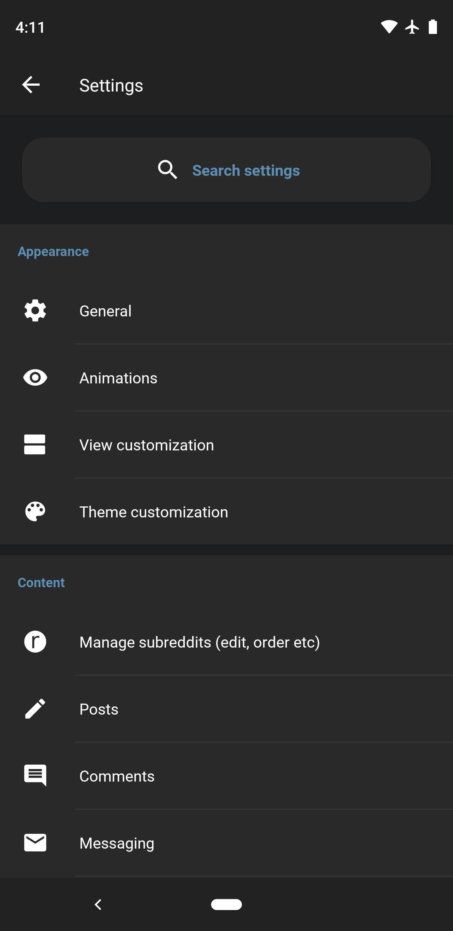
- Settings Search: Most of these app have a setting for everything, but that can make it hard to find the option you’re looking for. If an app is marked with “Yes” here, that means there’s a search function built into its settings menu.
- Browsing Gestures: Swiping to navigate through Reddit, be it from a post back to the front page, from a link back to the comment section, or any other such gesture that aids with browsing.
- Upvote & Downvote Gestures: The ability to swipe, double tap, or triple tap on a post or comment to upvote the content. Only one app in our final five had this feature.
- Live Comment Mode: With AMAs and breaking news threads, you might find yourself refreshing the comments section to check for new content. Live comment mode will do this for you automatically, almost turning Reddit threads into live chat rooms.
- Incognito Mode: The ability to open subreddits, user profiles, or links without the activity being recorded in the app’s internal history. Sync has an option to open any subreddit in incognito mode, while Slide has a setting that simply won’t record history when you open an NSFW subreddit.
- Data Usage Controls: Options to limit the app’s data usage while on cellular. Typically, this is done by reducing the quality of media and disabling features like inline GIF playback (see below).
- Offline Browsing: The ability to cache subreddits, comments, and/or links. With this feature, you could download your favorite subs and all their content, then still be able to read Reddit when you’re on a plane or in an area with no reception.
- Native Viewer: The ability to view content in a popup viewer inside of the app without having to open media links (images, GIFs, videos, etc.) in a browser. The five finalist apps were all capable of natively handling most Reddit submissions, though some of the apps that missed the cut could only handle select sites like Imgur.
- Imgur Album Support: Whether or not the app is capable of displaying Imgur albums in its native viewer. While all the apps listed here can open a single Imgur link in-app, some force you to view albums in a browser.
- Media-Only Mode: A viewing mode that only shows media, helpful for image, video, and GIF subreddits.
- Reader Mode: If an app is marked as “Yes” here, it can reformat web links to make them easier to read on a phone.
- Inline GIF Playback: GIFs that autoplay while you’re scrolling through the Front Page or a subreddit — in other words, you don’t have to tap a GIF to watch it; instead, it simply plays in the main feed.
- Peek Media: Long-pressing images, GIFs, and videos will open them in a popup viewer, then letting go will close the media. This is typically faster than tapping an image to open it, then tapping your back button to close it.
- Peek Links: Similar to Peek Media above, long-pressing a link to open it in a quick popup viewer.
- Peek Comments: The ability to long-press the comments indicator on a post to see a quick preview of the comment section.
- Filter Keywords: Blocking posts that contain certain words.
- Filter Users: Blocking particular users.
- Filter Domains: Blocking submissions from certain websites.
- Filter Subreddits: Preventing subreddits from showing up in /r/all.
- Filter Flair: Blocking posts that have been tagged with a specific flair.
- Tag Users: The ability to tag a user for your own future reference. These tags then appear as flair next to that user’s screen name that only you can see.
- View Sidebar: Whether or not the app lets you open a subreddit’s sidebar.
- Edit User Flair: The ability to change your own flair within a subreddit. This feature is typically located in a subreddit’s sidebar.
- Display Flair: This category tells you if the app can display user flair, either as text, or as text along with images (in subreddits that support image-based user flair).
- Multireddit Support: The ability to create and/or view multireddits, which are a personal collection of select subreddits. Think of multireddits like a smaller, curated Front Page.
- Trending Subreddits: Whether or not the app can display the current trending subreddits — an ideal way of finding new subs to subscribe to.
- Table Support: On Reddit, tables are a lot like spreadsheets. Some apps display tables properly with delineated columns and rows, while others just show the data in a jumbled mess. Relay is an outlier here — it loads tables as raw data at first, but provides a link that you can tap to render the table properly.
- Subreddit Themes: Whether or not the app can display a subreddit’s built-in theme in some way.
- Favorite Subreddits: Reddit has a feature that lets you “star” subs, which then brings them to the top of your subreddit list on the new desktop site. Some of these apps offer this full functionality, while others only let you favorite subreddits, but don’t automatically show favorited subs first in the list. A third type of app here lets you star subreddits and move them to the top, but these changes aren’t reflected on the desktop site, so it’s an “in-app only” feature.
- Manual App Backup: With so many customization options in all of these apps, you’ll want the ability to manually back up the app’s settings so that you can restore them on another device. Only a few apps let you do this manually, while others rely on Android’s built-in backup system that can be hit or miss.
- Notification Channels: The ability to customize different types of notifications that come from the app. For example, you could have mod mail show up with a heads-up notification and make sound, then set DMs to show up silently. This feature requires Android 8.0 or higher.
- App Shortcuts: The ability to long-press the app’s home screen icons to access quick links to your favorite subreddits. Requires Android 8.0 or higher.
- Adaptive Icon: Whether or not the app’s home screen icon supports Android Oreo’s Adaptive Icon feature, which allows your launcher to automatically change the shape of the icon to match your device’s theme.
Why Your Favorite App Missed the Cut
We anticipate plenty of comments about how it’s a travesty that we left off XYZ Reddit app, so let’s get out in front of that one.
The first omission that needs to be addressed is the official Reddit app. Yes, it’s pretty decent and it’s actually official, but you’re kidding yourself if you think it’s anywhere near as feature-rich as the third-party apps in this list. In fact, it had the fewest key features out of all the apps we tested — only 6 out of 39.
Then there’s Bacon Reader and Reddit is Fun, which used to be two of the best options several years ago. Times have changed, however, so if you’re still using an app that looks like this or this in 2019, it’s time to reevaluate some things. Loyalty is nice, familiar interfaces are comfortable, but trust me — the five apps that actually made our list are much more fluid and intuitive once you get used to them.
Finally, there’s the app whose absence will probably upset the most people: Now for Reddit. This one just simply missed the cut, as the five apps below had more key features than Now could offer. As an example, Sync for Reddit either tied or won in 32 out of 39 comparison points — Now, on the other hand, scored 10 out of 39.
In fact, we actually tested all nine of the top Reddit apps for Android. To see how the entire field fared, you can check out the full version of our chart.
App 1: Sync for Reddit
If we’re not nitpicking, there are precisely two things Sync for Reddit could do better: Be cheaper and implement upvote/downvote gestures. Outside of those, you’re dealing with the perfect Reddit app here. Polished UI? Check. Endless customization options? You betcha. View modes that are perfect for any type of media? Oh man, you don’t even know.
- Play Store Link: Sync for Reddit (free)
Let’s start with the interface. The base look is inspired by Google’s Material Design 2, which emphasizes single solid colors to make it easier for apps to invert their colors if they choose to implement dark mode. Sync has followed suit in that regard, too, with a dark mode that can be set permanently or automatically based on time of day. But the theming doesn’t stop there — you can set custom colors for every element in the app, from the background to buttons and accents.
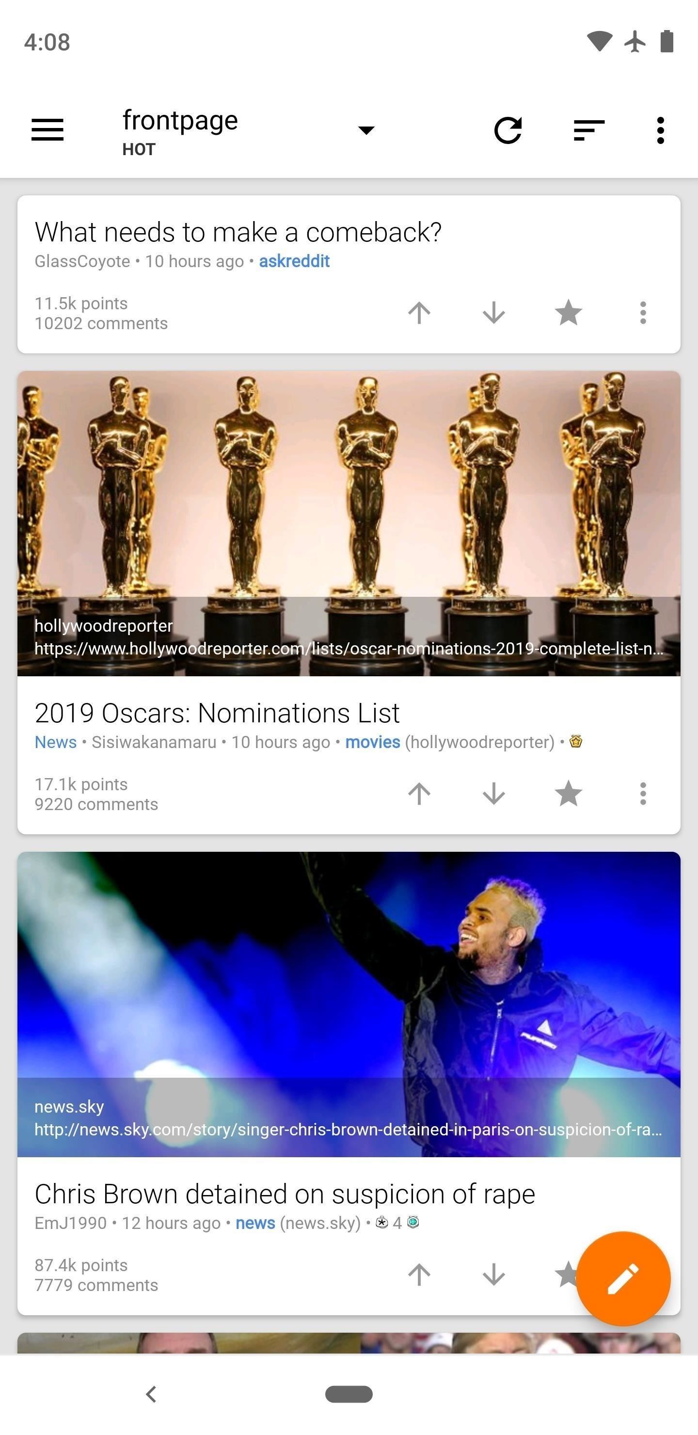
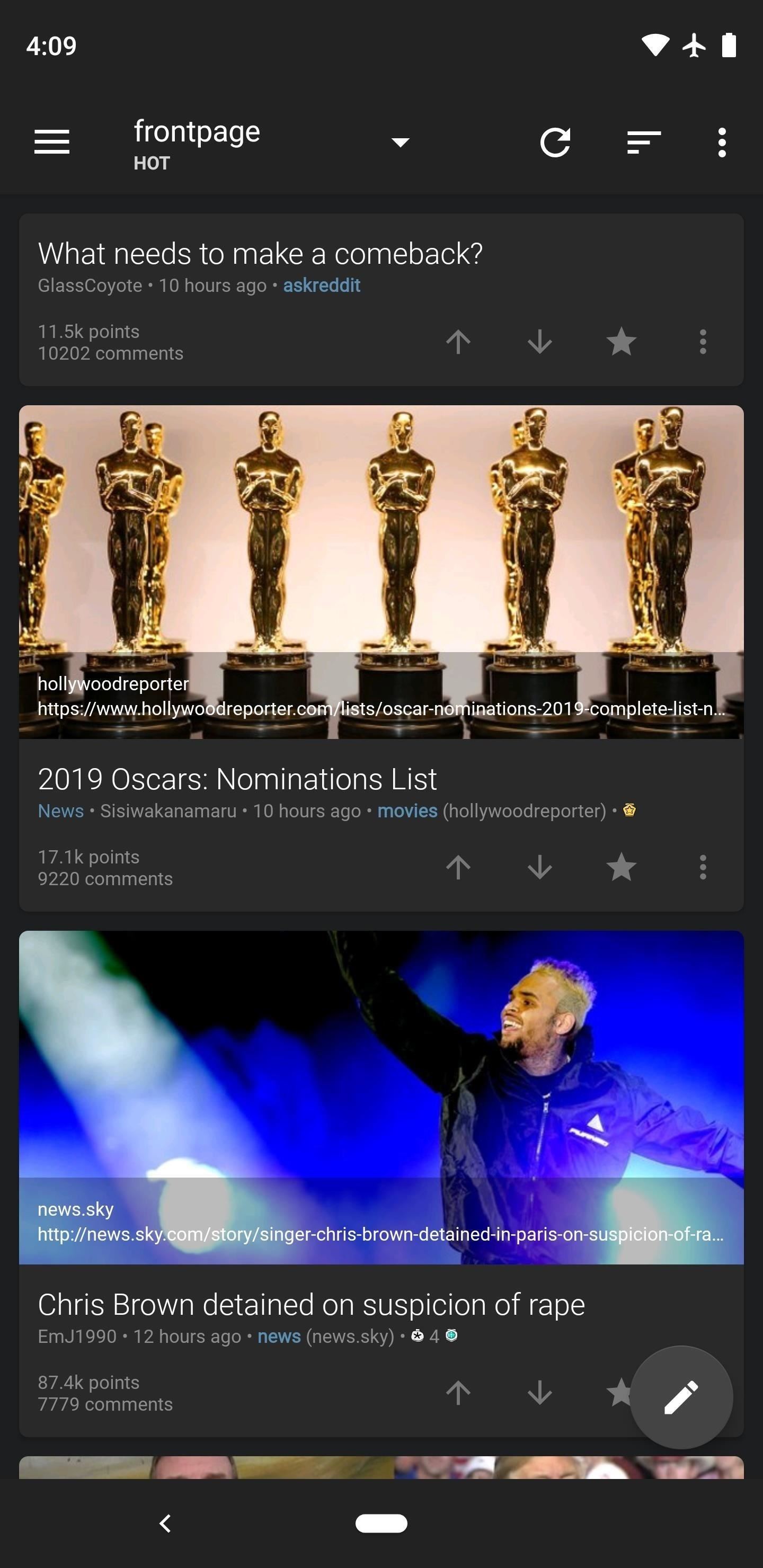
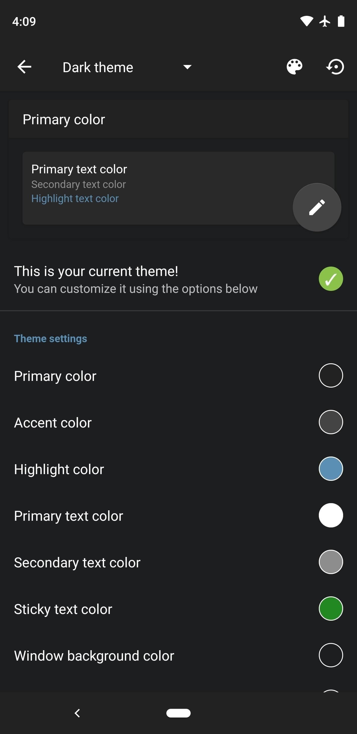
In terms of customization options, Sync is only rivaled by Joey, Slide, and Boost, but Sync’s settings menu is a lot more organized than those and even features a search function so you can easily find the option you’re looking for.
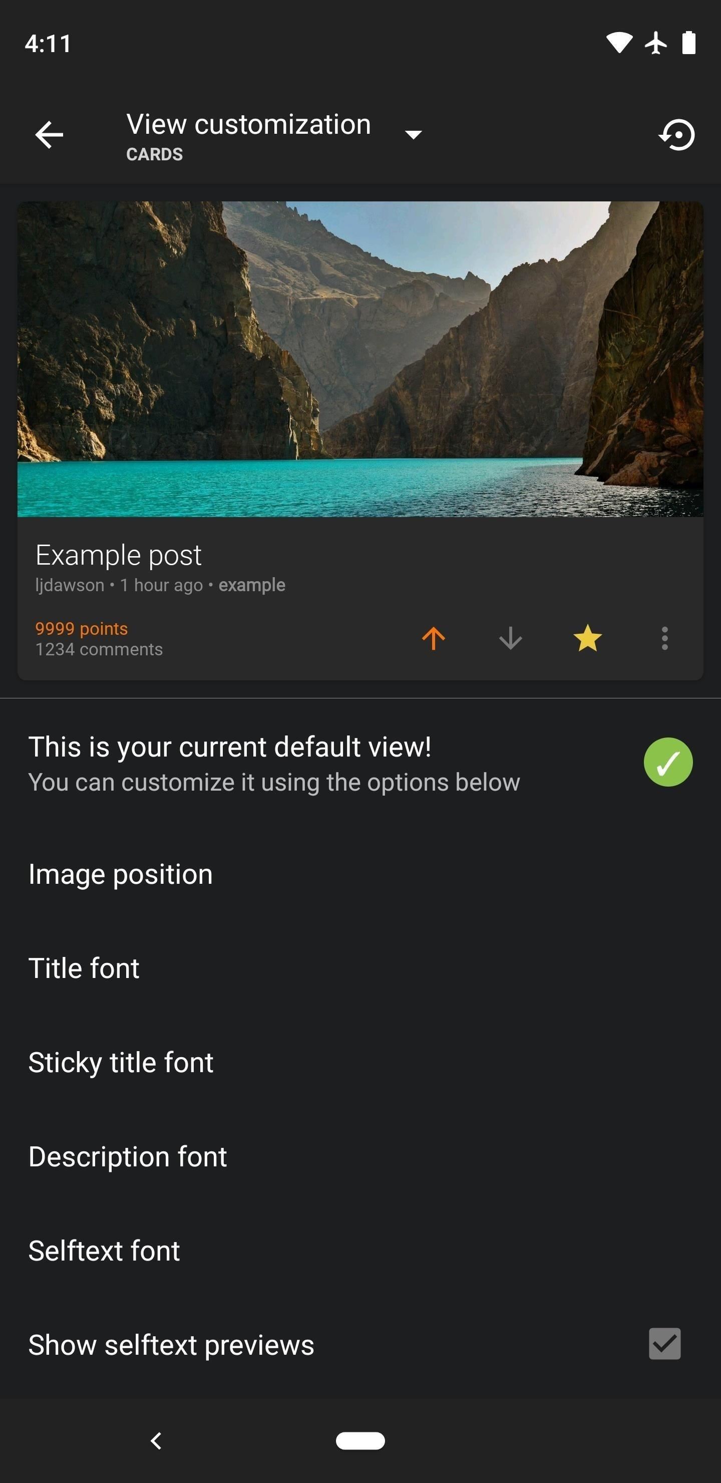
One of the best features here is the “View customization” menu, where you can pick and choose exactly which elements appear on posts, in comments, and even the navigation drawer. So if you want a button to quickly save posts, you can add that. Or if you’d rather that same button hide posts, you can swap it out. If you want more options, you can add both buttons along with a few others — or you can remove everything except the menu button for a clean look.
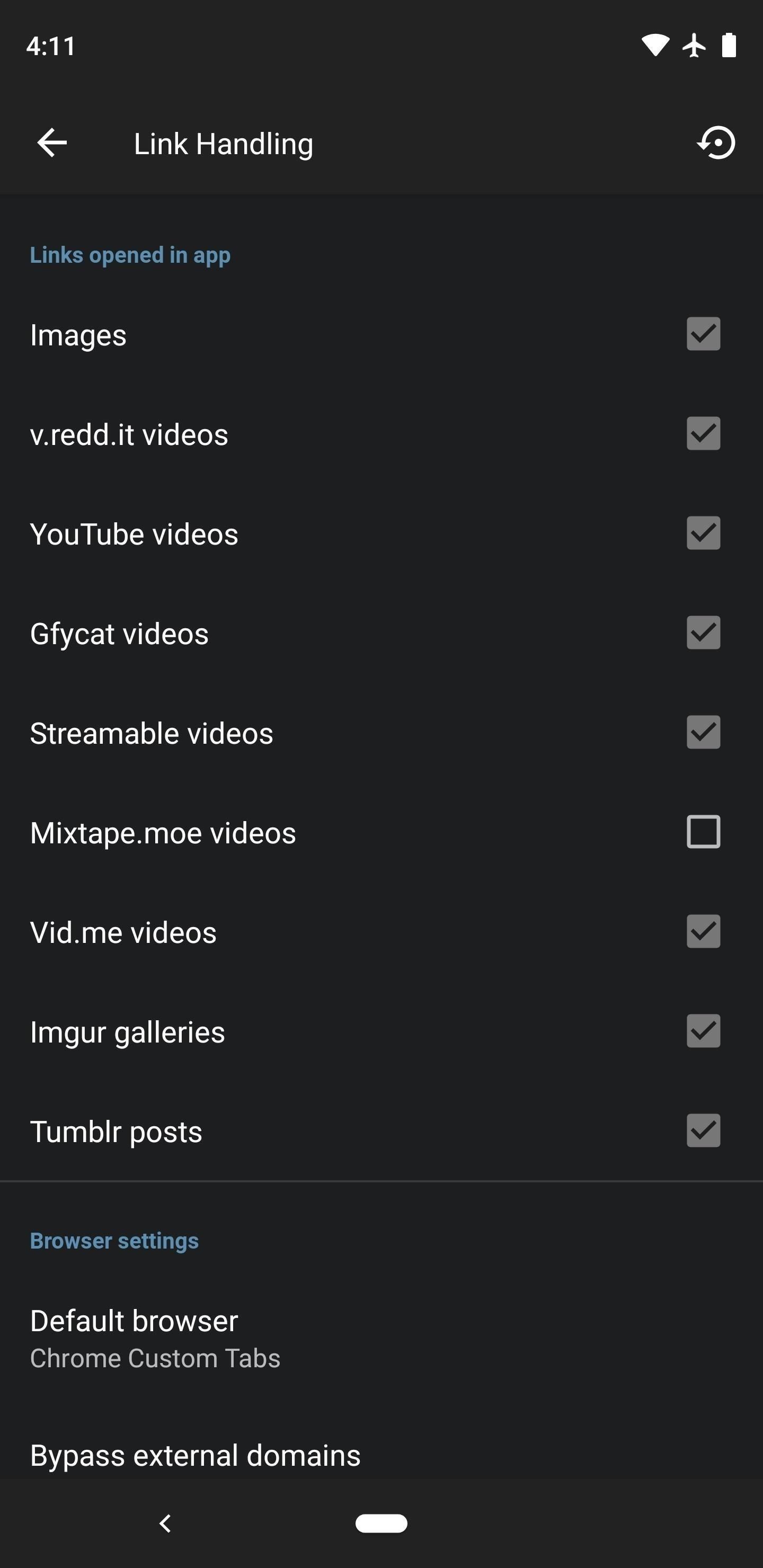
The area where Sync excels the most is with link handling. Virtually every media site shared on Reddit is supported with Sync’s native viewer, so tapping an image, GIF, or video in your feed results in the media playing almost instantly instead of loading in an internal or external browser. This really makes it feel like Reddit is one place instead of a collection of links.
Other areas where Sync shines include filters, which can block content from users, websites, keywords, subreddits, or even posts with a specific flair. GIFs and videos can even autoplay as you’re scrolling, so there’s no need to tap through. There’s also support for almost all key Reddit-specific features, with the exception of favorites (though Sync lets you star subs for use on the desktop; it just doesn’t reorder your subreddit list based on this system since it lets you do that in the app).
Then there are two useful features in Sync that no other app shared: image flair and offline downloads. The former is great for subs like /r/nba that use logo-based flair, while the latter is where Sync gets its name: you can sync a subreddit’s media and comments to your device so that they’re still available when you’re offline.
Sync offers two ways to browse your list of subreddits: a side navigation menu, or a drop-down list. The former can be accessed by swiping in from the left edge of almost any screen, while the latter works by tapping the subreddit’s name in the action bar up top. Navigation gestures are slick, including a swipe-to-go-back function and the ability to peek on images and videos by long-pressing them.
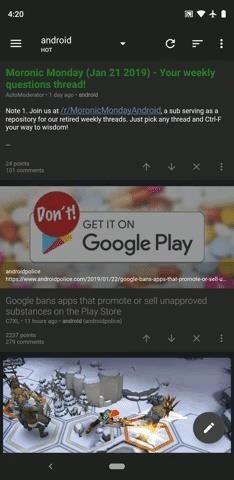
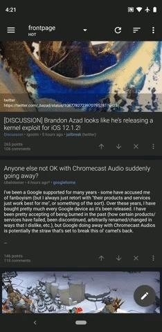
Sync’s developer, Laurence Dawson, is extremely active, issuing regular updates for over five years now and responding to community requests, so the app will only continue to get better. That said, the gap between Sync and the rest of the field has closed in the last couple of years, due in large part to the next app on our list.
App 2: Joey for Reddit
Joey goes toe-to-toe with Sync, stuffing the stat sheet with almost every imaginable feature. Key differences are a lack of support for Imgur albums (pretty big disappointment), no ability to view a subreddit in its native theme, and subpar support for built-in Android features like App Shortcuts and Adaptive Icons. However, it does clearly beat Sync in one key area: Unlike the first-place app on our list, Joey is completely free and does not show ads.
- Play Store Link: Joey for Reddit (free)
As one of the newest apps on our list, it’s downright impressive how Joey’s developer, codesForLiving, has been able to quickly put together one of the most well-rounded Reddit apps in existence. Joey really shines with its extensive theming and customization options, along with support for nearly all key Reddit site features. In short, you won’t be missing out on any major features with Joey.
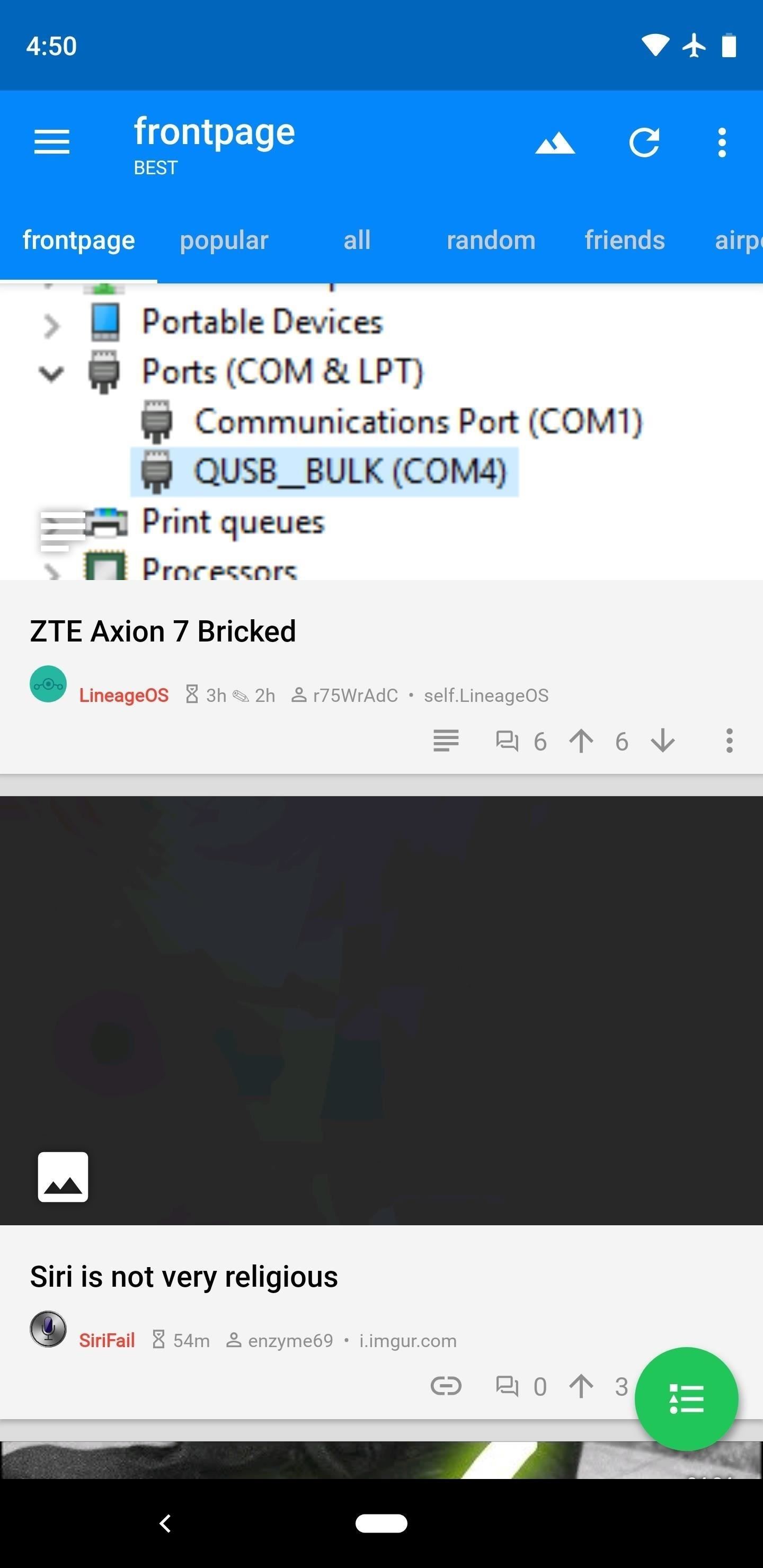
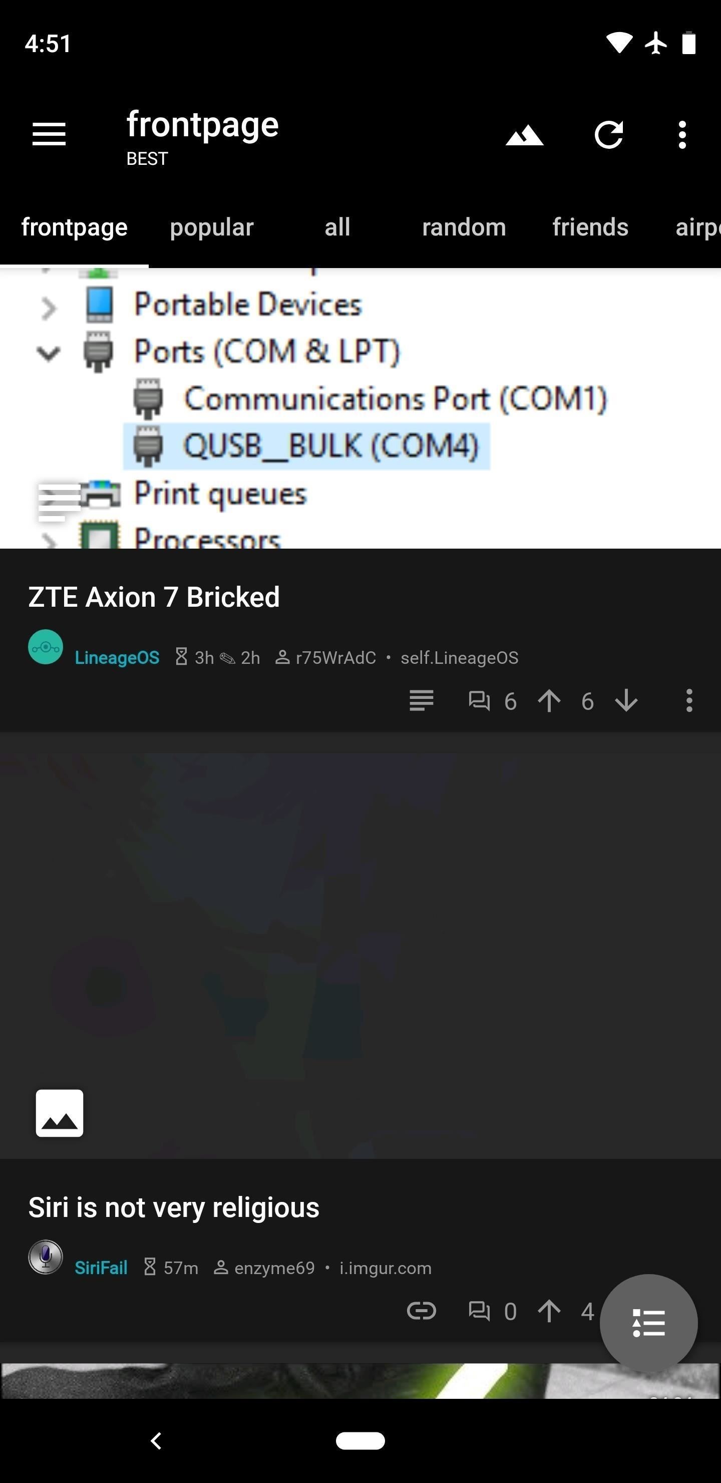
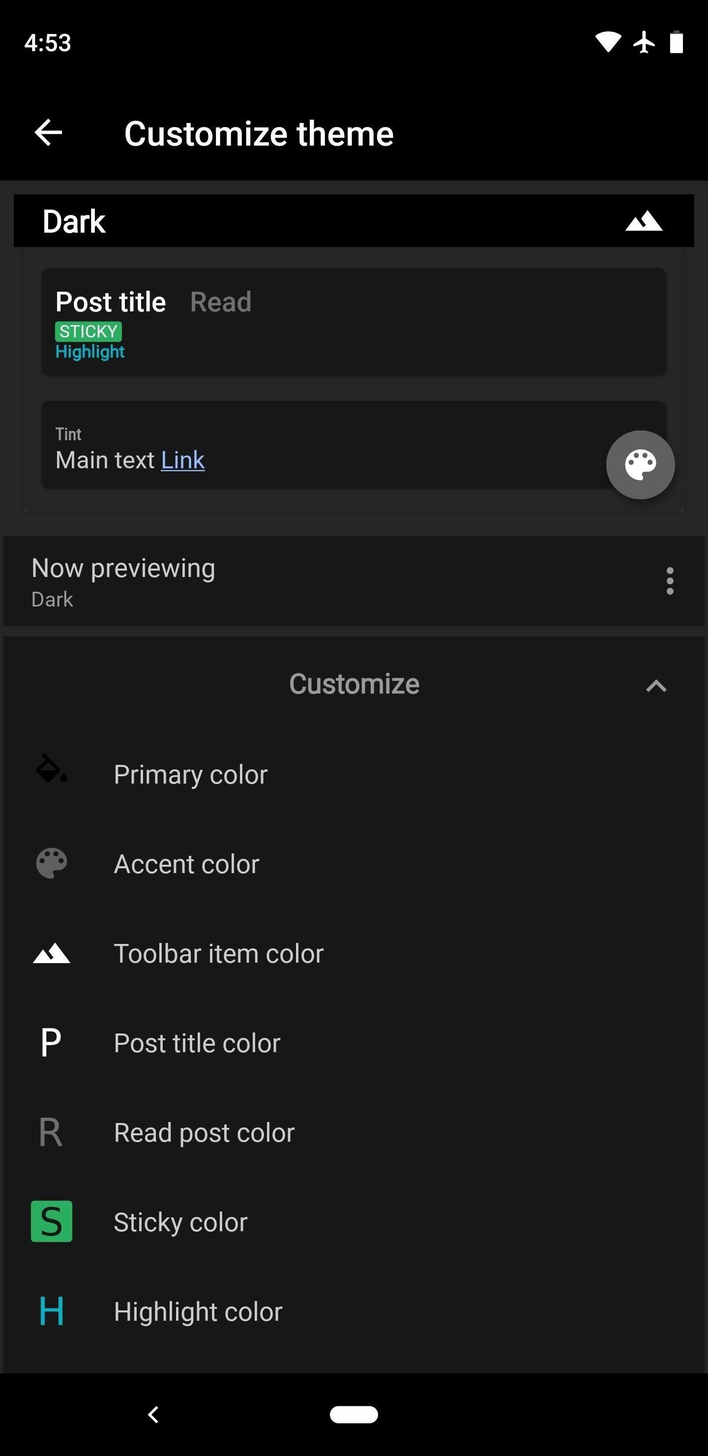
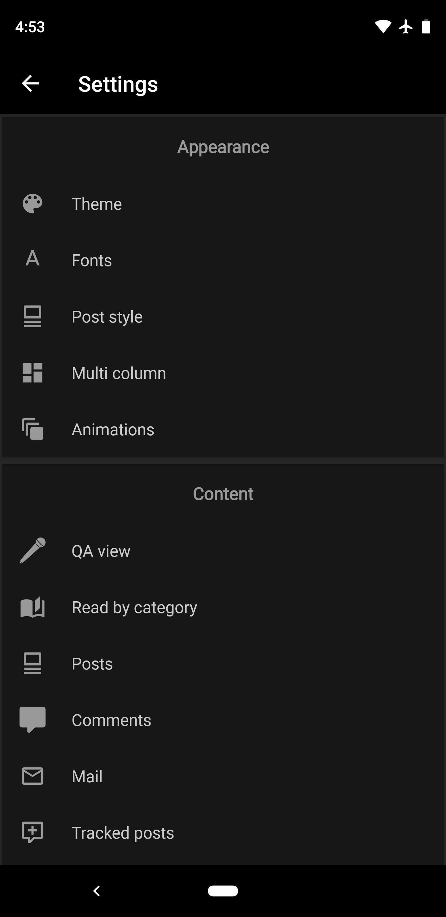
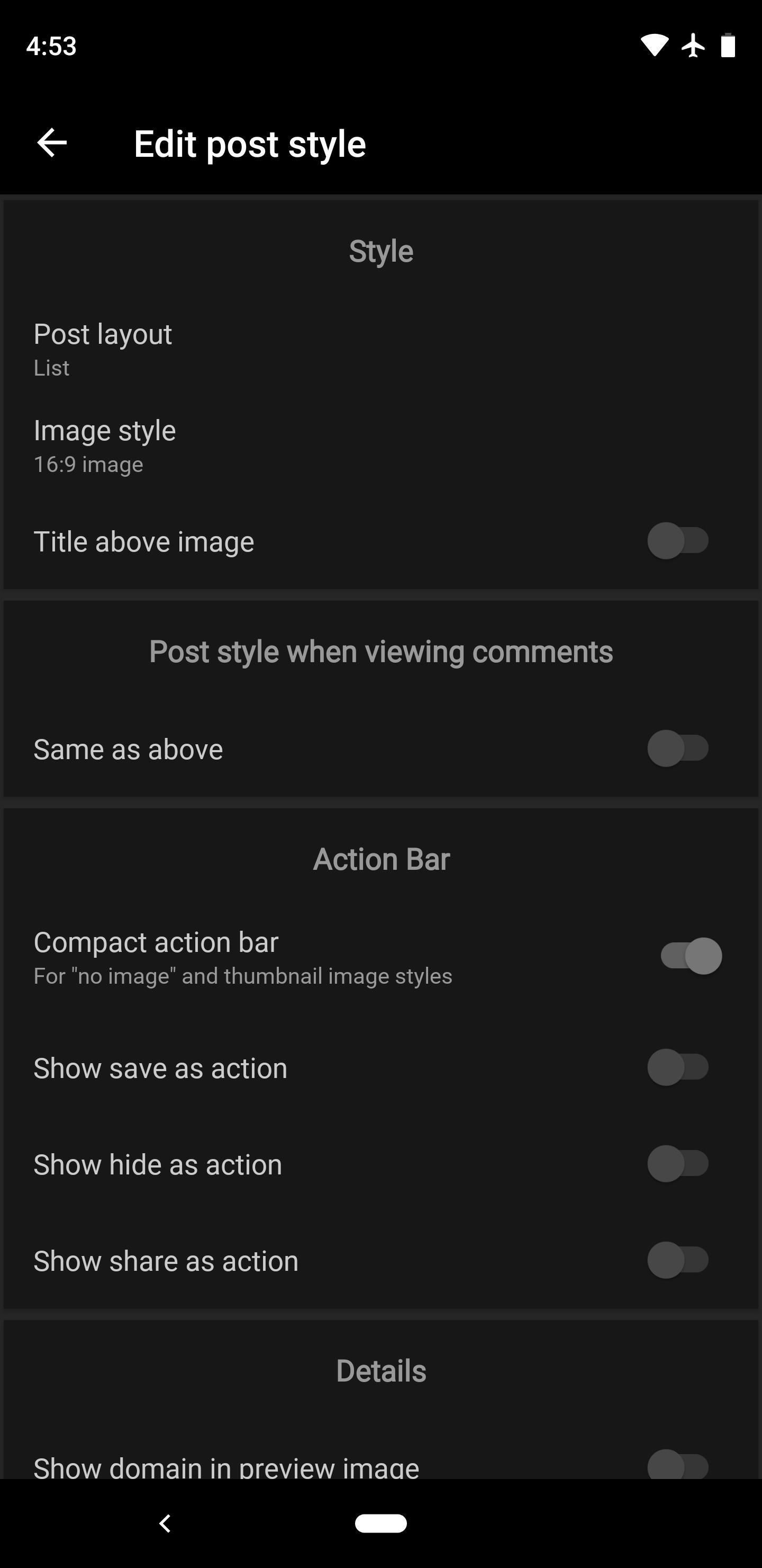
Joey has more settings than any one person could need, but that’s the point — the app is built to accommodate all tastes. If you don’t like the way Joey behaves by default, even with the tiniest things, chances are you can fix it. You’ll have to do some poking around since there’s no settings search, but you can tweak everything from the animations down to the font.
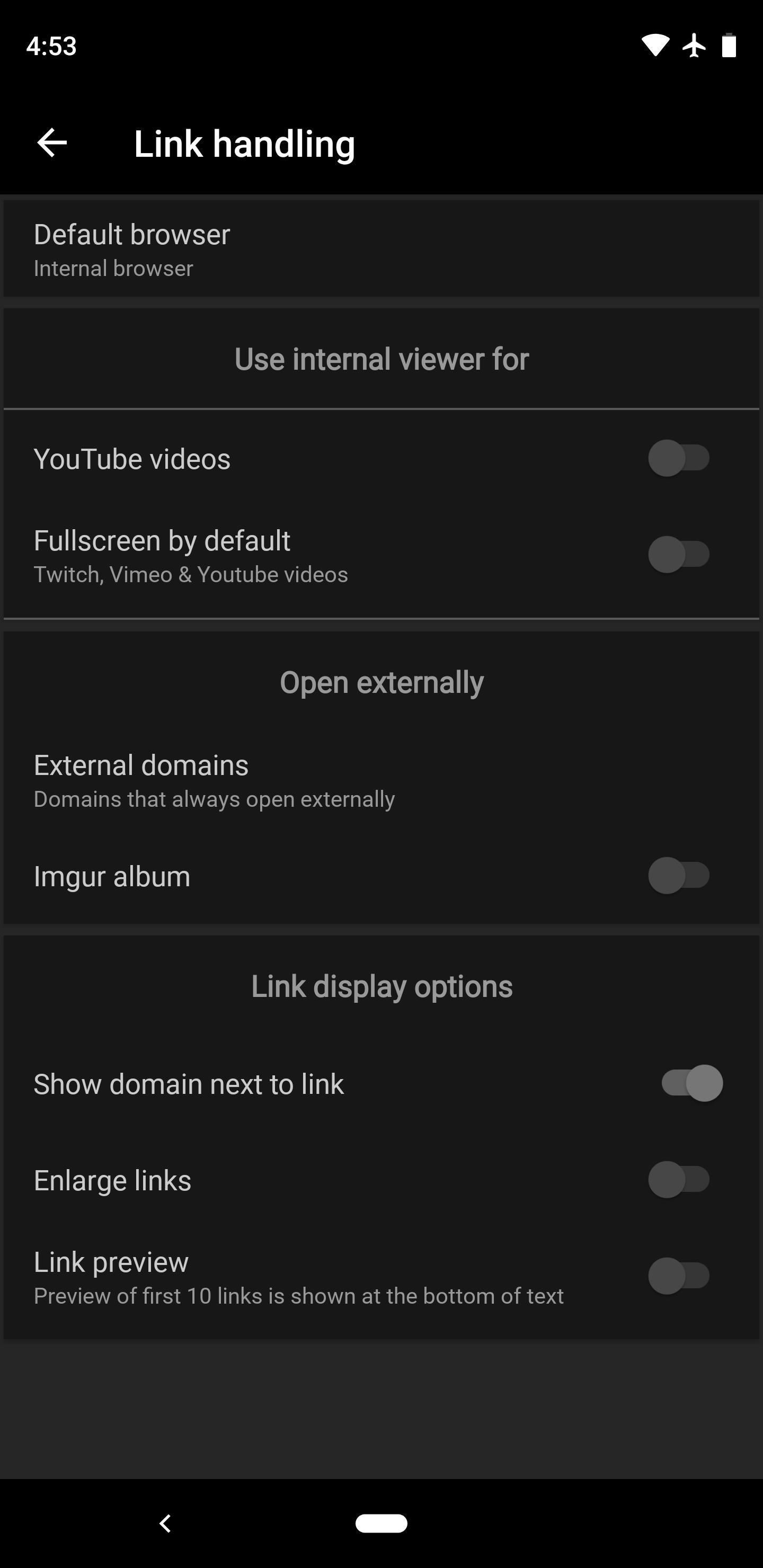
This app can handle almost every type of media submission on Reddit natively, but there’s one major exception: Imgur albums. If there’s an Imgur link in your feed with only one image, it opens perfectly in the native viewer. But if the same type of link points to an album of multiple images, the app uses WebView to open the mobile version of Imgur instead. It’s a bit frustrating, but on the bright side, this is Joey’s single biggest downside.
Where Joey really shines, however, is with its price. Unlike the other apps in this list, there’s no pro version — Joey is completely free and does not show ads, so there’s nothing to upgrade. So while it’s lacking in a few minor areas compared to Sync, if you’re not willing to pay for a Reddit app, this is the one to go with.
Browsing subreddits is an easy task thanks to a traditional side navigation menu and a set of tabs. You can swipe in from the left edge to view the full list with easy scrolling, or you can swipe left or right to flip through your subs one by one. And there’s a really cool Instagram-like upvote/downvote gesture: double tap to upvote a post, or triple tap to downvote it.
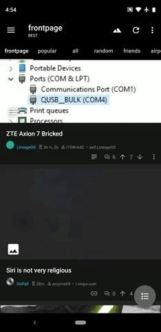
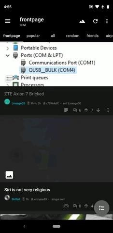
The gestures don’t stop there. When you’re viewing a post, you can swipe right to go back. If you want to quickly view content without tapping through and then pressing your back button or swiping back, you can peek virtually anything in Joey by long-pressing it. This works for media, links, and even comments, as you can see in the second GIF below.
Aside from the specific issue with Imgur albums mentioned above, the only general complaint I had after testing Joey for a couple of days is a lack of polish. Not to say the app isn’t gorgeous with slick UX elements — no, this is a very minor quibble. It’s stuff like a crowded and tricky-to-navigate settings menu and a few minor quirks with animations.
Honestly, though, I can’t say enough good things about Joey. If you’re a fan of customization and you want to milk Reddit for everything it’s worth — all without paying a dime or putting up with ads — this should be your new Reddit app.
App 3: Slide for Reddit
Slide is another do-it-all Reddit client, and like the two entries before it, it ticks so many boxes. A few features are hidden behind a paywall, but if you’re willing to spring for the pro version, you’ll end up with one of the most robust Reddit apps for any platform — an an open-source app at that!
- Play Store Link: Slide for Reddit (free)
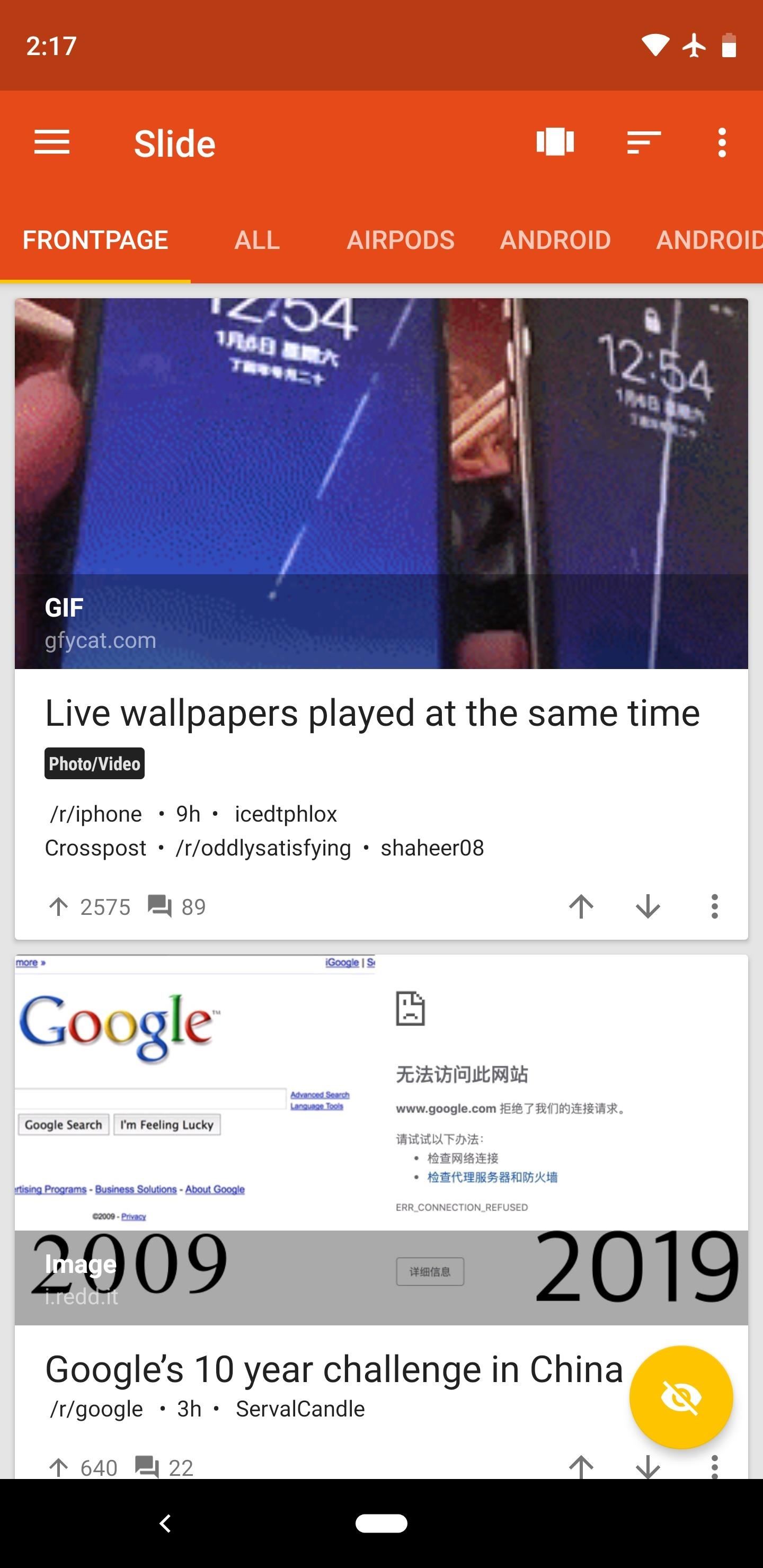
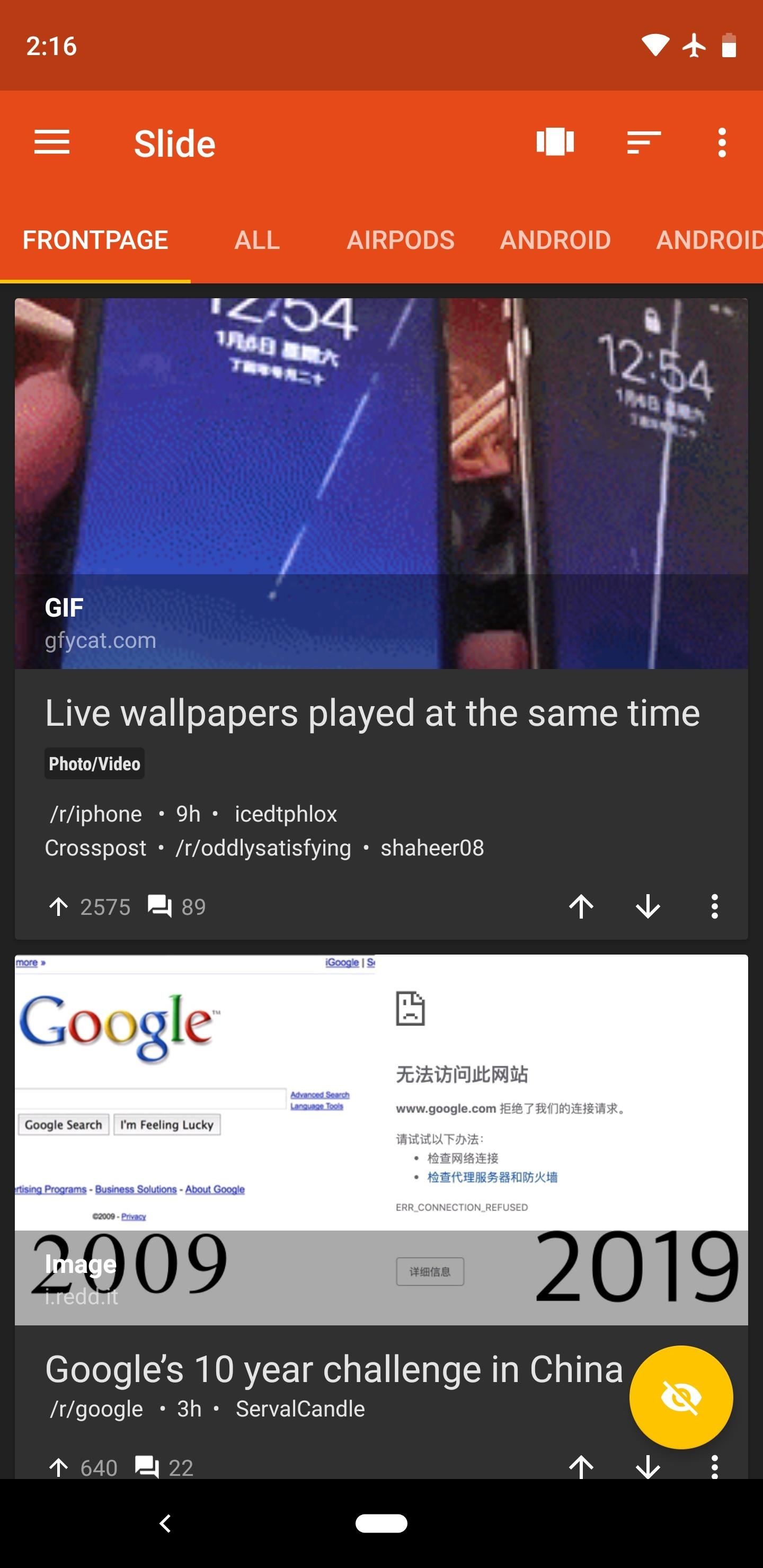
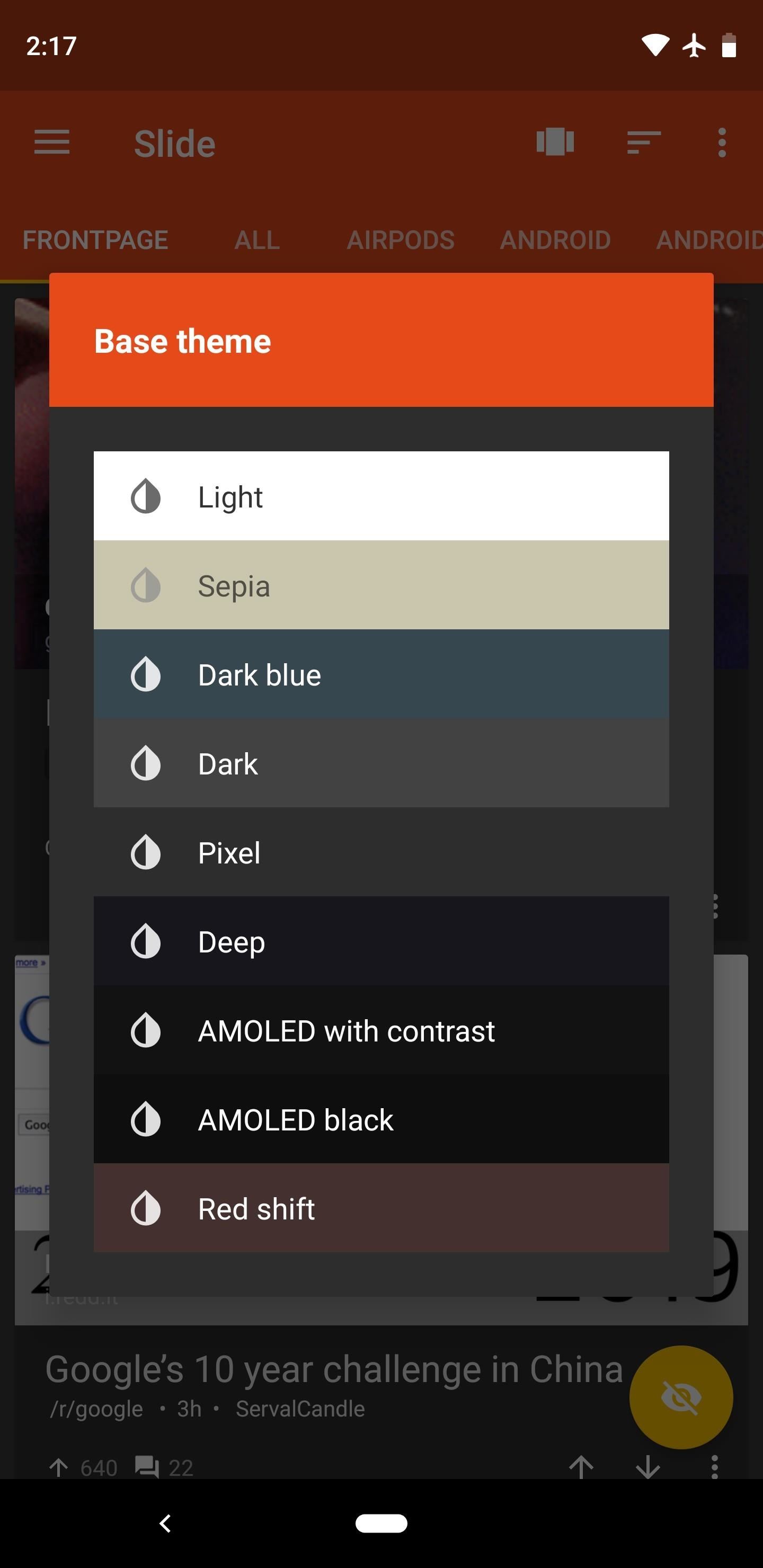
There are plenty of themes in Slide, but automatic day and night themes are not available in the free version. That said, you can pick from dozens of colors to use as the header background and various UI accents, and all of these can be combined with one of nine base themes, including a true black theme for OLED devices.
There are some data points from the above chart that I should clarify here. First, image-based user flair is supposedly supported (there’s a button in each subreddit’s sidebar that offers to “Sync Image Flair” and pull from the sub’s CSS), but I was unable to get it to work. Ideally, this would happen automatically anyway, as is the case with Sync for Reddit.
Secondly, upvote and downvote gestures only apply to comments when you have the “Navigation bar vote gestures” setting enabled. If you do, you can swipe up on the up arrow or down arrow at the bottom of the screen to vote on comments. Don’t get me wrong here, this is a good thing and an interesting feature — I just wanted to clarify that you wouldn’t get double and triple tap voting gestures like with Joey.
Slide’s settings menu is well organized and full of features, plus you can even search for a specific setting. Virtually every type of media link you’ll find on Reddit is supported in the app’s native popup viewer, and that includes Imgur albums. But perhaps the best setting is a simple toggle: Save NSFW History. With this turned off, you won’t leave any traces while browsing NSFW subreddits.
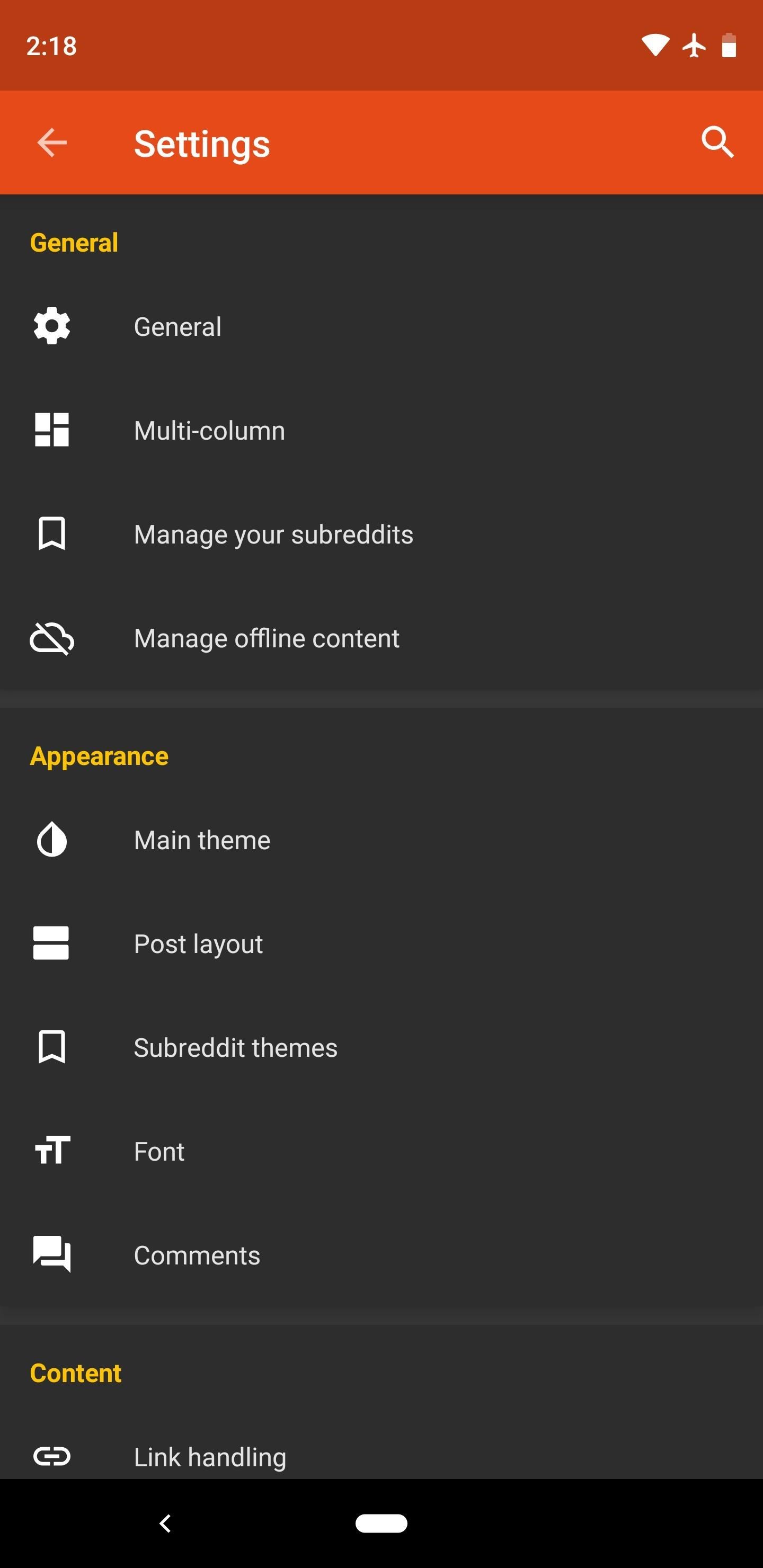
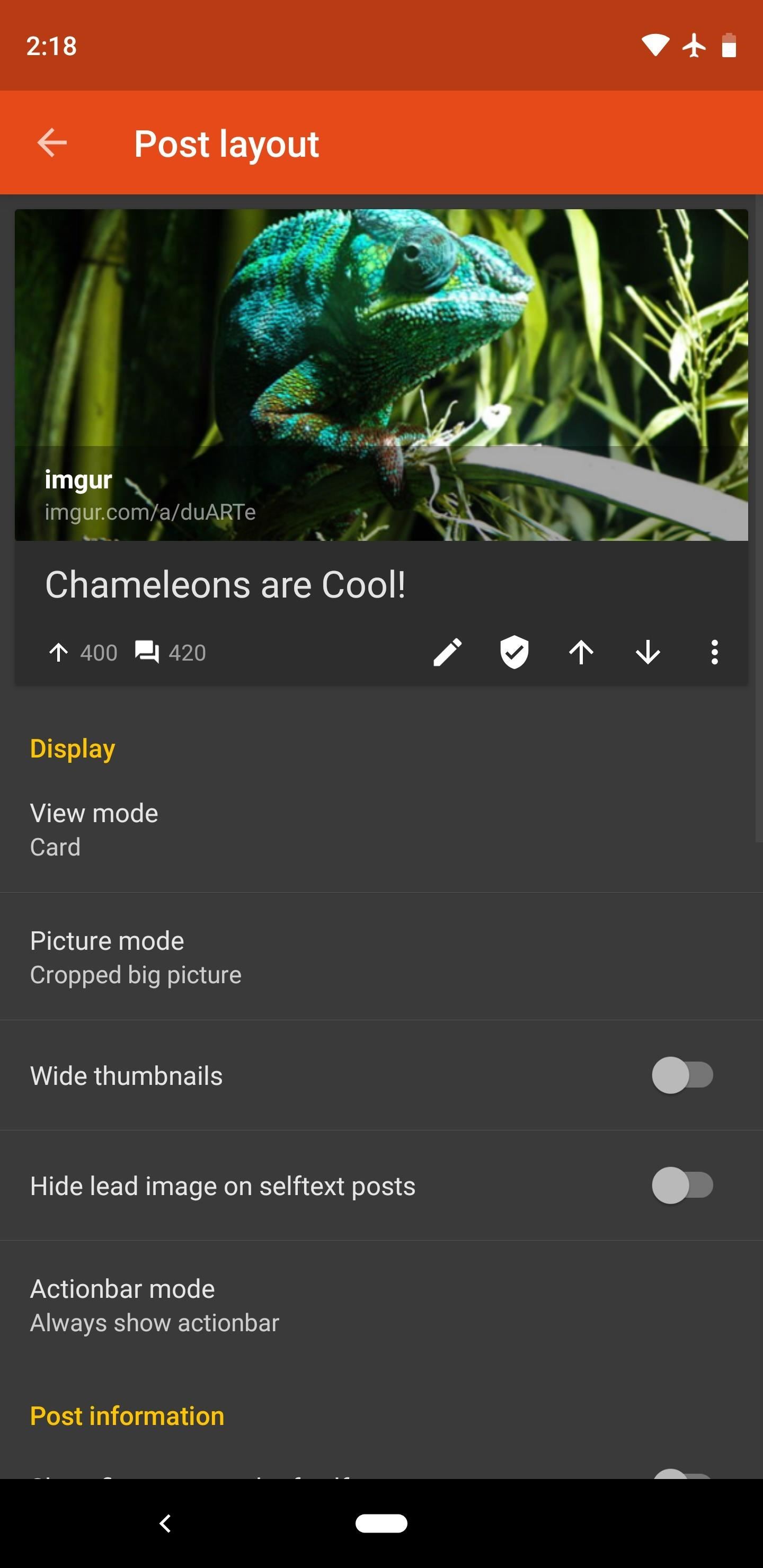
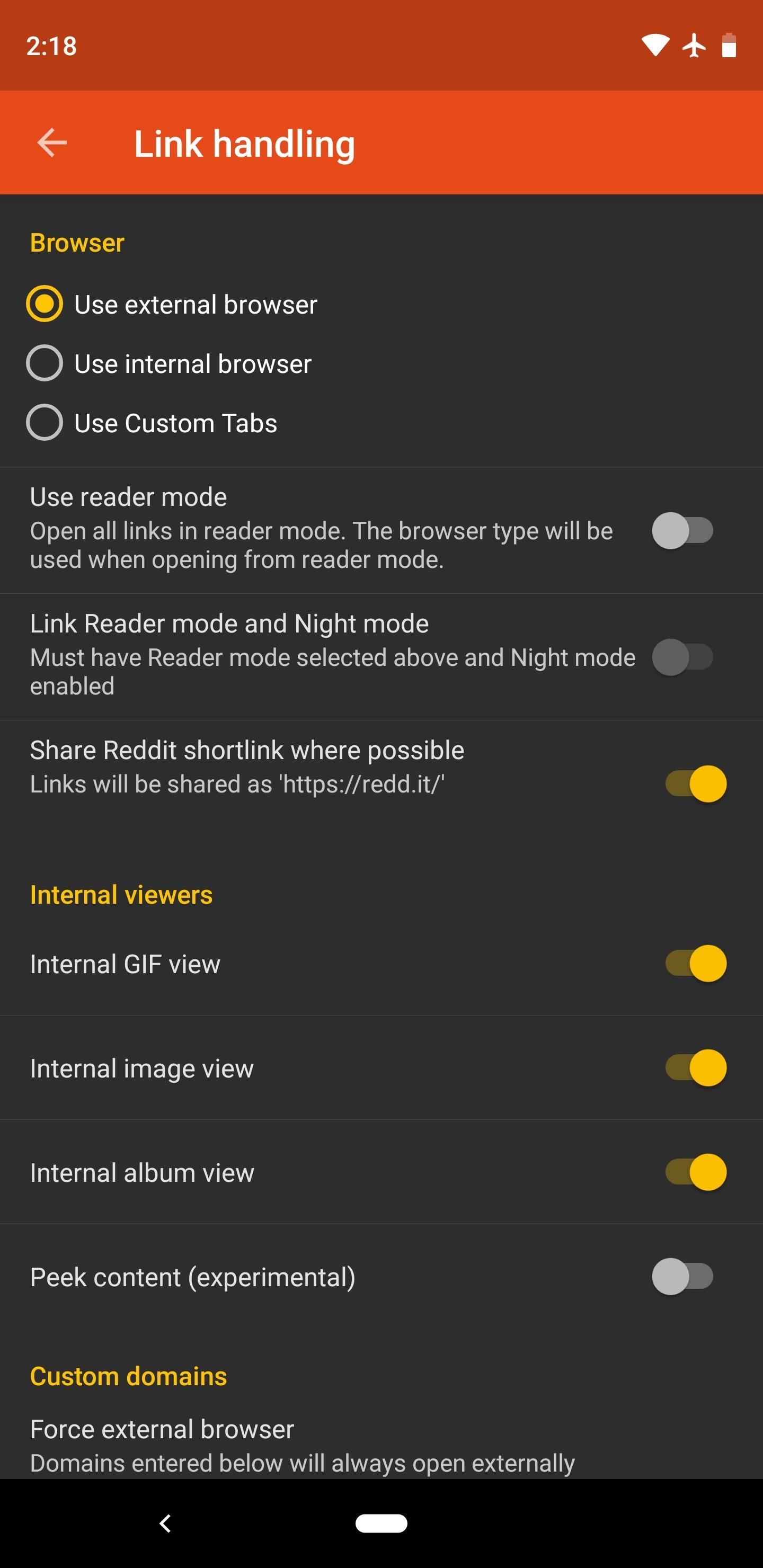
Gestures are aplenty here — after all, it’s where Slide gets its name. Like Joey, you have two options for navigating your subreddit list: the side navigation menu, or a set of tabs that you can swipe between. The latter can be cumbersome if you’re subscribed to dozens of subs, but if you reorder your subreddit list to put your most commonly-visited subs first, it becomes an indispensable feature.
You can peek images and GIFs by long-pressing them, and you can swipe right to go back. But Slide’s coolest gesture is a simple left-swipe: when you’re viewing a post, just slide your thumb sideways and you’ll be taken to the next post. This works both in subreddits and on the front page.
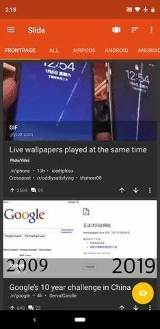
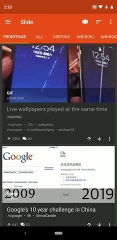
While Slide slipped to third place because of a few minor features it was lacking, it’s really neck-and-neck with the top two on our list. Give it a try, and if you like what you see, buy the pro version to support open-source software, unlock a few more features, and reach parity with Sync and Joey.
App 4: Boost for Reddit
Hot on the heels of our top three is Boost, a highly customizable option that offers great support for Android’s latest features, like App Shortcuts, Adaptive Icons, and Notification Channels. When you combine this with its theme options and polished interface, you end up with a slick and modern Reddit app that’s easy to love.
- Play Store Link: Boost for Reddit (free)
If you’re not a fan of Boost’s default look, you don’t have to put up with it. There are so many different theming options, from the primary background color down to the text color used to indicate you’ve read a post. Combine this with automatic day and night modes, and you’ve got a theme system that could only possibly be rivaled by Sync for Reddit.
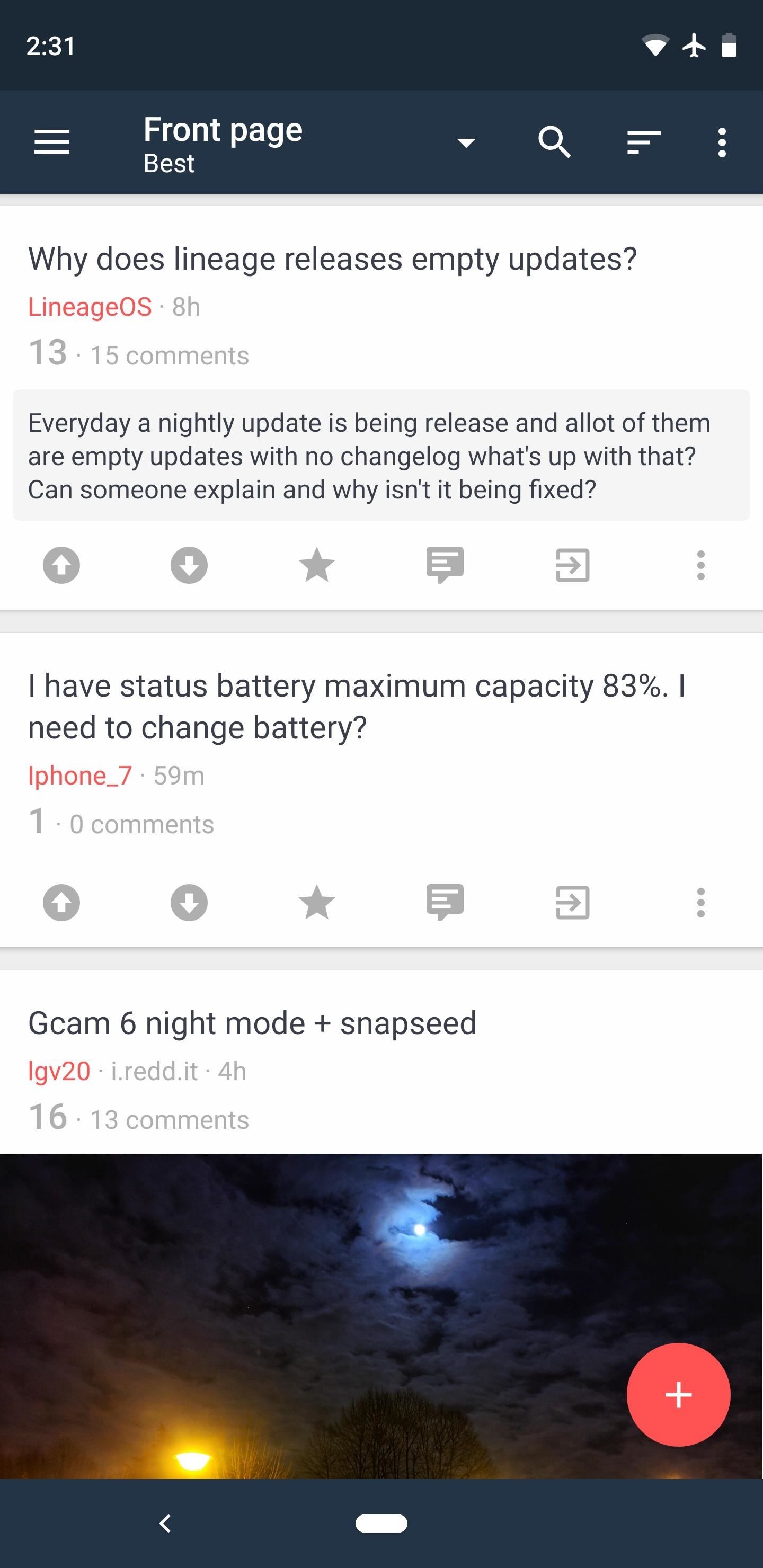
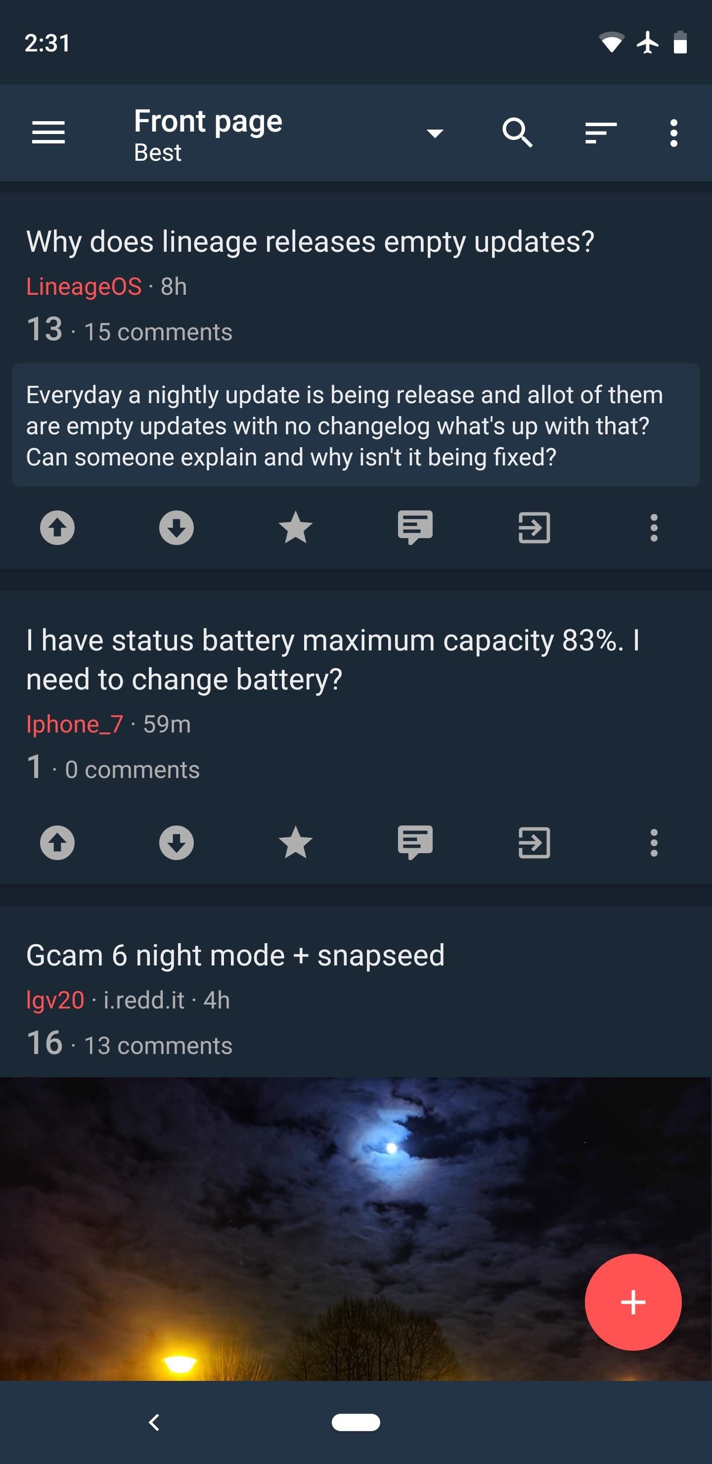
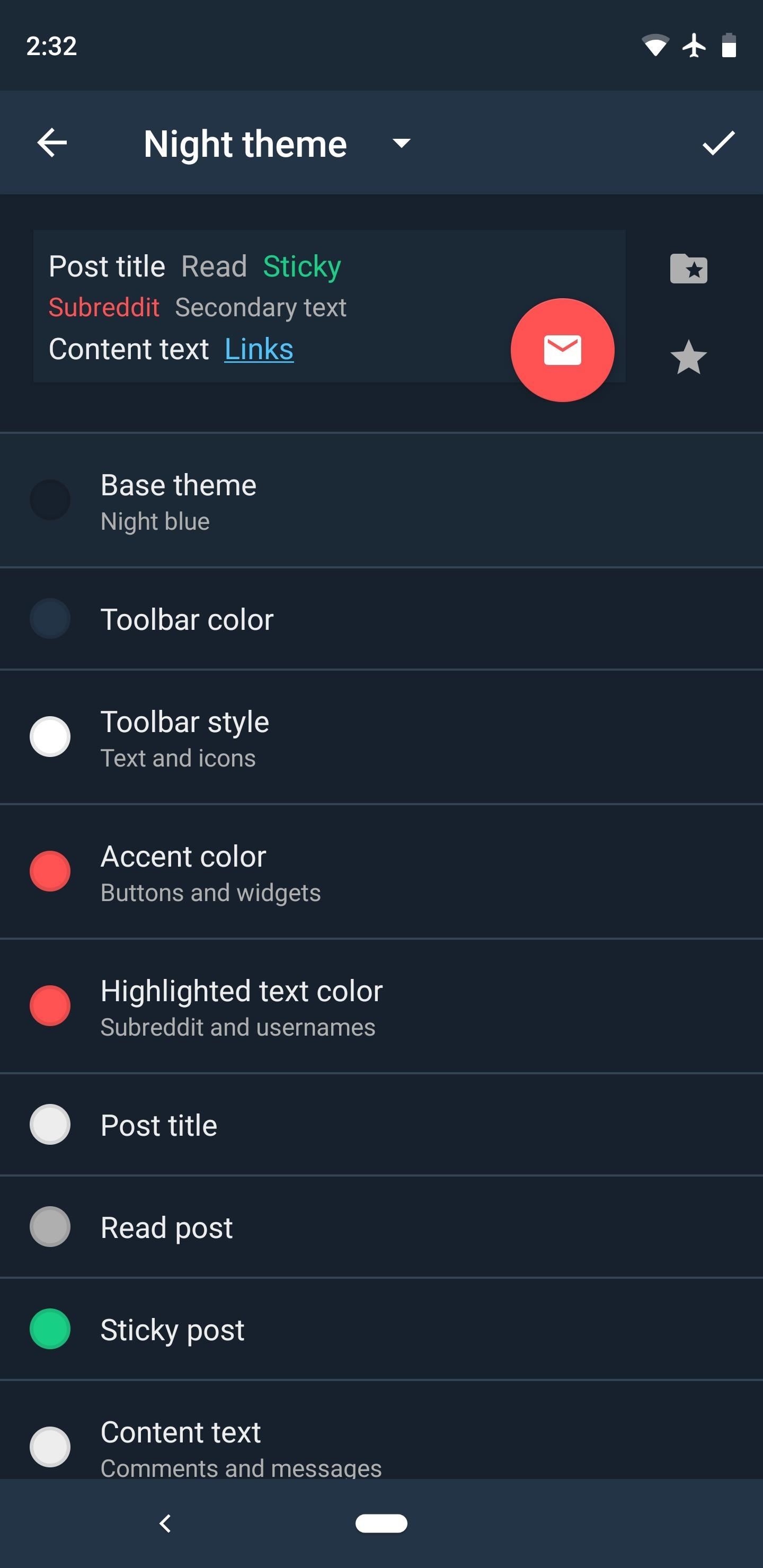
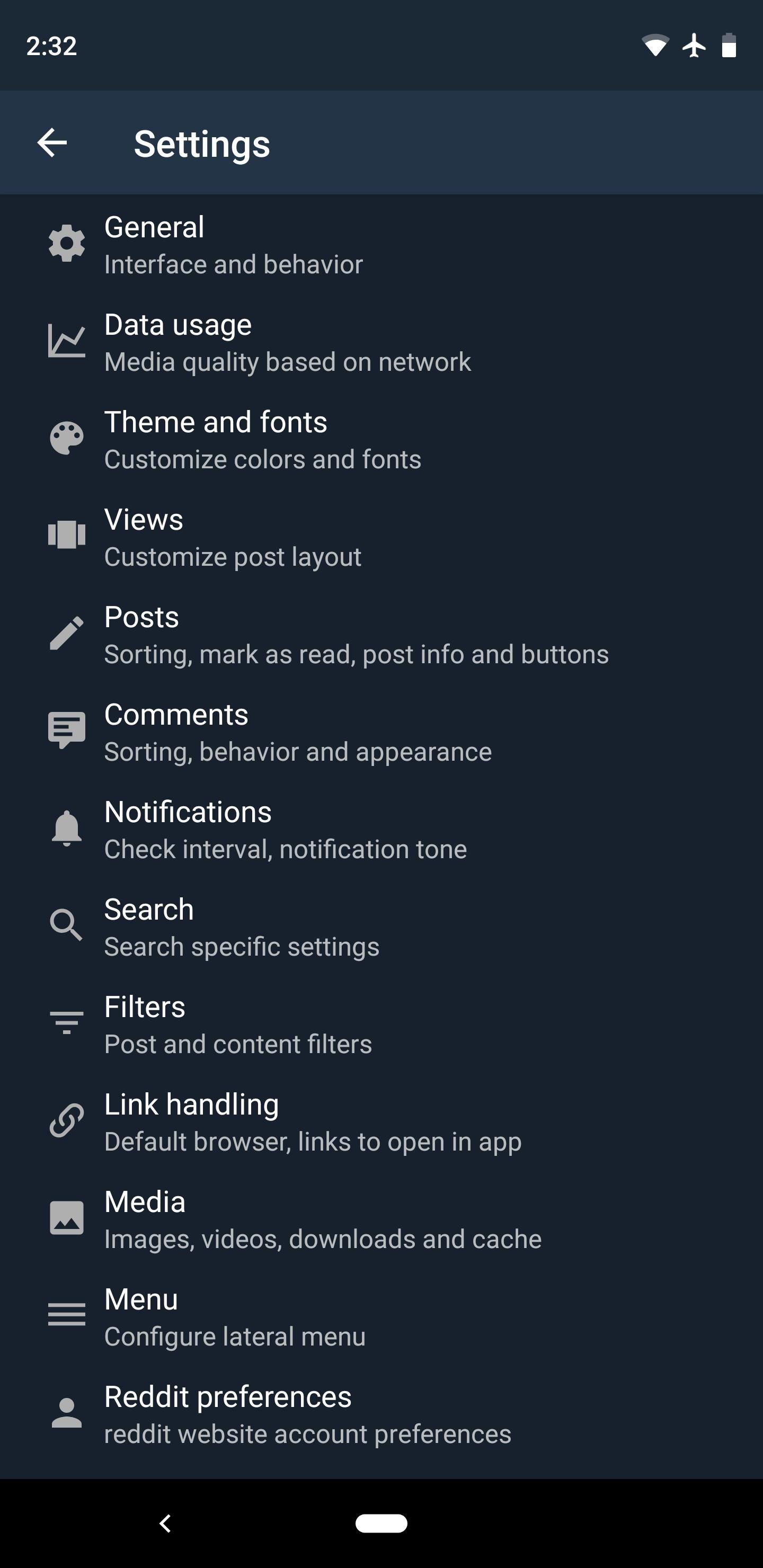
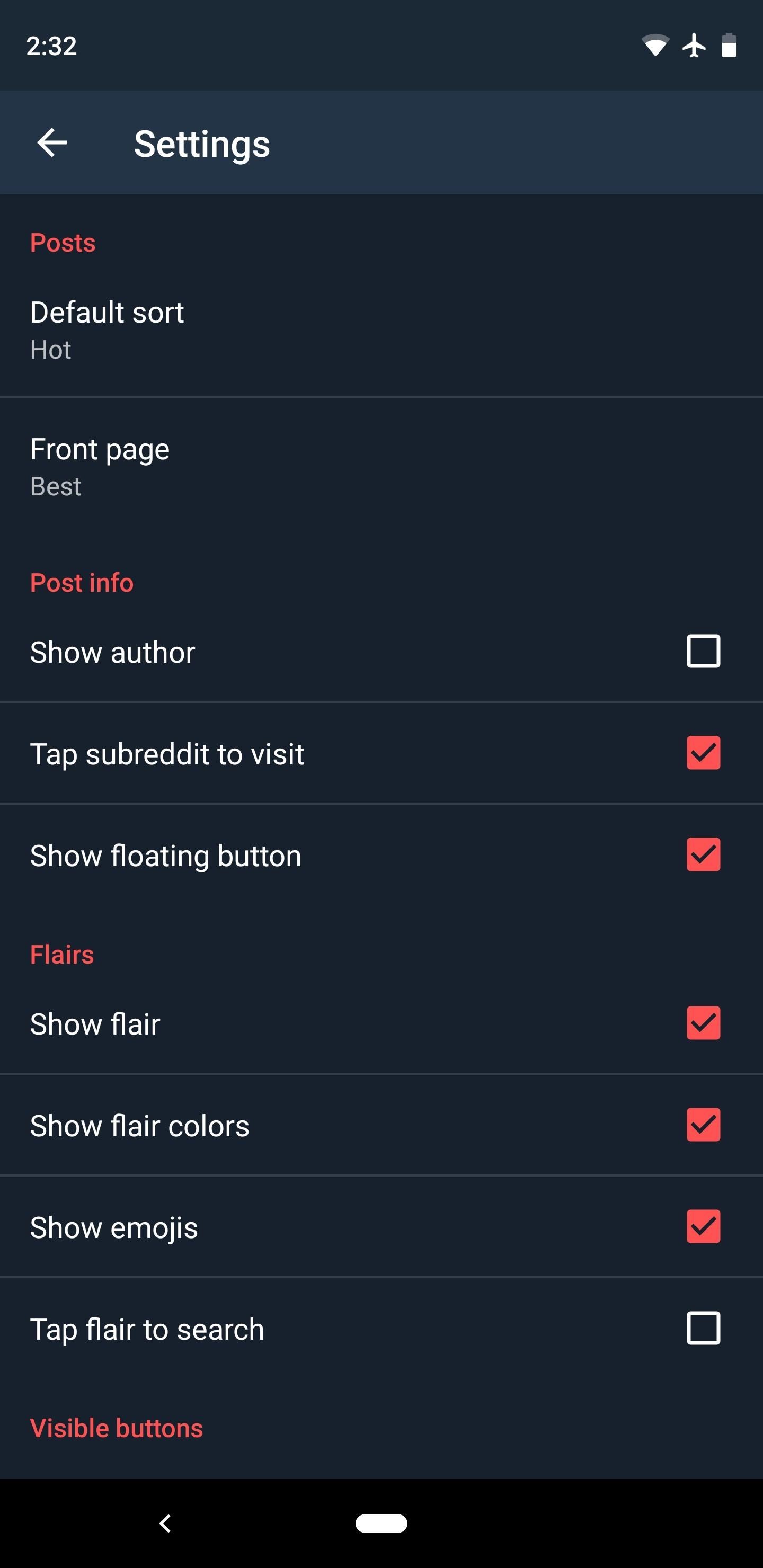
The settings menu is quite robust, but it’s a little disorganized and there’s no search feature, so you’ll have to poke around quite a bit. That said, there are controls for the appearance and functionality of virtually every aspect, and the native viewer supports the vast majority of Reddit media links.
To clarify data in the chart above, favorite subreddits are an in-app only feature because it doesn’t pull your favorites from Reddit itself. You can star subreddits to move them to the top of the list, but this only applies to the list in Boost. And while there’s no true incognito mode, you can turn off history altogether. Not ideal, but a potential workaround if that’s a must-have feature for you.
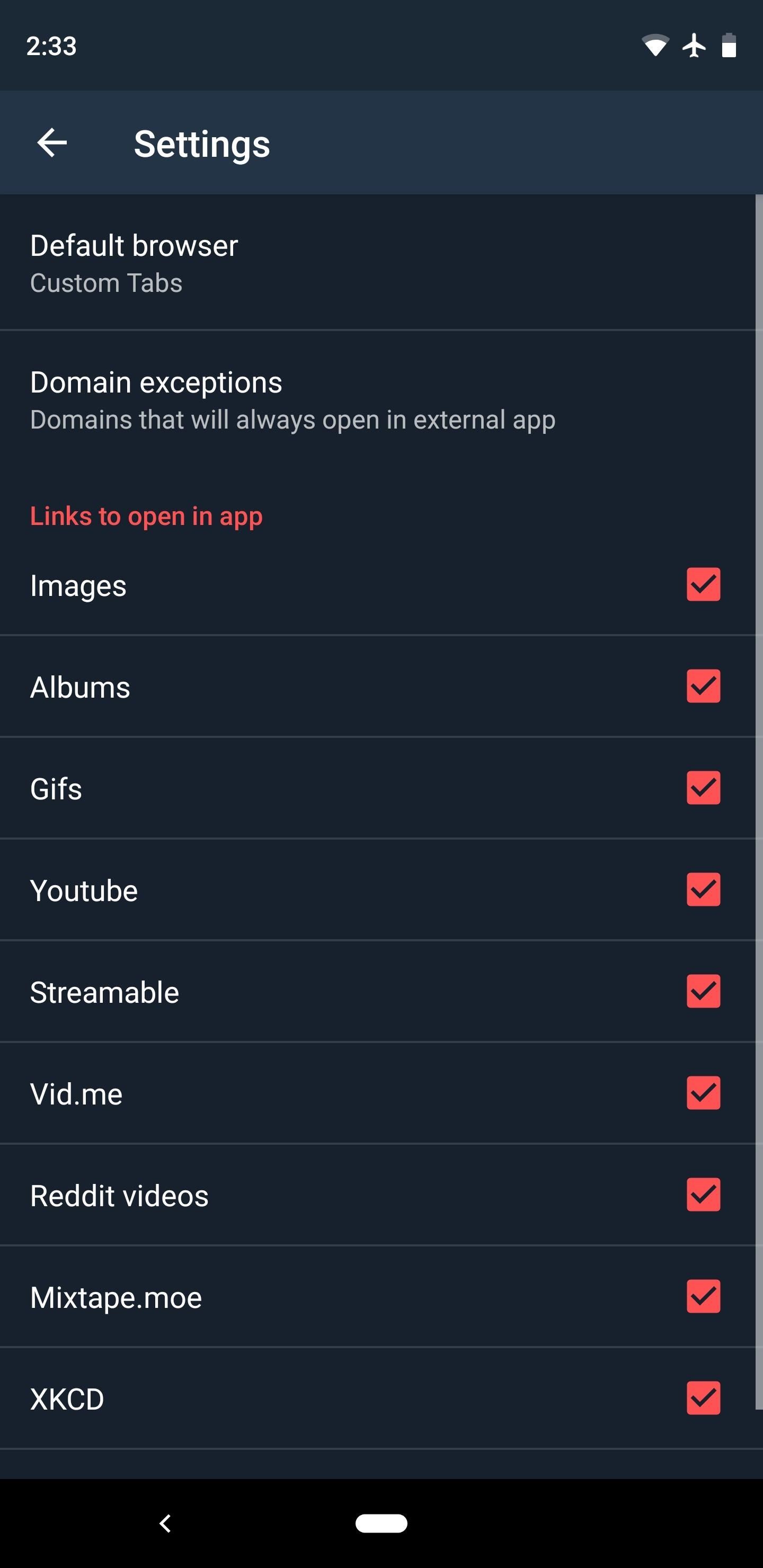
To navigate between your subreddits, Boost has the standard side menu, which is really all you need in most situations. But this is supplemented by a drop-down menu of sorts, which appears when you tap the subreddit name in the action bar at the top of the screen. I say “of sorts” because it’s not a true drop-down menu — it’s more like a full-fledged menu, complete with search functionality.
Gestures aren’t quite as expansive as some of the other apps on this list, though they’re fluid. You can swipe in from the left edge of almost any screen to access the side menu, and you can swipe to the right while in a post’s comment section to go back out to the main list.
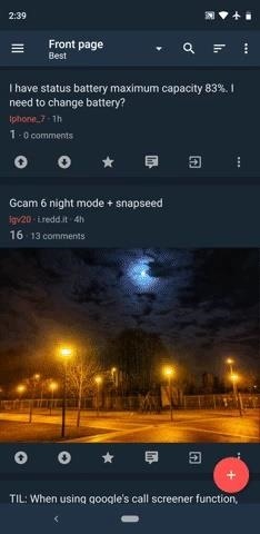

Overall, Boost is a lot like Sync or Joey — if you’ve used either of those, you’ll feel right at home with the interface. It’s missing some key features, though, with the ability to peek media and view live comments being the biggest ones. But if these aren’t important to you, it’s every bit as good as the first three apps on our list.
App 5: Relay for Reddit
The app formerly known as Reddit News, Relay for Reddit, rounds out our list. To be frank, it’s a good Reddit app, but when compared to the first four apps above, it’s a clear step behind. That said, there are some unique features that could make Relay the right choice for you.
- Play Store Link: Relay for Reddit (free)
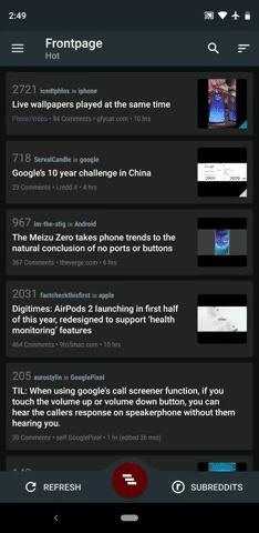
Relay sports an augmented Material Design interface with a bottom bar in addition to a side navigation menu. It might feel a little geeky to some, but that’s a matter of taste. Objectively, though, it doesn’t have nearly as many theme options as the first four apps in this list, but it does at least have two dark and light themes each.
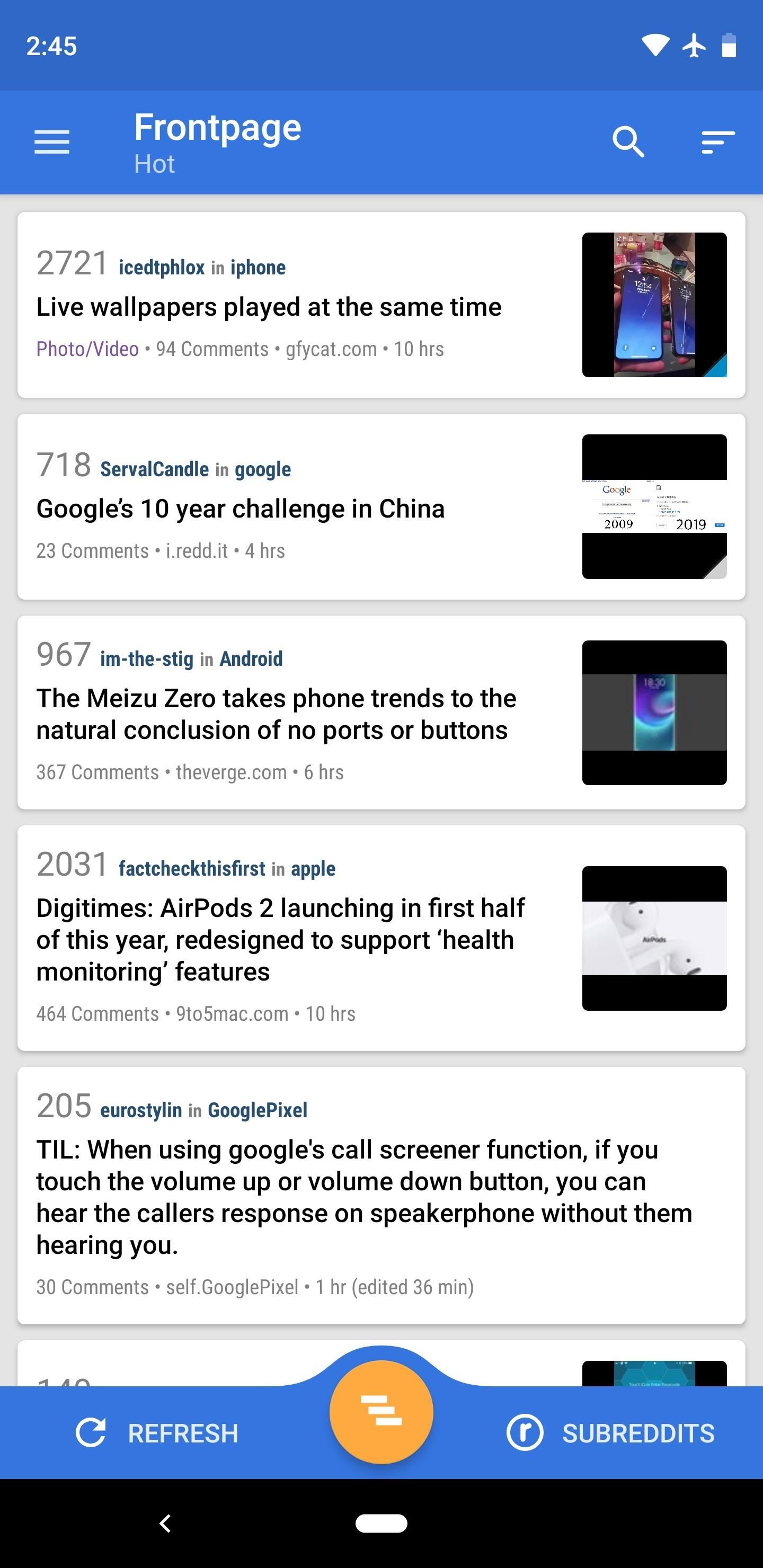
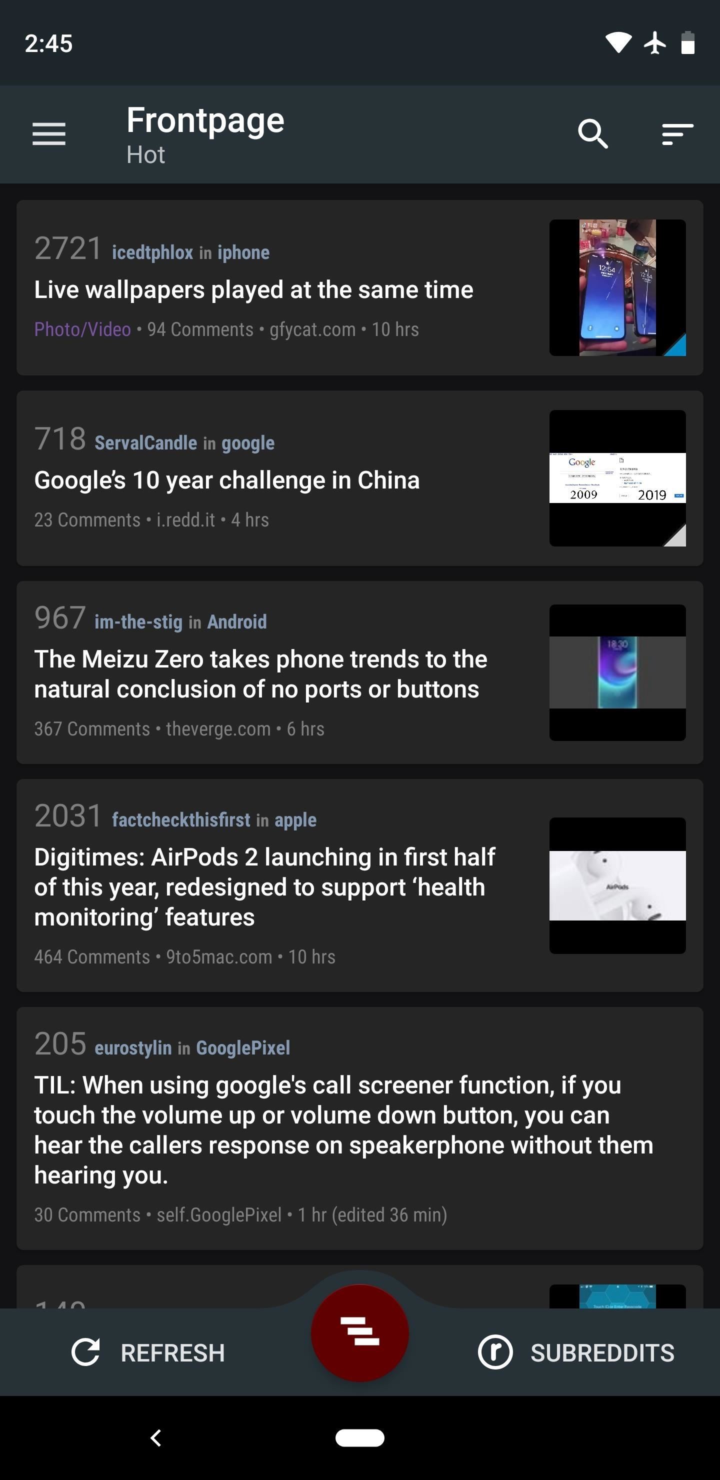
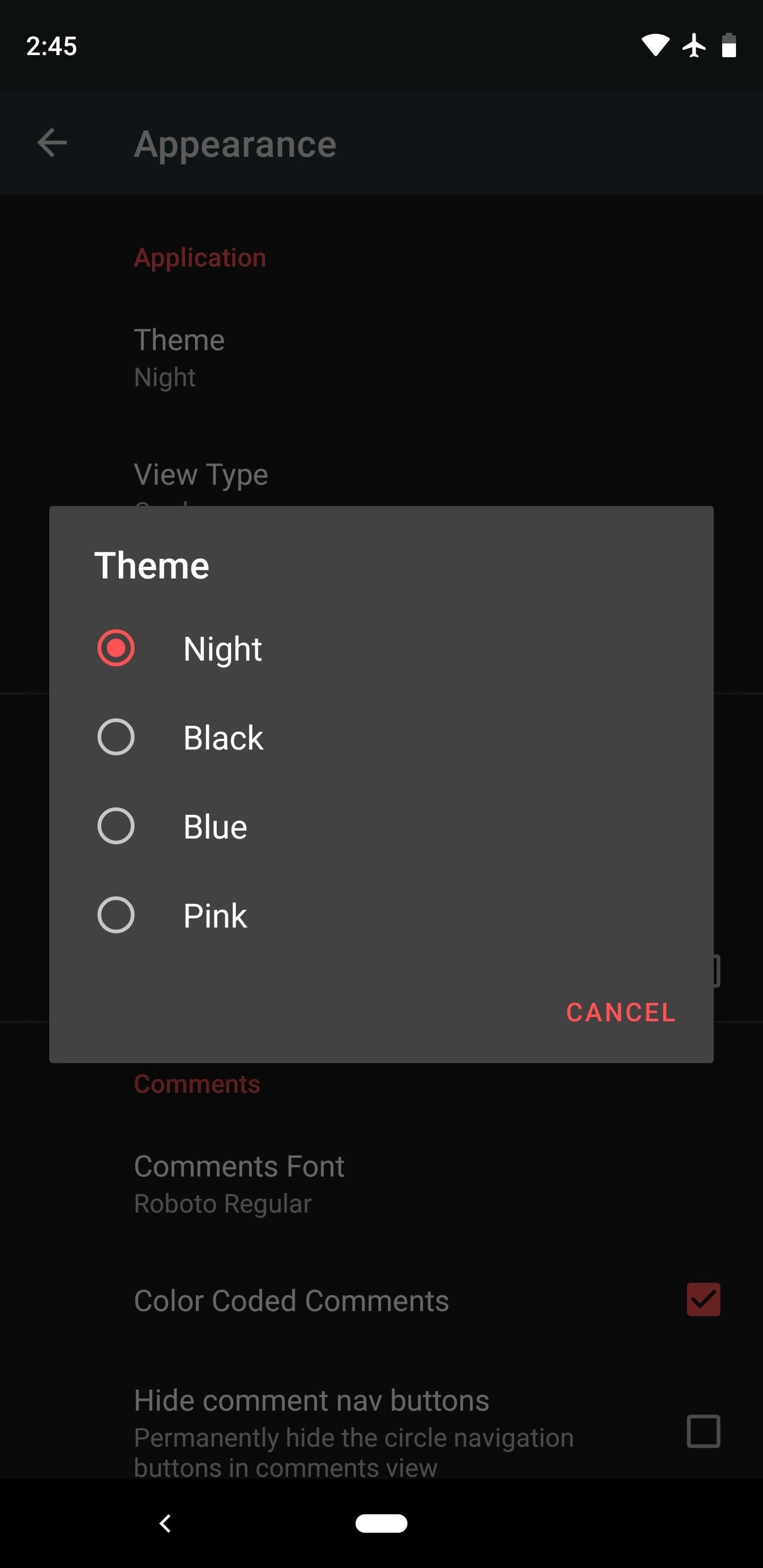
The settings menu is well organized, but there’s no search function to find specific options. You can choose custom fonts, but that’s about the extent of the customization for UI elements. While most media links will open in the app’s native viewer, sadly, Imgur albums open in a WebView browser window.
Filters aren’t nearly as robust as the first four apps on this list, so be careful browsing /r/all. If a post contains a data table, it will be a jumbled mess on first look, but you can view a properly formatted popup of the table by tapping a link that Relay will provide. Other notable features that are missing include a live comments mode, the ability to peek media, and inline GIF playback.
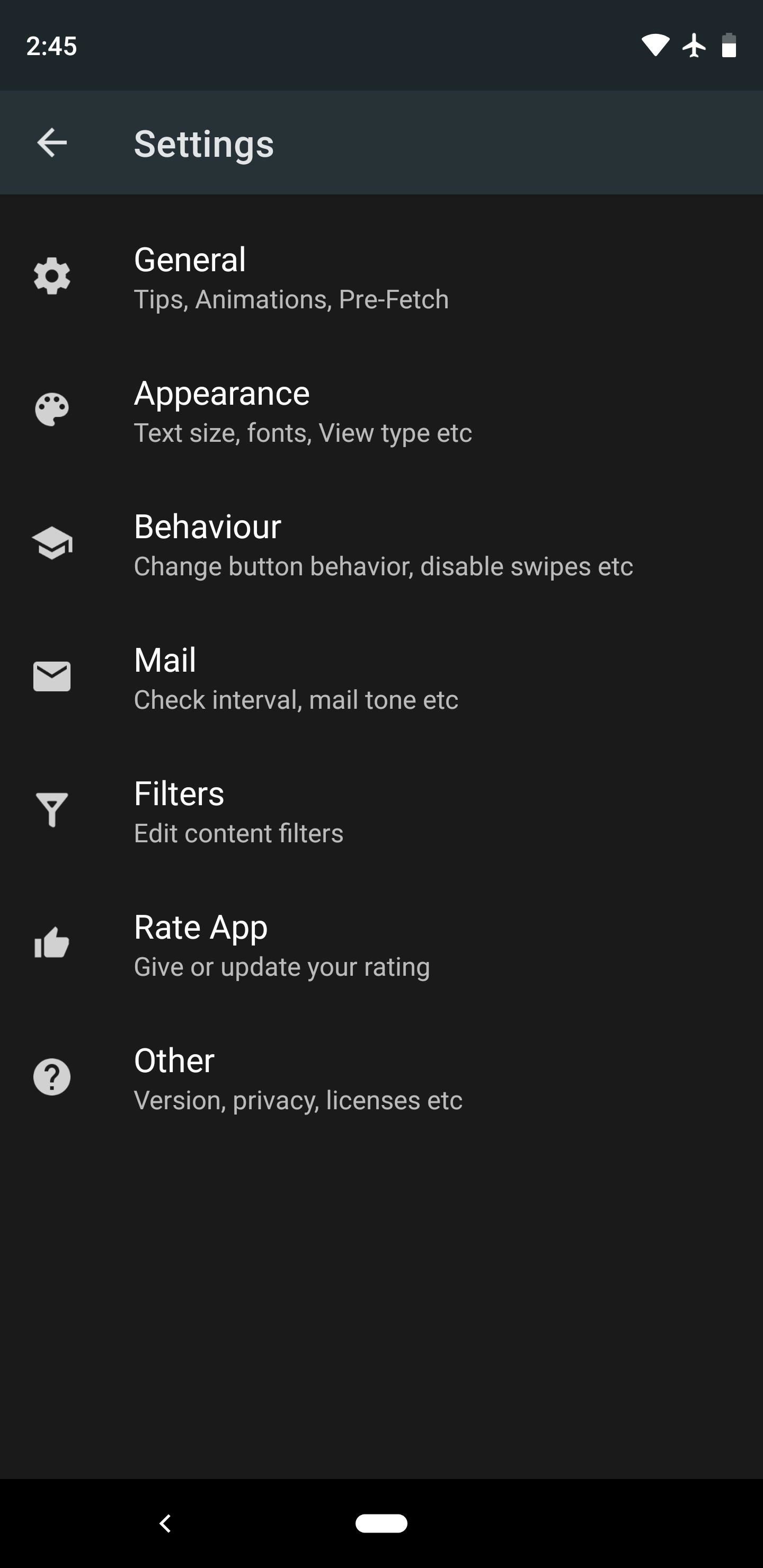
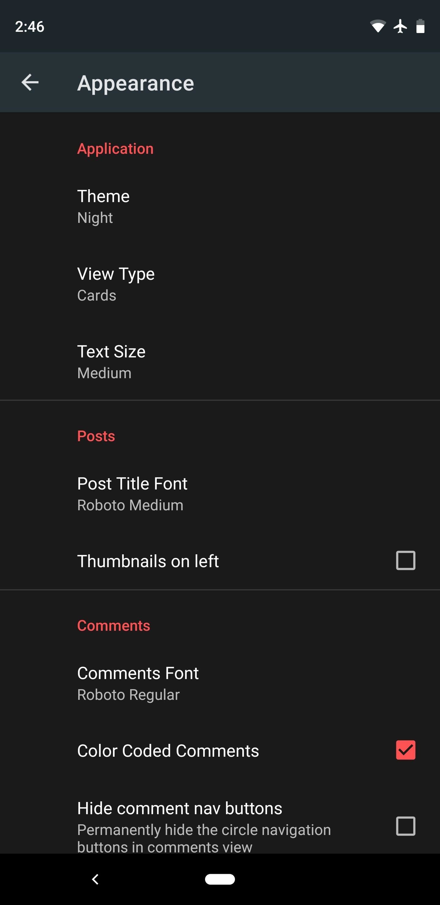
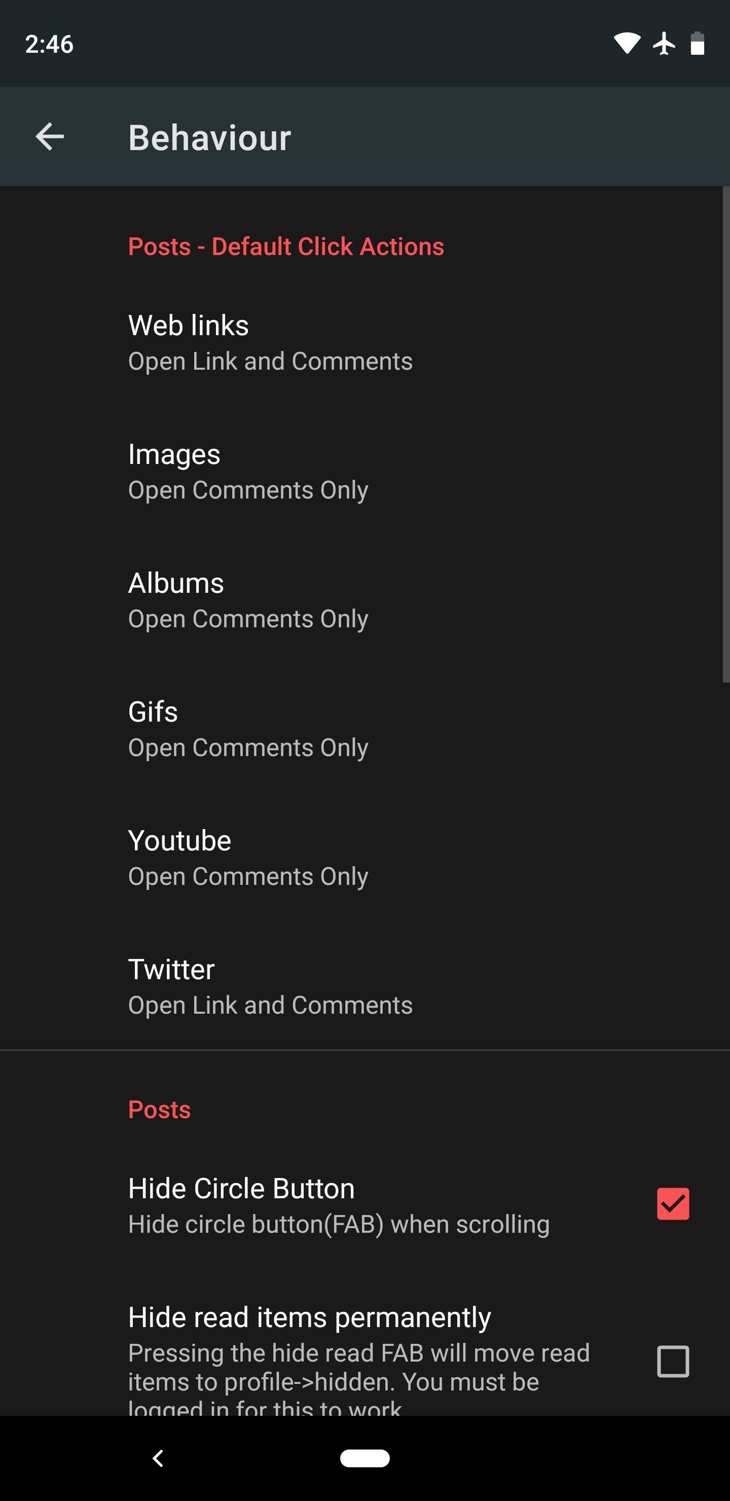
To navigate through your list of subreddits, you’ll have to tap the “Subreddits” button on the unconventional bottom bar, then swipe up from this same area. This does the job, but it’s not quite as natural as a side navigation menu would be, and the fact that there isn’t another easy option for navigating subs puts Relay a step behind the rest of the pack here.
Where Relay really shines is with the rest of its gestures. You can swipe to the right on any post to view options like upvote and downvote buttons and the overflow menu. When you tap a link, the external site will load by default and you can scroll through to read the entire article, but you can also swipe up from the bottom of the screen to load the comments section for that submission on Reddit. This goes a long way towards making Reddit’s content feel like a native aspect of the site.
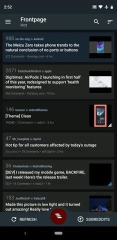
My honest recommendation with Relay is to try one of the first four apps on this list first. If you’re not feeling the standard Material Design UI they all share or you wish there were more creative gestures, then give Relay a try.
TL;DR
We tested the top nine Reddit apps for Android. There was a clear separation between the top four apps and the rest of the pack. Sync, Joey, Slide, and Boost were the cream of the crop, and Relay was the best of the rest. On its heels were Now for Reddit, BaconReader, and Reddit is Fun, then way at the end was the official Reddit app. Here’s what you should know about our top five in the end:
Sync: Very polished, extremely feature-rich, and natively supports almost all content on Reddit. The only real downside is a pricey pro version if you want to remove ads.
Joey: Lots of features, very close to Sync overall, clearly better than the rest of the pack, but could use a tiny bit more polish. If you refuse to pay for a Reddit app, Joey’s your best option — it’s completely free and doesn’t show ads.
Slide: Just a notch below Sync and Joey when it comes to features, but robust and polished nonetheless. Themes are somewhat lacking, but the ability to swipe between subreddits or posts is enticing.
Boost: Neck-and-neck with Slide. Upsides are a solid interface and plenty of options. Downsides are a lack of minor UX features and fewer options for viewing media.
Relay: A step behind the first four apps because it’s somewhat lacking in customization options and has a design that some might find tacky. But if you’re a fan of gestures, Relay’s a great choice.
This article was produced during Gadget Hacks’ special coverage on becoming a social media expert on your phone. Check out the whole Social Media series.
- Follow Gadget Hacks on Pinterest, Reddit, Twitter, YouTube, and Flipboard
- Sign up for Gadget Hacks’ daily newsletter or weekly Android and iOS updates
- Follow WonderHowTo on Facebook, Twitter, Pinterest, and Flipboard
Hot Deal: Set up a secure second phone number and keep your real contact details hidden with a yearly subscription to Hushed Private Phone Line for Android/iOS, 83%–91% off. It’s a perfect second-line solution for making calls and sending texts related to work, dating, Craigslist sales, and other scenarios where you wouldn’t want to give out your primary phone number.
“Hey there, just a heads-up: We’re part of the Amazon affiliate program, so when you buy through links on our site, we may earn a small commission. But don’t worry, it doesn’t cost you anything extra and helps us keep the lights on. Thanks for your support!”


