My One Unexpected Gripe After Switching From Windows to Mac
macOS
Quick Links
-
A Tale of Two Philosophies
-
macOS Needs Better Focus
-
Workarounds
As a long-time Windows user, there are obviously many things that feel different about macOS—and I knew most of them going in. But one thing in particular really caught me off guard, and it might be my biggest annoyance.
A Tale of Two Philosophies
Before I talk about my grievance, I need to set the stage. When you maximize an app in Windows, it’s not really full-screen—the taskbar remains visible. But in macOS, clicking that green maximize button hides the menu bar and dock, putting the app fully front and center.


This has a pretty big impact on how you manage apps on the screen. In Windows, you can keep apps open in full size and still easily multitask from the taskbar. However, in macOS, maximizing an app means constantly mousing to the edges of the screen to reveal the menu bar and dock or alt + tab-ing through open windows.
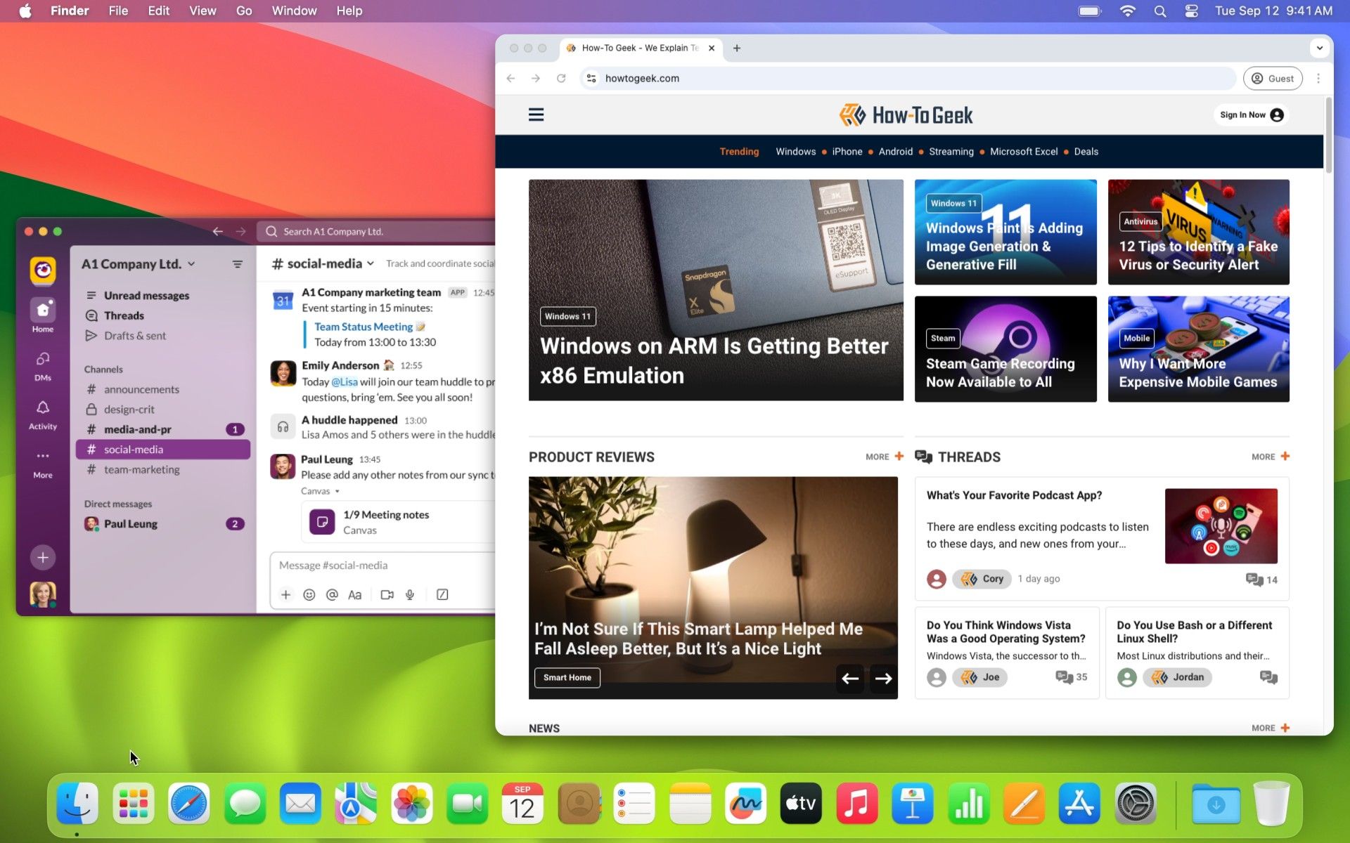
So, what does this have to do with anything? Because of how windows behave in macOS, you end up with apps spread out all around your screen in different window sizes. It’s pretty common to be able to see multiple apps layered on top of each other—and that is where my gripe comes in.
macOS Needs Better Focus
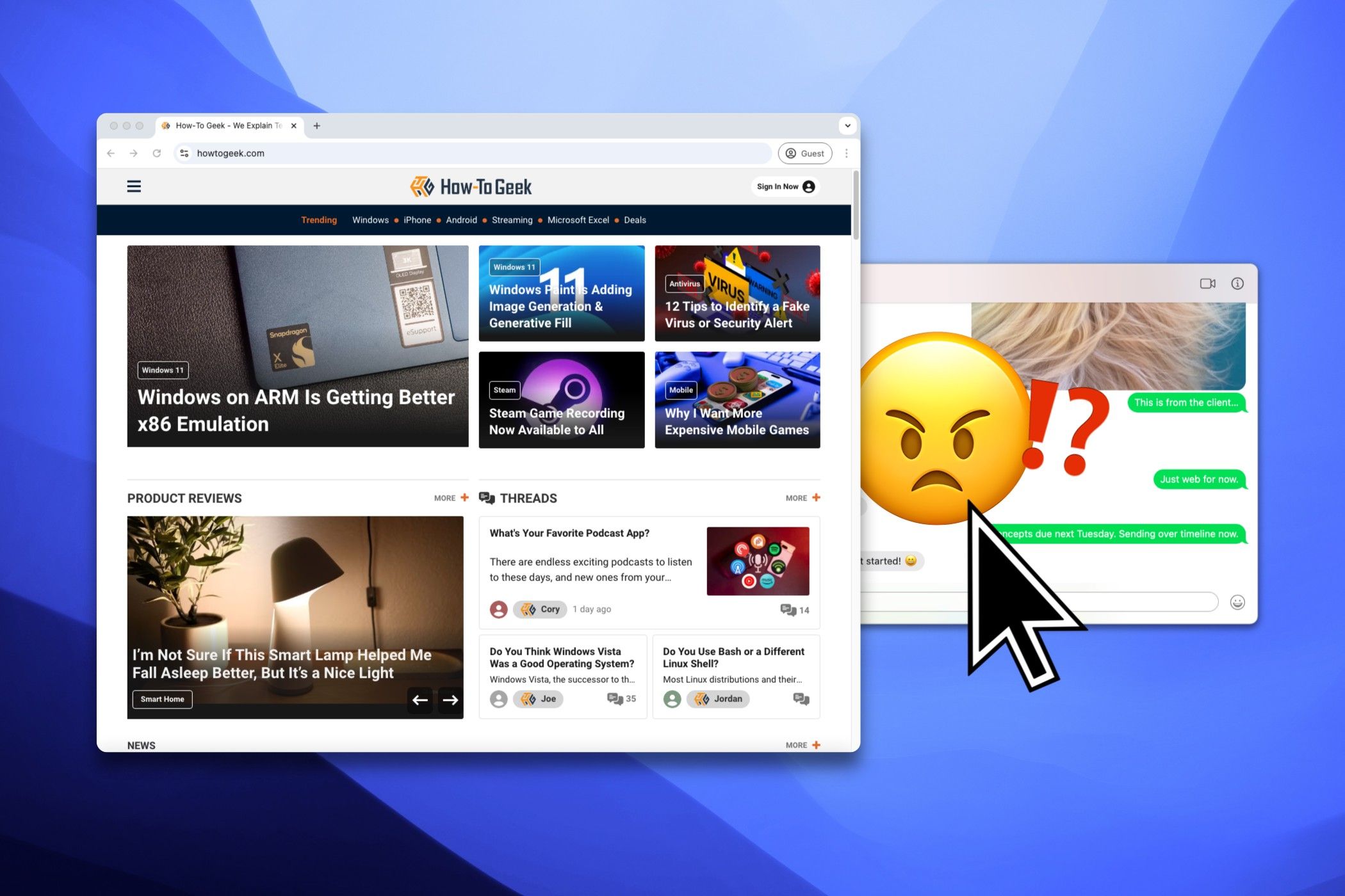
In Windows, you can interact with anything visible on the screen with your mouse. It doesn’t matter if the app is in the foreground or background. You don’t need to click on an app to bring it into the foreground before interacting with it. This is not the case in macOS.
Allow me to explain why this is so annoying. I do most of my work in Chrome and Slack, and I always have them open on the screen side-by-side. Let’s say I’m writing in Chrome, and I get a message in one of my Slack channels. I have to click the Slack window once to make it active, then click the Slack channel to open it. Two clicks.
This little thing throws me off every time I use macOS. I’m essentially clicking twice as much just to use multiple apps on the screen at once. Which, as outlined above, is how macOS tends to be used most often. Maybe it’s only because I’ve used Windows for so long, but this feels very clunky and wrong.
If something is visible on my screen, I expect to be able to interact with it right away. Some apps do work like this on macOS, such as the calculator, and some parts of apps do it as well, like the tab bar in browsers. However, it’s not nearly as widespread as I’d like. If the OS is going to lead me to have multiple windows spread out on my desktop, I’d like to be able to use them easily.
Workarounds
Thankfully, I’m far from the only person who has had this gripe. There are a couple of “solutions” available to try if you feel the same way.
First, you can simply hold the Cmd key while clicking with your mouse to interact directly without focusing the window. Personally, I find this cumbersome, and it’s still doing two things to accomplish one click.
A more robust solution is a window management utility called “Yubai.” One of its features includes “focus-follows-mouse,” which does exactly what it sounds like: windows move into focus when you mouse over them. This is a better answer, but I personally don’t like it, either.
One of the reasons I’ve seen for macOS’ default behavior is that it protects you from accidental clicks. Well, I’m much more likely to move my mouse outside of the active window, so Yubai ends up pulling windows to the forefront and getting in the way.
To be honest, I haven’t found a great solution for this annoyance. The best thing to do seems to be simply Cmd + Tab between apps as much as possible. I don’t love doing that for apps that are literally side-by-side on the screen, though. Just let me click what I want, Apple!


