Microsoft Should Bring Back the Metro UI for Handheld Gaming
A blast from the past that’s a must for improving Windows handheld experience.
Quick Links
- The Windows Struggle on Gaming Handhelds Is Real
- The Metro UI Worked Great on Touch Screens
- With a Few Tweaks, Metro Can Work Great With D-Pads and Thumbsticks, Too
Key Takeaways
- The default Windows 11 user interface is far from ideal for handheld gaming; the Metro UI would be a much better fit.
- The Metro UI was great on touch screens and can work even better with a D-pad.
- Microsoft shouldn’t just revive the Metro UI from the Windows 8 era and slap it on Windows 11; it should slightly redesign and tweak it in order to make it a perfect fit for Windows handhelds.
While the Metro UI wasn’t the best way of interacting with your desktop or laptop computer, it could be the best way to interact with Windows on your handheld PC. Instead of trying to reinvent the wheel, Microsoft should unretire Metro and unleash it on handheld PCs, here’s why.
The Windows Struggle on Gaming Handhelds Is Real
Windows gaming handhelds are mostly great, but they all share one major issue: Windows itself. As someone who owns an ASUS ROG Ally, I can attest that navigating around Windows on a daily basis with an analog stick playing the role of a very poor mouse replacement is one of the worst gadget-related experiences I’ve ever had.
While nowadays it isn’t that bad, because I mostly use Moonlight to locally stream games and Armoury Crate to launch games and set up gaming-related stuff, it was pretty bad during the first month of owning the device because I had to actually use and navigate around Windows, a lot.
Setting up the device, debloating Windows, disabling stuff such as Memory Integrity that hampers gaming performance, and installing game launchers and games was a proper struggle because the Windows UI is in no way whatsoever optimized for thumbsticks and D-pads.
In all honesty, ASUS could’ve included a trackpad on the right-hand side that would immensely improve the whole experience, but even then, the regular desktop UI of Windows 11 would be far from ideal and only frustrating instead of infuriating.
Other issues with the Windows handheld experience include updates messing up gaming performance, Windows occasionally overwriting GPU drivers, or installing apps that bring more harm than good without the user’s knowledge.
Like the time when a Windows update had quietly installed the OpenCL, OpenGL, and Vulkan Compatibility Pack app, which then started crashing games left and right until someone on the ROG Ally subreddit had identified the perp and saved many ROG Ally owners with their PSA post.
That said, these issues are a part of the regular Windows experience and are outside the scope of this piece, but it’s worth mentioning that the Windows struggle on gaming handhelds is multifaceted and doesn’t only include unfriendly UI.
Now, don’t get me wrong. I love the freedom a Windows-based gaming handheld gives me, allowing me to play Game Pass games, run any PC game I want, play multiplayer titles that are incompatible with the Steam Deck, and seamlessly install game mods.
But the fact is that the Windows user experience is made for a mouse and keyboard and that even a trackpad isn’t an optimal way to navigate around the OS. I’m fully in favor of Microsoft coming up with a handheld-friendly version of Windows, and I might have a solution. One that had been lying forgotten for many years. I’m talking about the Metro UI.
The Metro UI Worked Great on Touch Screens
I loved the Metro UI and its minimal, tile-based design philosophy on my Nokia Lumia 520, one of the best phones I’ve ever owned. The snappiness of the Metro UI-powered Windows Phone operating system was in line with the high-end iOS and Android experience of the time, despite the Lumia 520 being a budget device.
The live-tile scrolling home screen was so different and so much better-looking than what we had at the time on iOS and Android, and the easy-to-navigate options menu was better than what I have today on my Galaxy S21FE.
The beauty of the Windows Phone 8.1 Start screen with its transparent tiles and subtle animations is still, at least for me, the best design I’ve ever seen on a smartphone OS. The ease of being able to seamlessly add new tiles to the infinitely scrolling Start screen instead of having to deal with multiple home screens was so far ahead of its time; it’s a crying shame we don’t have something similar nowadays.
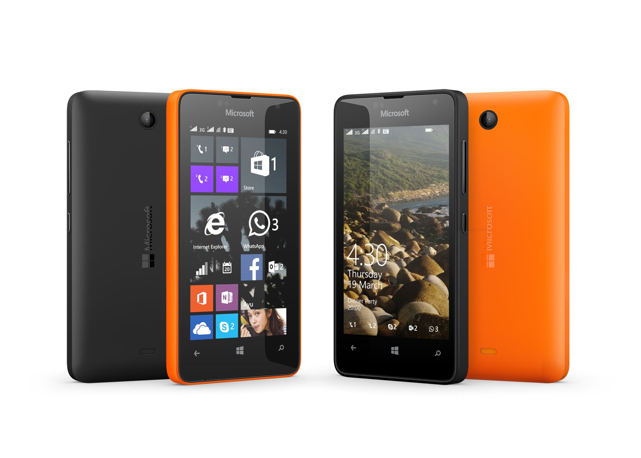
In a nutshell, the Metro UI worked great on touch screens. It was a near-perfect touch screen user interface. But when you think about it, Metro would also work great with a D-pad. Let me elaborate.
With a Few Tweaks, Metro Can Work Great With D-Pads and Thumbsticks, Too
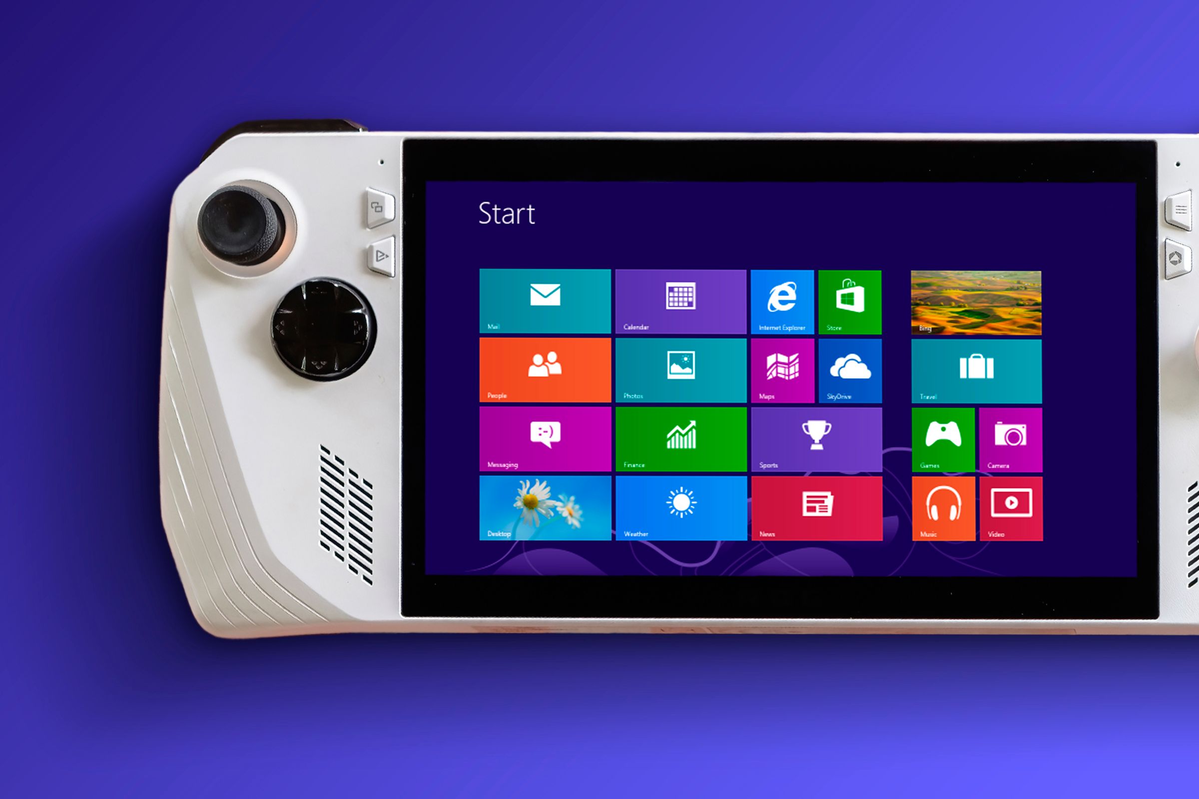
Windows 8’s tile-based, square-like design is perfect for navigating around with a D-pad, as is its settings menu that’s quite similar to the options menus we have on game consoles and the Steam Deck.
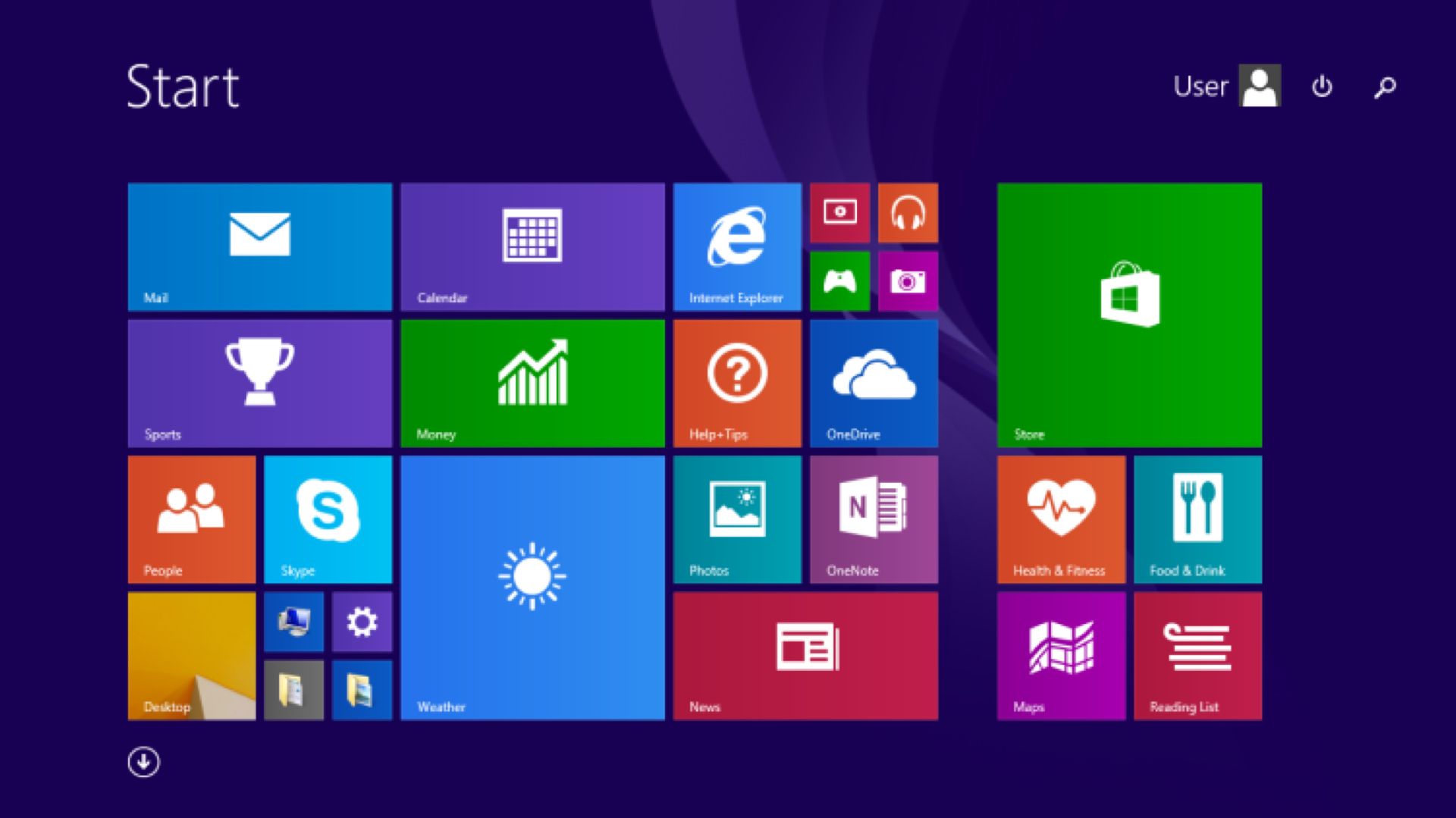
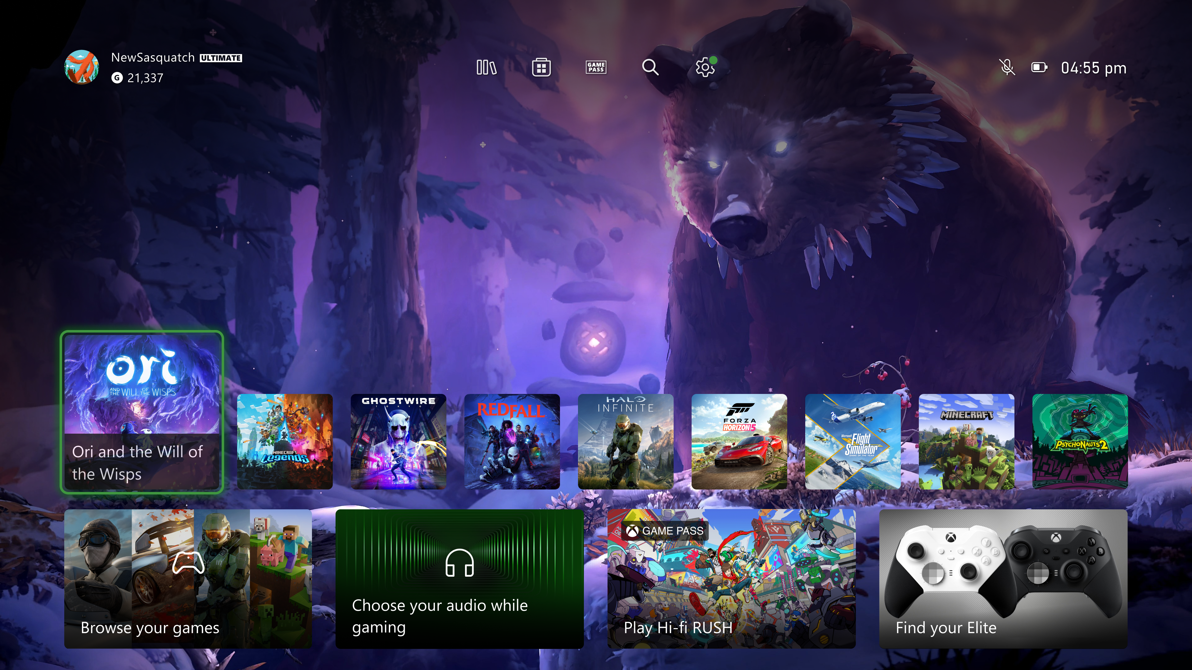
You’ve got large square and rectangle-shaped tiles that are perfect for a 4-direction navigation device such as a D-pad, you’ve got a Steam Deck-like options menu that’s, again, perfect for navigating around with a D-pad, and you’ve got the app design philosophy that’s, surprise surprise, yet again perfect for a D-pad even though it was originally made for a touch screen. It’s no wonder why many Metro design elements survived for so long on Xbox consoles.
Just look at the image below and you’ll see what I’m talking about. Imagine having this UI on your Windows handheld, and try to visualize just how seamless it would be to navigate around it with a D-pad.


