How to Use Pictures and Icons as Chart Columns in Excel
Microsoft Excel
Quick Links
-
Beginner: Replacing Columns With Basic Images
-
Advanced: Creating Partially Filled Column Graphics
Excel offers many different chart types—including column and bar graphs—to present your data. However, you don’t have to settle for the preset column and bar layouts. Instead, you can swap these for thematic pictures or icons to make your chart catch everyone’s eye.
Beginner: Replacing Columns With Basic Images
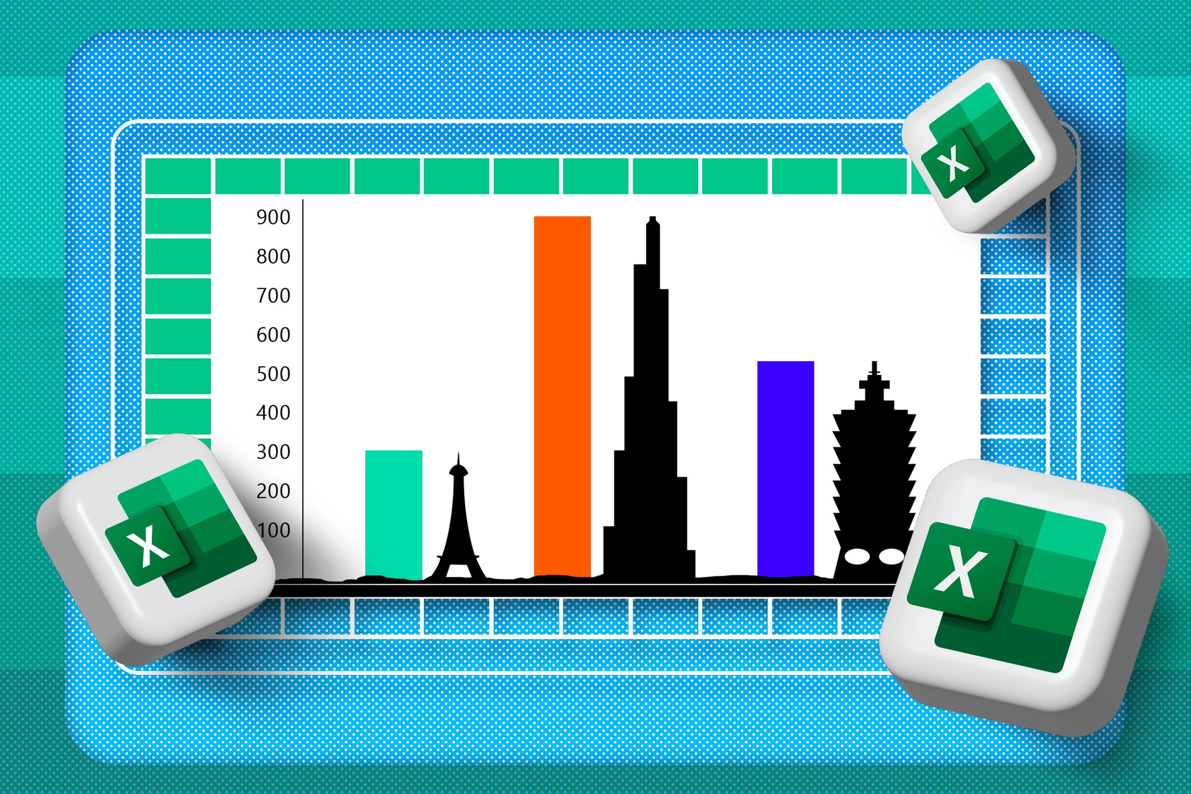
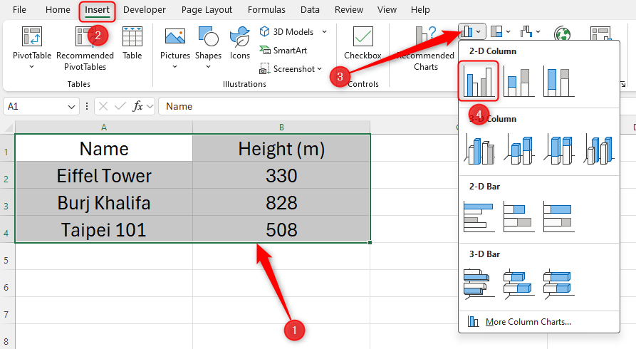
This Excel sheet lists the heights of three well-known buildings. To create a column chart, I will select the data, click “Insert,” and choose the “2D Clustered Column” option.
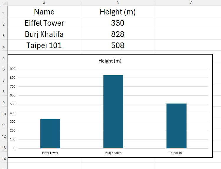
This produces a neat chart that is easy to read.
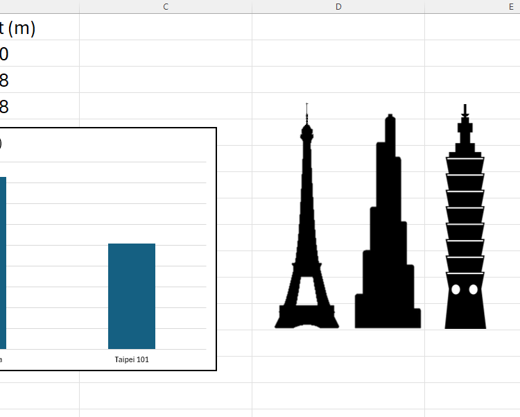
As useful as this is, I now want to make my chart even more visual by replacing the columns with silhouettes of the three buildings. When I first discovered this trick, I was surprised by how easy it was to do. First, use a search engine to find suitable images, and copy and paste them into Excel.
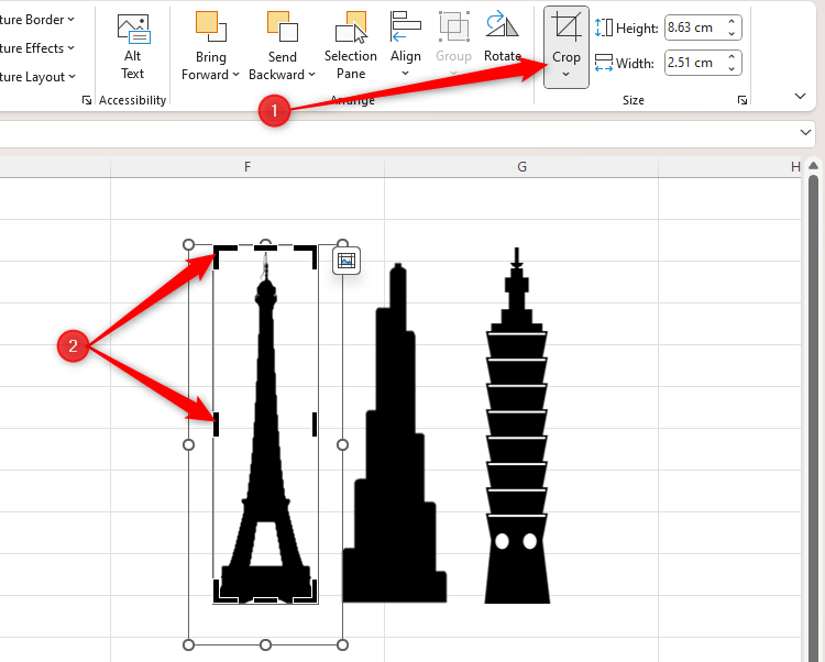
Before you transfer these images to your chart, you need to remove any unneeded space from around their edges. Select the first graphic, and in the Picture Format tab, click “Crop,” and use the handles as appropriate.
Repeat this process for all the images you’re going to use in your chart.
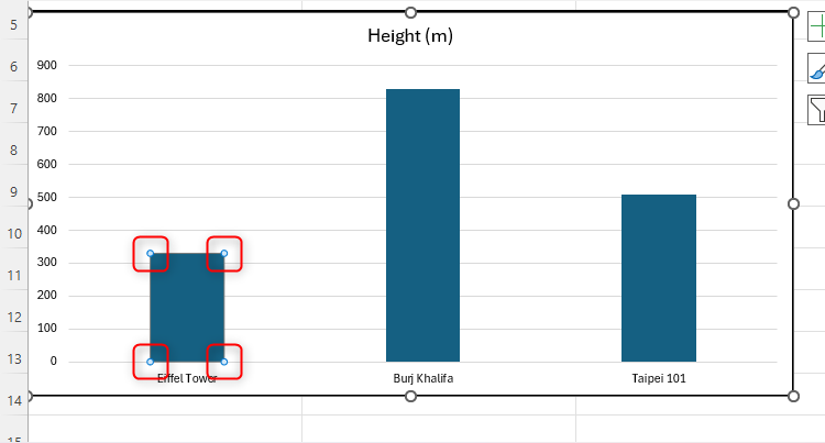
Now, select the image that will replace the first column, and press Ctrl+C. Moving back to your graph, click the first column twice—the first click selects all the columns, and the second click isolates that single column. Make sure you don’t double-click, as this is a different command in Excel. Instead, click once, leave a second or two, and then click again.
You can tell that you’ve done this correctly by seeing the handles around the edge of that column only, and not the other columns.
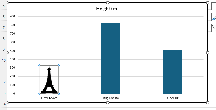
Paste the copied image by pressing Ctrl+V. You will see the cropped image replace the default column in your chart.
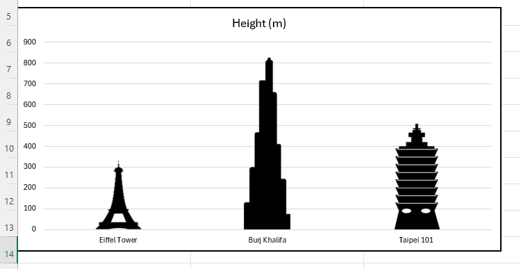
Follow the same process with the other columns, remembering to click each of them twice before replacing it with the image.
Play around with your new chart by changing the original data. You’ll see the images grow and shrink—exactly the same way as a column would—according to the changes you make.
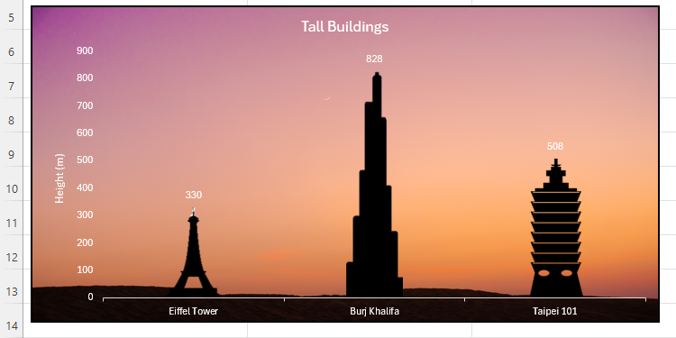
Now, delete the originally pasted images, and tidy up your chart to make it stand out. For example, you might want to add data labels, rename your axes, or even change your chart’s background.
Who knew that you could create something so visually impressive in Microsoft Excel? Take a moment to compare this chart to the original column chart I created earlier, and appreciate how adding images and making a few changes have such a huge impact.
Advanced: Creating Partially Filled Column Graphics
You can make use of Excel’s ability to replace columns with images to create more specific comparisons, like a male-female ratio chart.
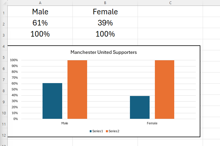
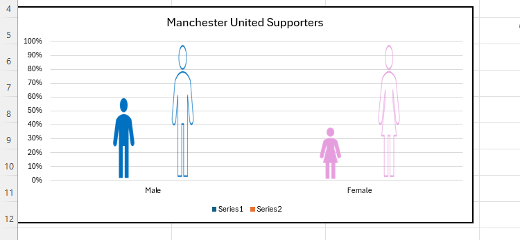
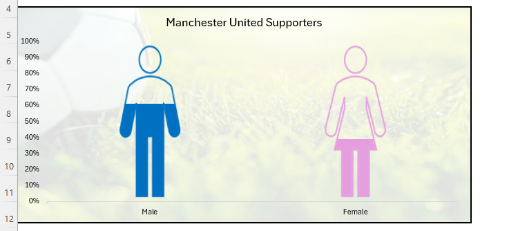
This Excel data and the corresponding chart shows the number of Manchester United supporters who identify as male, and the number who identify as female (numbers fabricated for demonstration purposes). It’s important that you include the 100% values within your chart’s data for reasons that’ll become clear soon.
This time, rather than searching for images online, I’m going to use Microsoft’s gallery of icons. You can do the same by clicking Insert > Icons, and using the search bar to find the icons you need. In my case, I’ve typed person, and selected standard male and female icons, before clicking “Insert.”
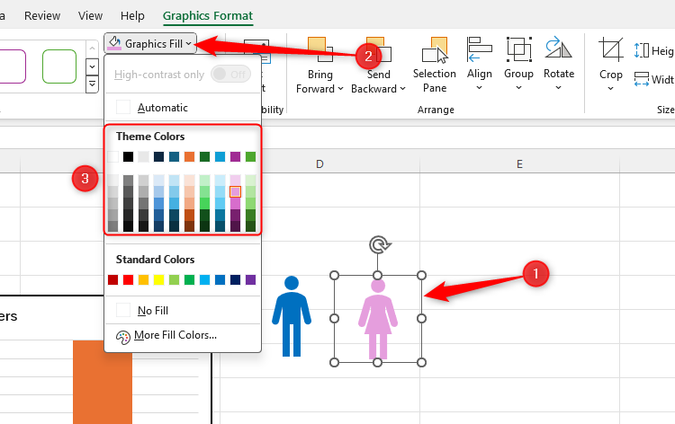
Next, select one of the icons, and click the “Graphics Fill” drop-down in the Graphics Format tab to change its color. Then, do the same with the other icon, choosing a color that’s clearly distinguishable from the first. I’ve gone with the very stereotypical blue and pink identification in my demonstration.
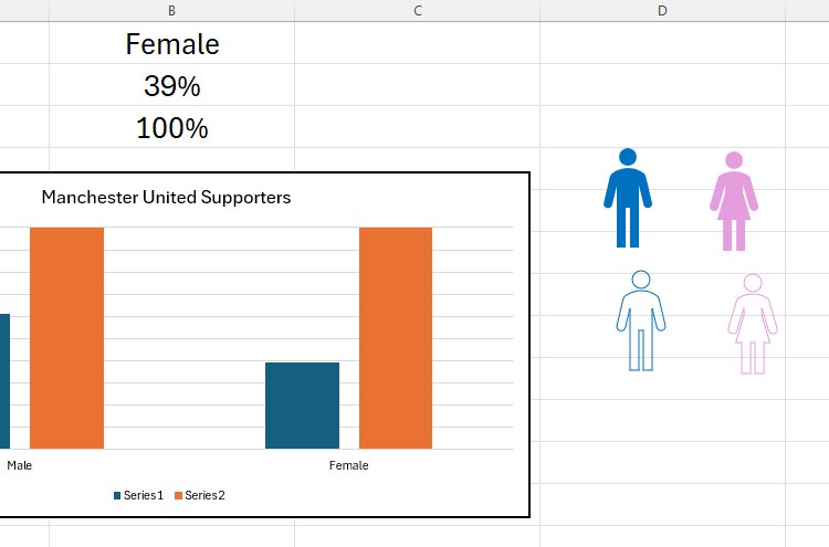
Now, select one icon, hold Ctrl, and select the other icon—this will mean that both icons are selected simultaneously. Then, press Ctrl+C > Ctrl+V to duplicate them.
Your job now is to add an outline and remove the color fill from these duplicated icons. Select the first duplicated graphic, click “Graphics Outline” in the Graphics Format tab, and choose the same color as you selected for its fill. Then, click “Graphics Fill,” and “No Fill.” Repeat this process for both of these duplicated icons. Now, you should have four icons, two of which are filled, and two of which have outlines only.
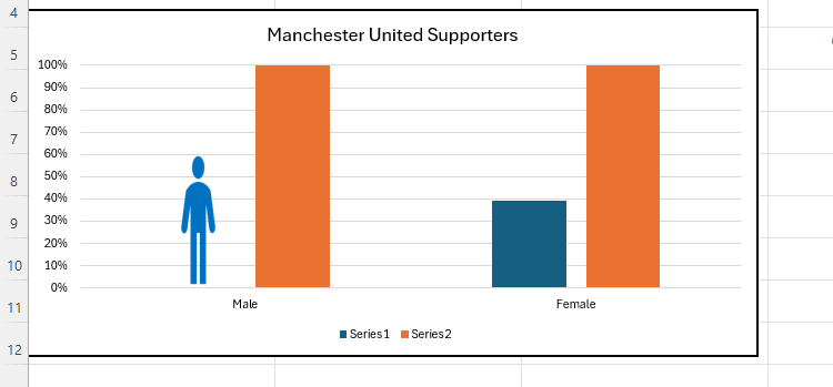
You’re now ready to insert these icons into your graph. Select the first filled icon that corresponds to the first column in your chart, and press Ctrl+C. Then, click the first column twice (not a double-click) to select it independently, and press Ctrl+V.
Repeat the process with the other three columns, where the filled icons replace the data values on the left, and the hollow icons replace the 100% columns on the right.
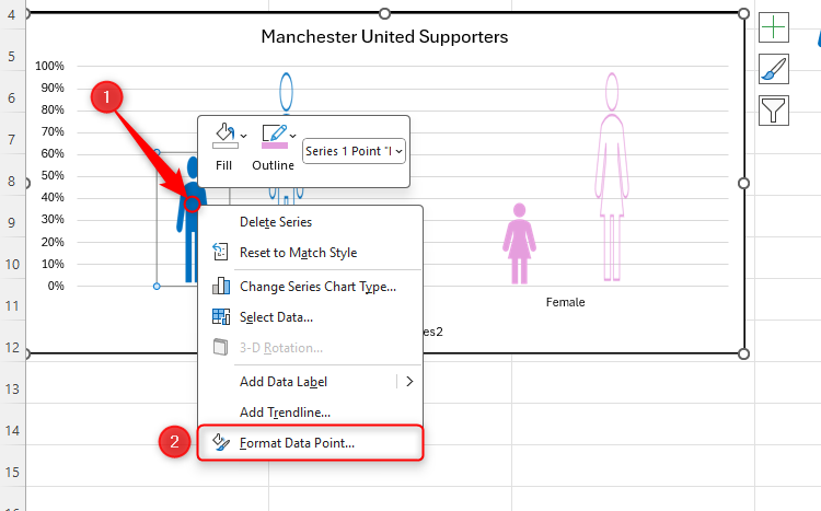
The next steps involve scaling and overlapping the icons. Click the first icon twice to select it independently, right-click it, and then select “Format Data Point.”
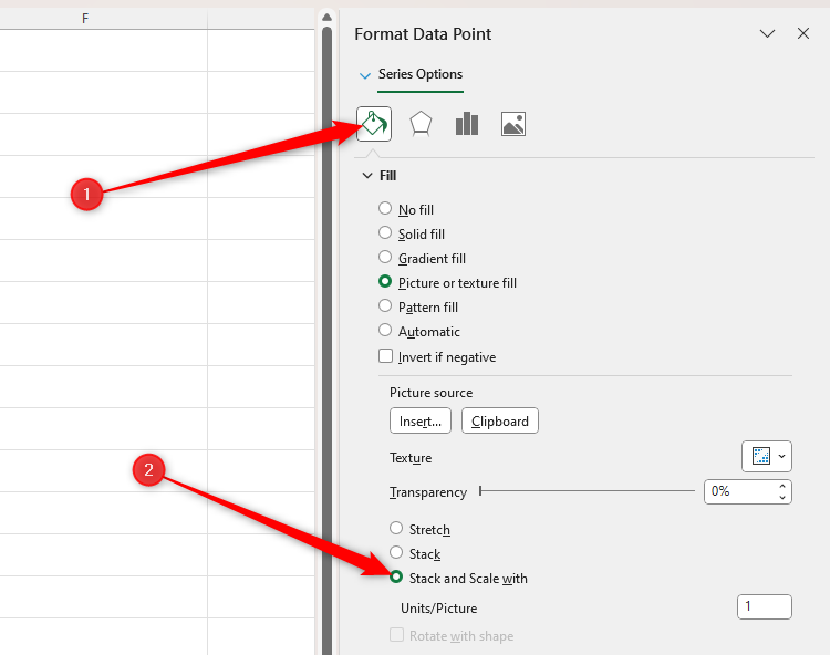
In the Format Data Point sidebar, click the “Fill And Line” icon, and check “Stack And Scale With.”
Repeat this process for all remaining icons, ensuring you select them individually as you go. When you’re done, leave the Format Data Point sidebar open, as you’re going to use it in the next step.
Although this might make your chart look unusual, don’t worry—this is just a temporary issue that will rectify itself shortly.
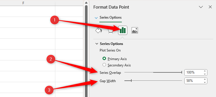
Now, to overlap the filled and outlined icons for each gender, single-click one of the outlined icons to select them both, and in the Format Data Point sidebar, click the “Series Options” icon. There, slide the Series Overlap value to “100%,” and change the Gap Width to a value that works well on your chart (your chart will change as you drag the slider).
In my case, I’ve gone for a 58% gap width, as this leaves my human icons reasonably proportioned.
Finally, tidy up your chart to give it the best appearance possible. In my case, I’ve removed the legend and gridlines, and I’ve added a semi-transparent soccer-themed background.
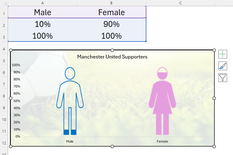
Tinker with the numbers in your original data set to see the filled areas of your icons change. Here, I’ve changed the female representation to 90% and the male representation to 10%.
The hollowed-out icons remain at the full height, as they correspond with the 100% values in my data. The colored icons, on the other hand, grow and shrink with my variable data.
You can use the same techniques for bar charts, too. For example, if you’re comparing the average lengths of certain breeds of snakes, you could replace the bars with horizontal images.


