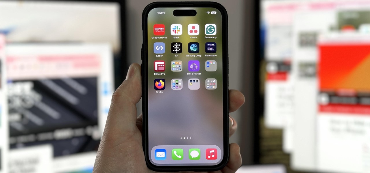
Some iOS and iPadOS apps offer alternative app icons you can switch between. Beyond that, you’d have to create aliases in the Shortcuts app to customize the look of the app icons on your Home Screen. But that would mean two icons for each app in the App Library. Now, in a new software update, Apple is giving us a middle ground for Home Screen icon customization.
With the iOS 18 and iPadOS 18 updates, currently in beta, you can change not just your app icons but also your widgets by switching between light and dark appearances and tinted colors.
Many of Apple’s apps have themeable Dark Mode icons, and third-party developers can update their apps with dark and tinted variants. Alternate app icons also need dark and tinted variants. Dark icons require a transparent background, while tinted ones require a fully opaque grayscale icon. Your system will composite its gradient background on these icons to create the effect. However, iOS 18 and iPadOS 18 will still attempt to adjust some app icons without any icon variants submitted.
- Don’t Miss: 10 New Home Screen Features Coming to iPhone with iOS 18
To start, touch and hold the wallpaper on your Home Screen, tap “Edit” in the corner when apps are jiggling, then select “Customize” from the options. This menu offers various customization options to adjust the appearance of icons and widgets.
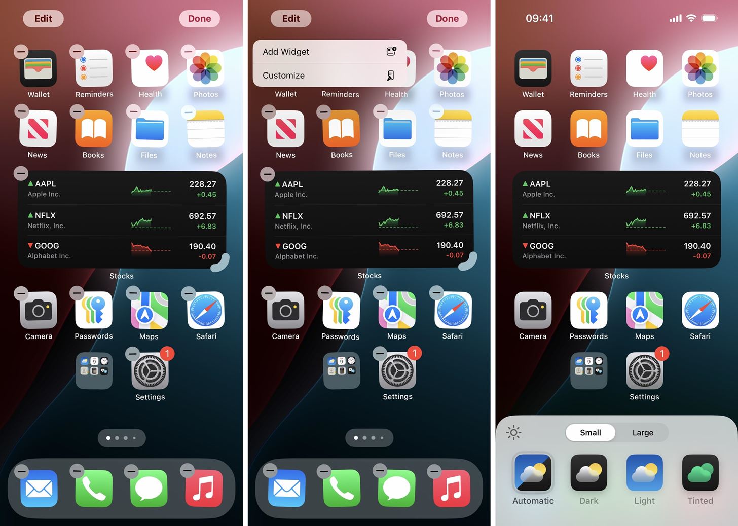
One of the first things you’ll notice is that you can make your icons “Small” or “Large.” Small is how your apps and widgets would appear on iOS 17 or iPadOS 17 and earlier. Large makes app icons and widgets slightly bigger, which, in turn, hides app, folder, and widget names. This simple adjustment can help you achieve a cleaner or more detailed look.
- Don’t Miss: With iOS 18, You Can Finally Hide App, Folder, and Widget Names on Your iPhone’s Home Screen
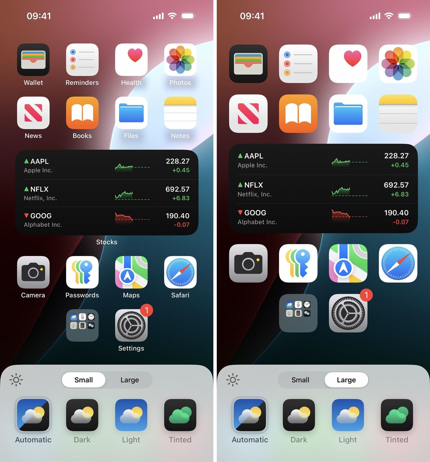
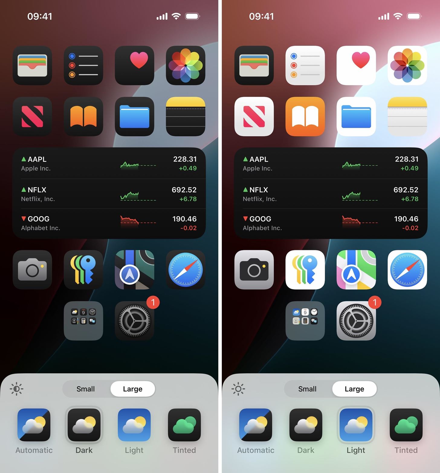
Underneath that, you’ll see four options for your icons. By default, “Automatic” is selected. This changes icons and widgets based on the chosen appearance system-wide, which you can toggle manually via Control Center, Siri, etc., or automatically via a set schedule.
To override the system-wide settings, you can choose between “Light” and “Dark.” This choice remains persistent, so if you pick dark icons and widgets, they’ll remain dark when your system changes between light and dark appearances.
If third-party developers have yet to submit dark variants of their apps, Apple will use on-device intelligence to try and darken apps. This automatic darkening, which first appeared in beta 3, works best when an app icon uses a simple symbol over a solid background. All other icons will be shaded slightly.
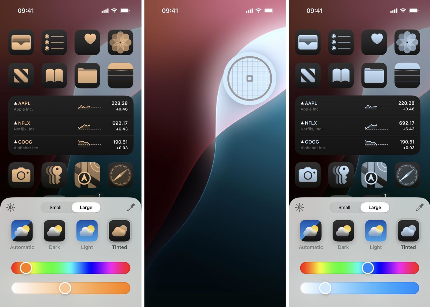
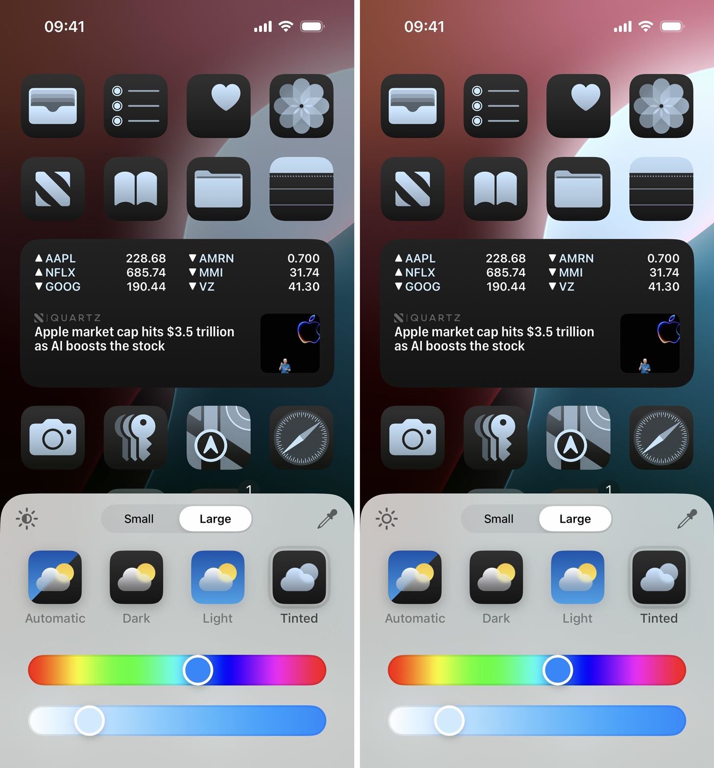
“Tinted” is the fourth icon in the icon customization interface. It affects the color of all icons, though apps with grayscale variants will look the best. The top Gradient slider adjusts the color, while the bottom Luma slider adjusts the brightness of the chosen color. When you move the circle on the Luma slider all the way to the left, you get the grayscale look. Alternatively, you can tap the eyedropper icon to select a color on your current wallpaper.
Any changes you make also apply to widgets, ensuring a coherent look across your iPhone or iPad. So, widgets will be accented by any tint you choose.
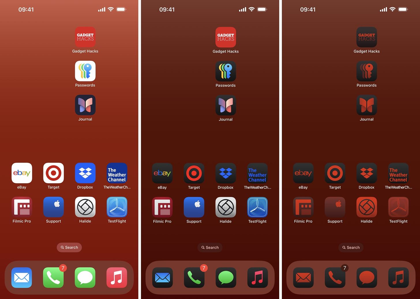
Below, you can see a mix of bookmarks and app icons from Apple and third parties. The icons in the light appearance (left) look normal, while icons in the dark appearance (middle) have dark backgrounds. With Dark Mode on, apps without transparent backgrounds will remain in their light appearance; bookmarks are also unaffected.
When tinted, the chosen gradient and brightness combination affects all icons. Apps with associated grayscale icons will look the best, but all other apps and bookmarks will still be tinted using on-device intelligence.
One more thing you can change: the wallpaper brightness. No matter which icon style you choose, tap the sun icon in the corner of the customization interface to dim or brighten the wallpaper.
Once satisfied, tap anywhere on the Home Screen to save your preferences.
Just updated your iPhone? You’ll find new features for Podcasts, News, Books, and TV, as well as important security improvements and fresh wallpapers. Find out what’s new and changed on your iPhone with the iOS 17.5 update.
“Hey there, just a heads-up: We’re part of the Amazon affiliate program, so when you buy through links on our site, we may earn a small commission. But don’t worry, it doesn’t cost you anything extra and helps us keep the lights on. Thanks for your support!”


