There are more than a few exciting new Home Screen customization options available in the iOS 18 and iPadOS 18 software updates, including some we’ve been waiting years for. Apple never mentioned a few of these new features and changes in the release notes, but you can see them all right here.
The iOS 18 and iPadOS 18 updates were released on Sept. 16, and they contain major improvements to not only the Home Screen but also the Lock Screen, Action button, Control Center, Apple Maps, Weather, Notes, and other aspects of your iPhone or iPad. As for the Home Screen, there are at least 12 things you need to know about:
1. You Can Rearrange App Icons/Widgets
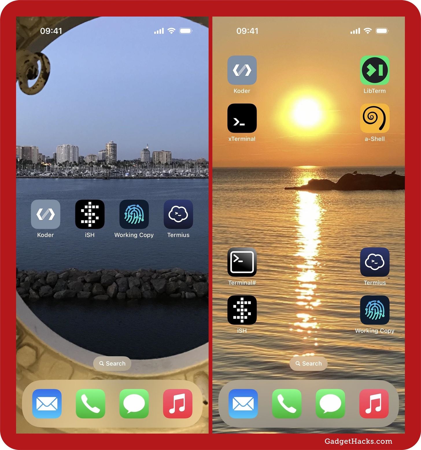
One of the most frustrating things about the Home Screen was that you couldn’t put apps, folders, and widgets on a page without them conforming to Apple’s gapless left-to-right, top-to-bottom reading order. There were complicated, infuriating workarounds most people would never even try, like web tools that use icon tricks to create gaps, but you’d have to redo the work anytime you wanted a new wallpaper.
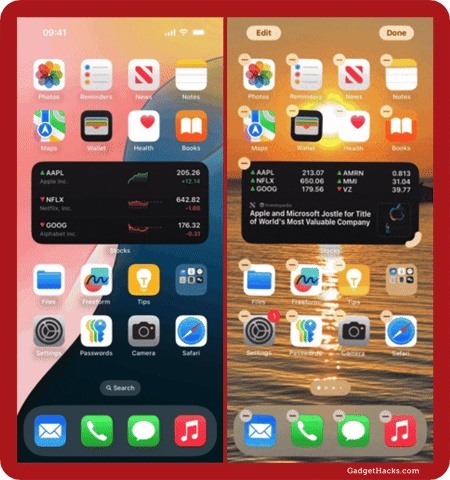
With iOS 18 and iPadOS 18, we can finally place an app icon, folder, or widget anywhere on the Home Screen. For example, you could place apps closer to the bottom for easier access or frame them around the subject of a photo wallpaper. Icons and widgets no longer have to obstruct important details in your backgrounds, like a pet’s face or the sun setting. You can move everything around to work with your wallpaper.
2. Dark Mode Works for Icons, Widgets, and More
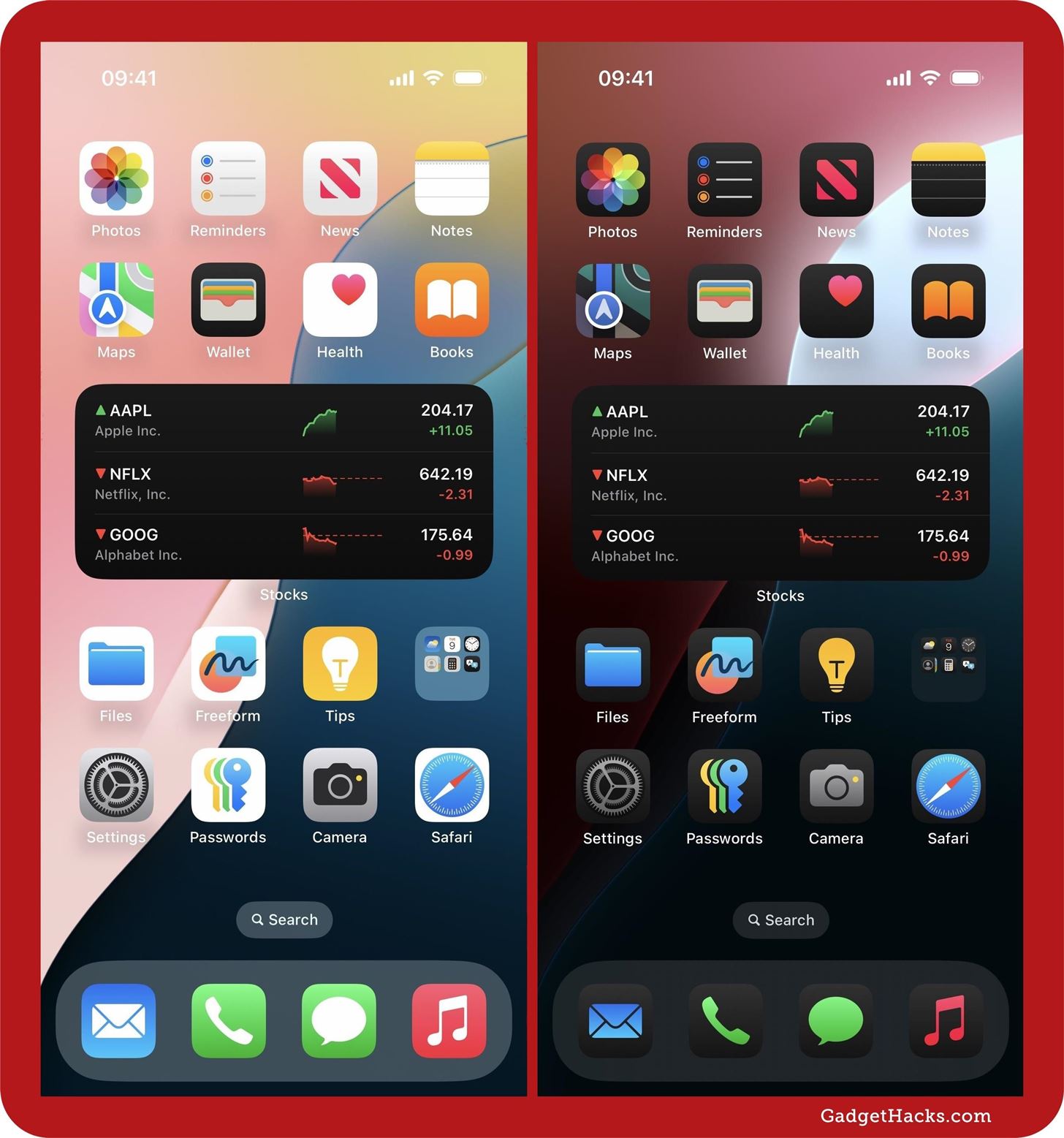
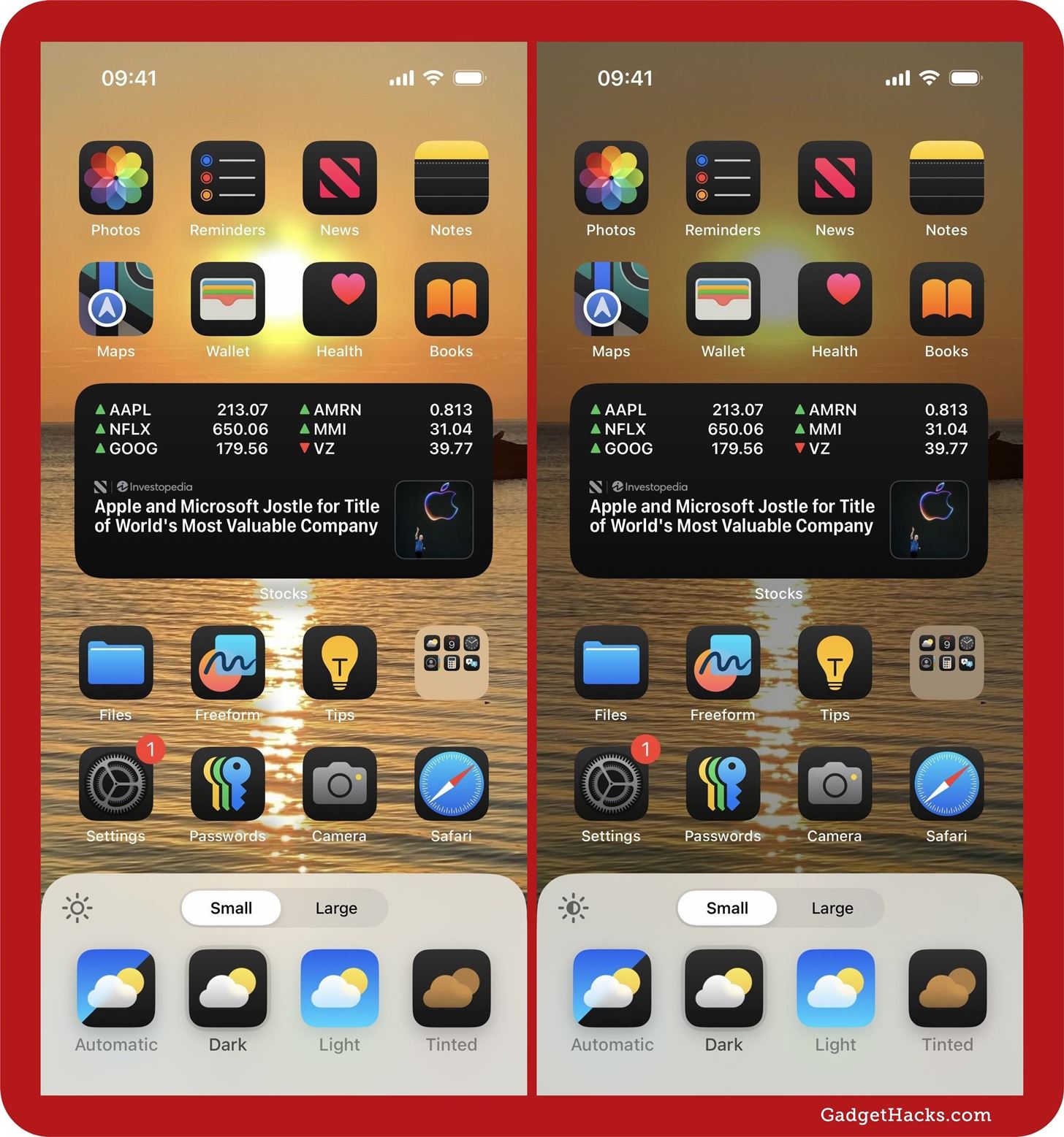
On iOS 17 and iPadOS 17, the Home Screen doesn’t change much or at all when Dark Mode is turned on. That changes with iOS 18 and iPadOS 18. Whether Dark Mode is automatically or manually turned on, it can darken app icons, folders, and widgets on your Home Screen, along with the wallpaper and dock. You can even set Dark Mode to work with the Home Screen even when the system-wide Dark Mode is off.
- Full Guide: Get Creative with Dark and Tinted Home Screen Icons on Your iPhone or iPad
3. You Can Dim the Dark Appearance
On past iOS and iPadOS versions, you could dim or not dim adaptive wallpapers when in Dark Mode. That option returns in the new “Customize” menu, which appears in a nonmodal sheet at the bottom. When “Dark” is selected, tap the sun icon in the corner to dim or not dim the wallpaper.
4. There Are Color Themes for Icons and Widgets
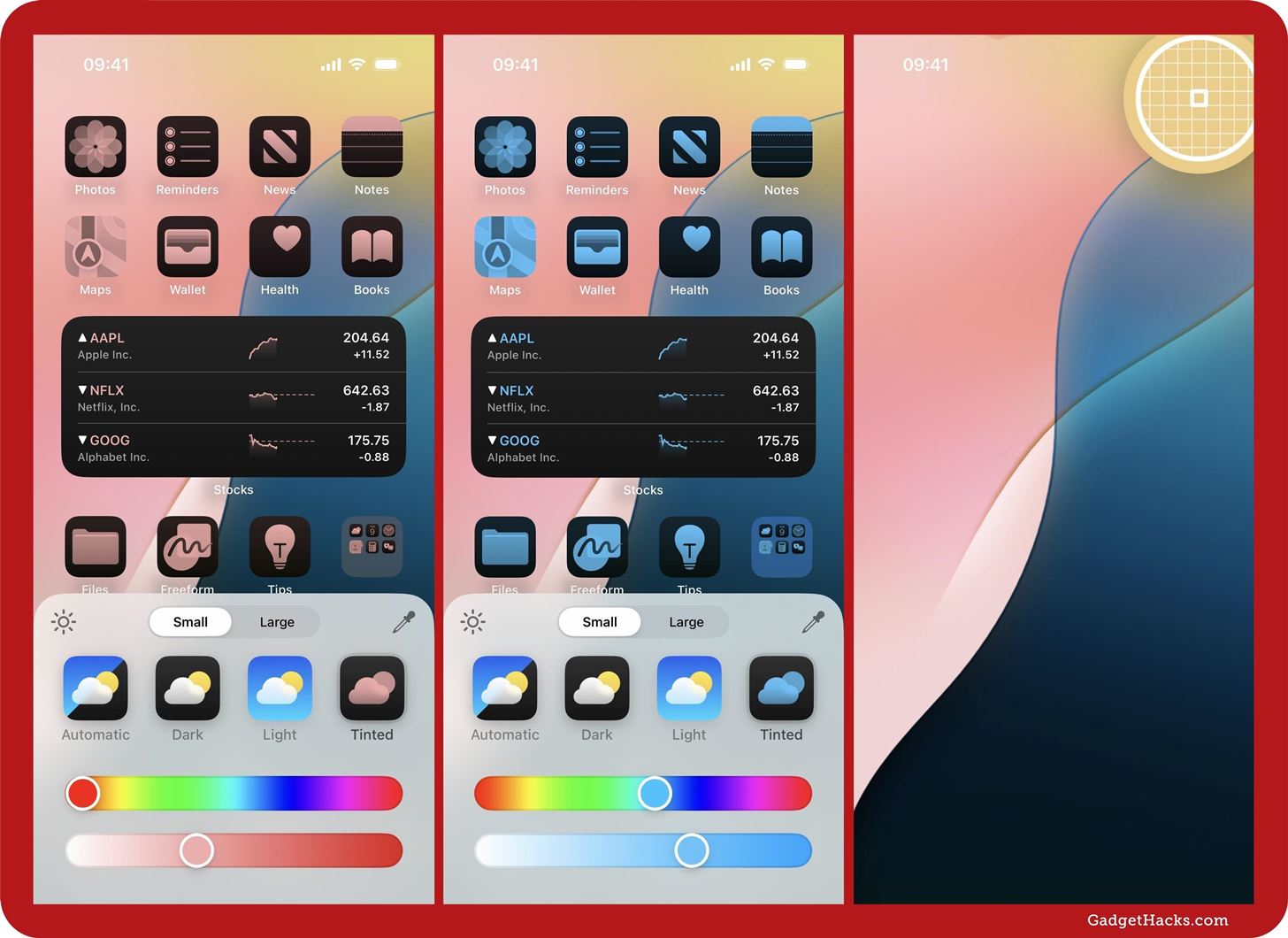
In the Home Screen’s new “Customize” menu, you can adjust your Dark and Light preferences, but you can also choose “Tinted,” which suggests a color for your app icons, folders, and widgets that complements your current wallpaper. If you don’t like the suggested color, adjust it using the gradient and luma sliders. You can also use the color picker tool to select any color on your wallpaper.
5. You Can Hide App, Folder, and Widget Names
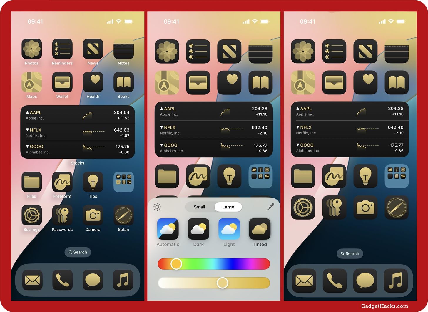
The “Customize” menu also has a tool that lets you enlarge app icons and folders on your Home Screen. This is great if you need larger icons to recognize things more easily, but it’s also got a very cool side effect: it hides app, folder, and widget names. It was somewhat possible to do on iOS 17 and iPadOS 17 and earlier using a few workarounds, like jailbreak tweaks and special Unicode characters, but iOS 18 and iPadOS 18 will do it for you with the “Large” switch. (If you don’t like the larger icons, you can still use the Unicode characters to hide app and folder names.)
- Full Guide: With iOS 18, You Can Finally Hide App and Widget Names on Your iPhone’s Home Screen
6. You Can Easily Resize Widgets
Widgets are easier to work with on iOS 18 and iPadOS 18 since you can easily resize the widgets already on your Home Screen. No more deleting them and adding them back as a different size from the gallery — now you just do it from the widget’s quick actions menu or via its drag handle. More interestingly, the quick actions option also lets you turn a widget into an app icon, and you can use an app icon’s quick actions to turn it into a widget!
- Full Guide: iOS 18 Lets You Change Widget Sizes on Your iPhone’s Home Screen Without Deleting Them First
7. Apps Can Now Be Locked and Hidden
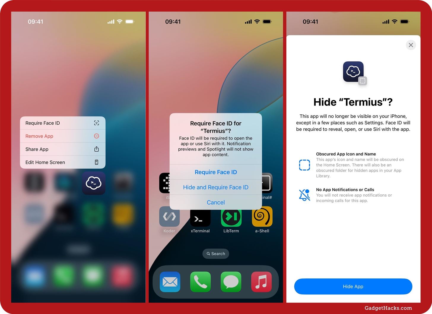
From an app icon’s quick actions menu on the Home Screen, you can quickly lock the app behind Face ID, Touch ID, or passcode protection to keep other people out. While you can “Require Face ID,” “Require Touch ID,” or “Require Passcode” on almost any app you want to lock, only some will let you hide them from the Home Screen, App Library, and other places system-wide. For example, preinstalled Apple apps like Files and Freeform can be locked but not hidden.
- Full Guide: How to Lock and Hide Apps on Your iPhone or iPad — The Official Way
8. There’s a New App Library Transition
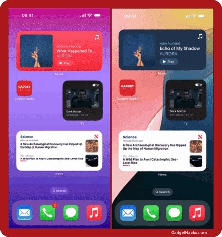
When you swipe to open the App Library on iOS 18, you’ll notice a new transition. On iOS 17, the App Library crossfades into the last Home Screen page, changing opacity over apps, widgets, folders, and the dock. On iOS 18, the App Library pushes the last Home Screen page offscreen.
9. There’s a Hidden Collection in App Library
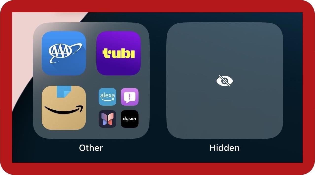
You’ll also find the new “Hidden” collection at the bottom of the App Library. Any third-party app or non-preinstalled Apple app you lock with Face ID, Touch ID, or passcode can be hidden from the Home Screen, Spotlight Search, and other locations, but you can find them all in the locked “Hidden” folder.
10. There Are New Widgets Available
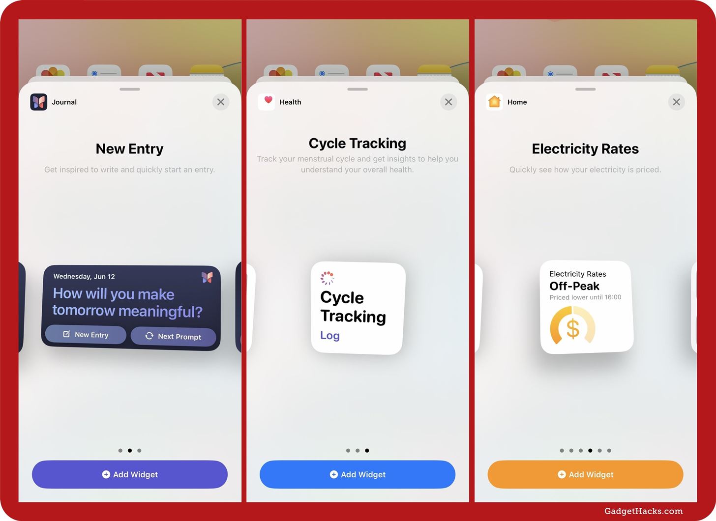
There are a few new widgets for your Home Screen. They include:
- Home widgets for Electricity Usage and Electricity Rates.
- Health widgets for Daily Vitals, Weekly Vitals, and Cycle Tracking.
- Journal widgets for New Entry and Streaks.
11. And Changes to Other Widgets
There are also a few updated widgets for your Home Screen. Changes include, but are not limited to:
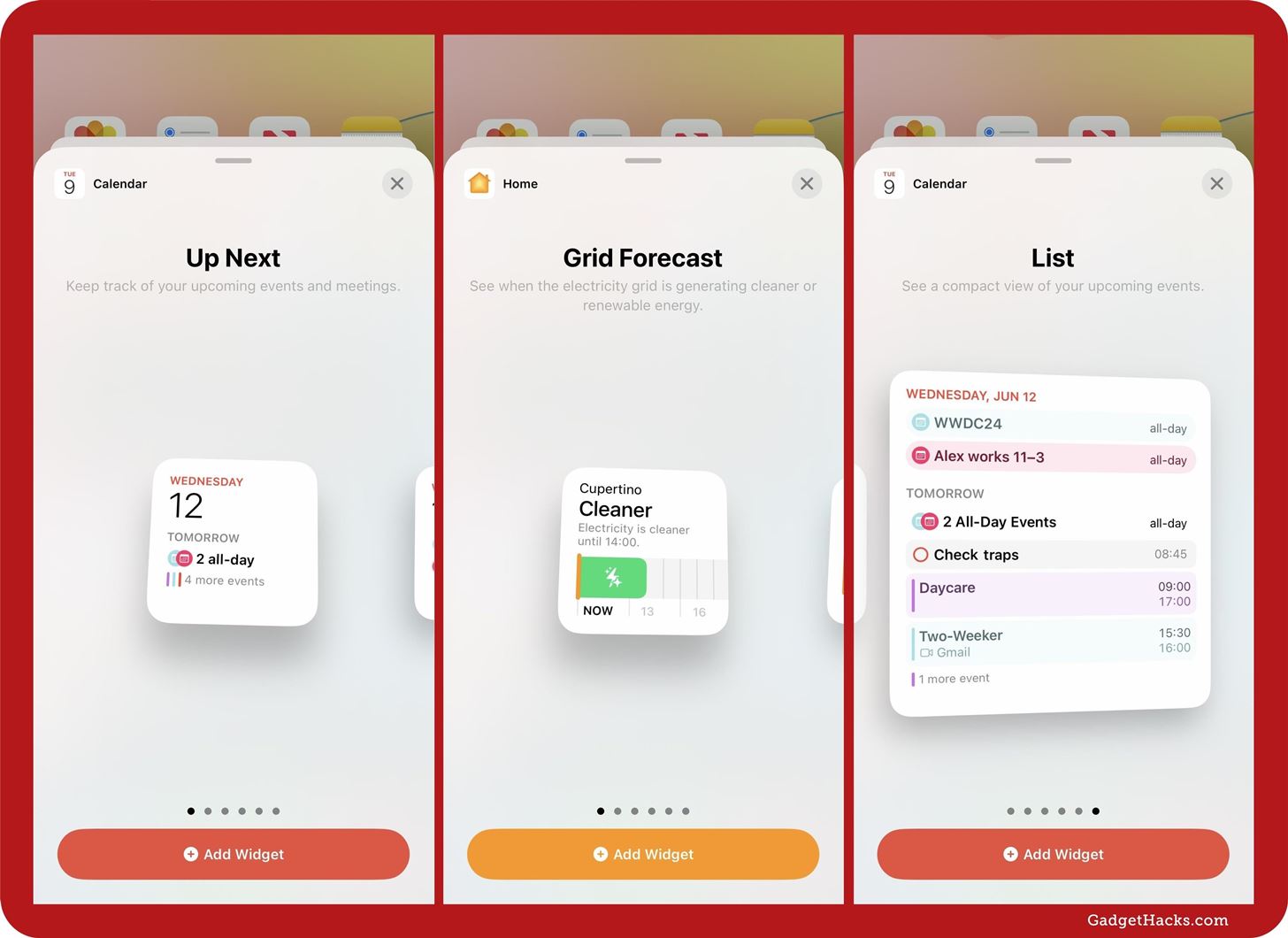
- Calendar widgets use calendar icons instead of lines to distinguish different calendars.
- Calendar widgets also highlight events with the calendar’s color instead of just having a colored line beside it.
- Calendar widgets now incorporate scheduled tasks in Reminders.
- Home widgets for Grid Forecast have a new lightning bolt symbol on the green bar.
- Maps widgets show a larger area of the map.
12. New Home Screen Icon
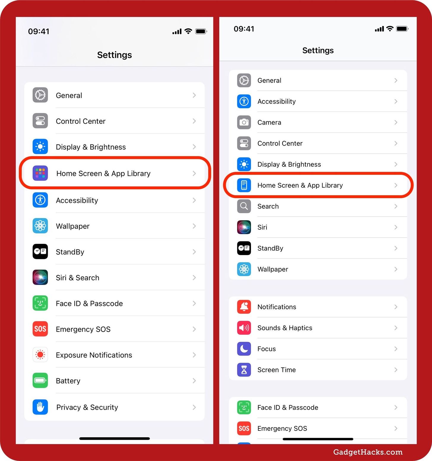
The “Home Screen & App Library” icon has changed in the Settings app. On iOS 17 and iPadOS 17, it’s a purple icon with nine app icons in a grid. On iOS 18 and iPadOS 18, that icon now belongs to the “Apps” menu in Settings, and the “Home Screen & App Library” icon is now a blue icon with an iPhone pictured, putting it in line with the icons for other preferences like “Accessibility” and “Display & Brightness.”
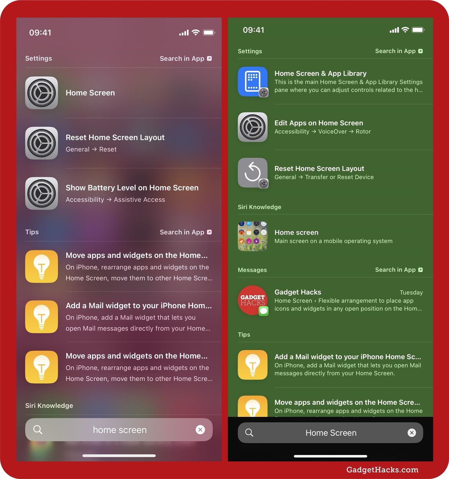
When you perform a Spotlight Search for “Home Screen,” you’ll see the same blue icon with the Settings app icon in the corner on iOS and iPadOS 18, as opposed to just the Settings app icon on iOS and iPadOS 17.
Just updated your iPhone? You’ll find new features for TV, Messages, News, and Shortcuts, as well as important bug fixes and security patches. Find out what’s new and changed on your iPhone with the iOS 17.6 update.
“Hey there, just a heads-up: We’re part of the Amazon affiliate program, so when you buy through links on our site, we may earn a small commission. But don’t worry, it doesn’t cost you anything extra and helps us keep the lights on. Thanks for your support!”


