Spotify has caught up to Apple in monthly podcast listenership and is even forecast to surpass Apple soon, but Apple just made some serious changes to its Podcasts app for iOS and iPadOS that could keep Apple at the top.
Third-party podcast players still offer features that Apple Podcasts doesn’t, such as social interactions (Breaker), faster playback speeds (Overcast; Castbox), and mixed up-next queues (Castro), but Apple Podcasts in iOS 14.5, released April 26, still manages to excite with almost 20 new features and changes.
Some of these new or updated app items are big while others are smaller details, but they all make Podcasts something worth coming back to if you left it on your iPhone for another app.
Feature 1: Premium Podcasts & Content
Perhaps the biggest change to Podcasts is that creators can offer monthly or annual paid subscriptions to their premium content from the new Apple Podcasters Program. Paid subscriptions, which can have free trials and sample episodes, may include an entire series, specific shows, individual episodes, early access, archives access, or bonus content for free episodes. You could also simply pay for freemium content, primarily an ad-free version of a show to skip all the advertisements.
Apple said that these subscriptions would become available in over 170 countries and regions starting sometime in May, and it should work in iOS 14.5, iPadOS 14.5, and macOS 11.3 or later. Up to six family members can access subscriptions for each podcast via Family Sharing.
Feature 2: Your Profile Photo in Listen Now
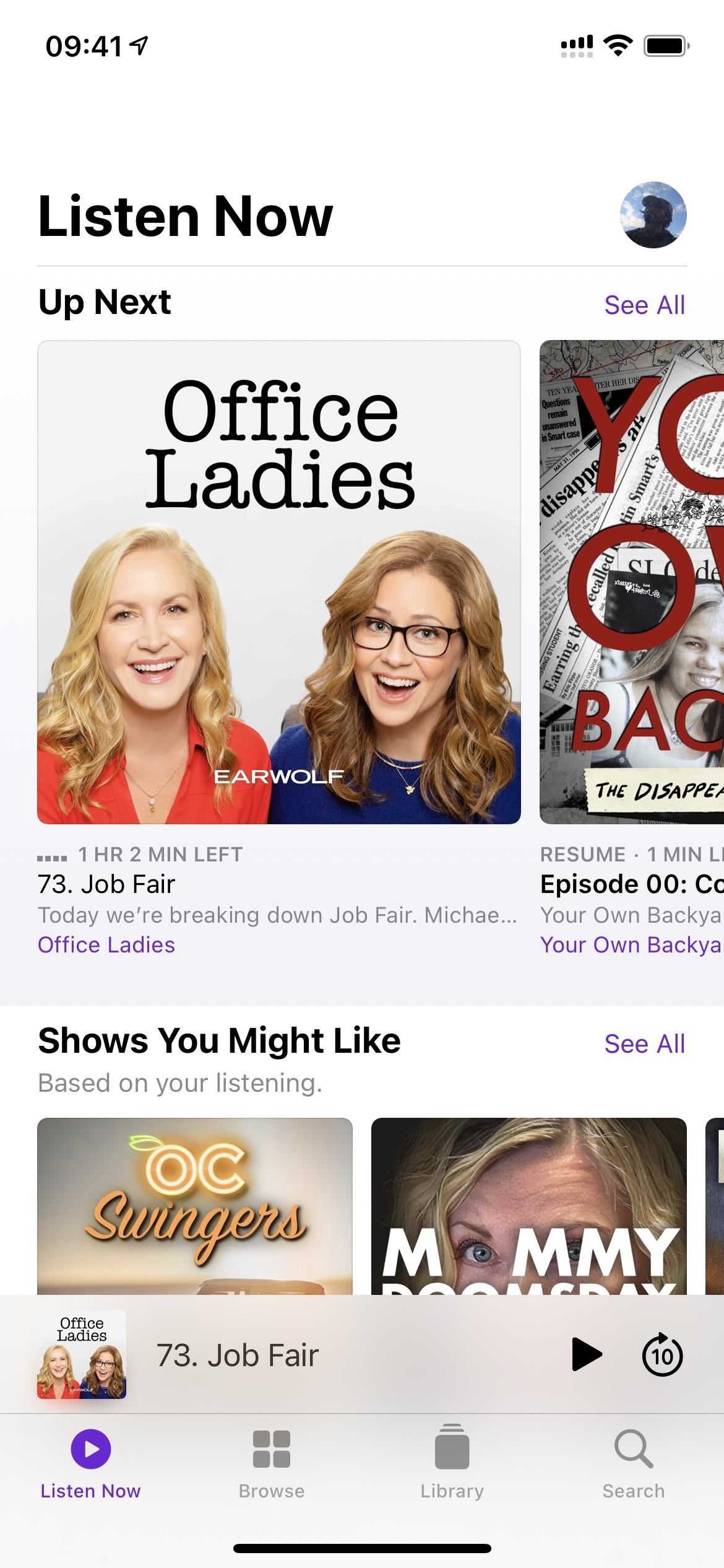
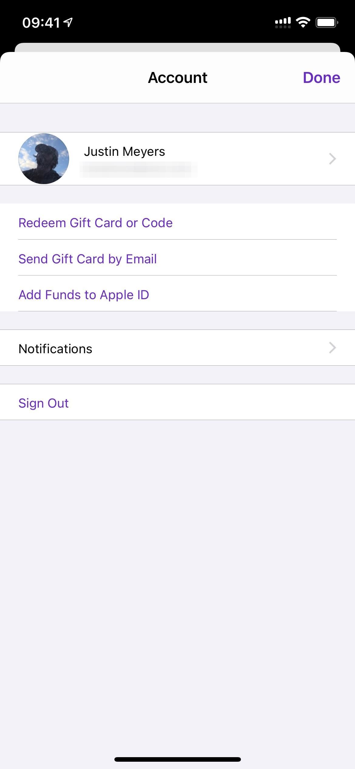
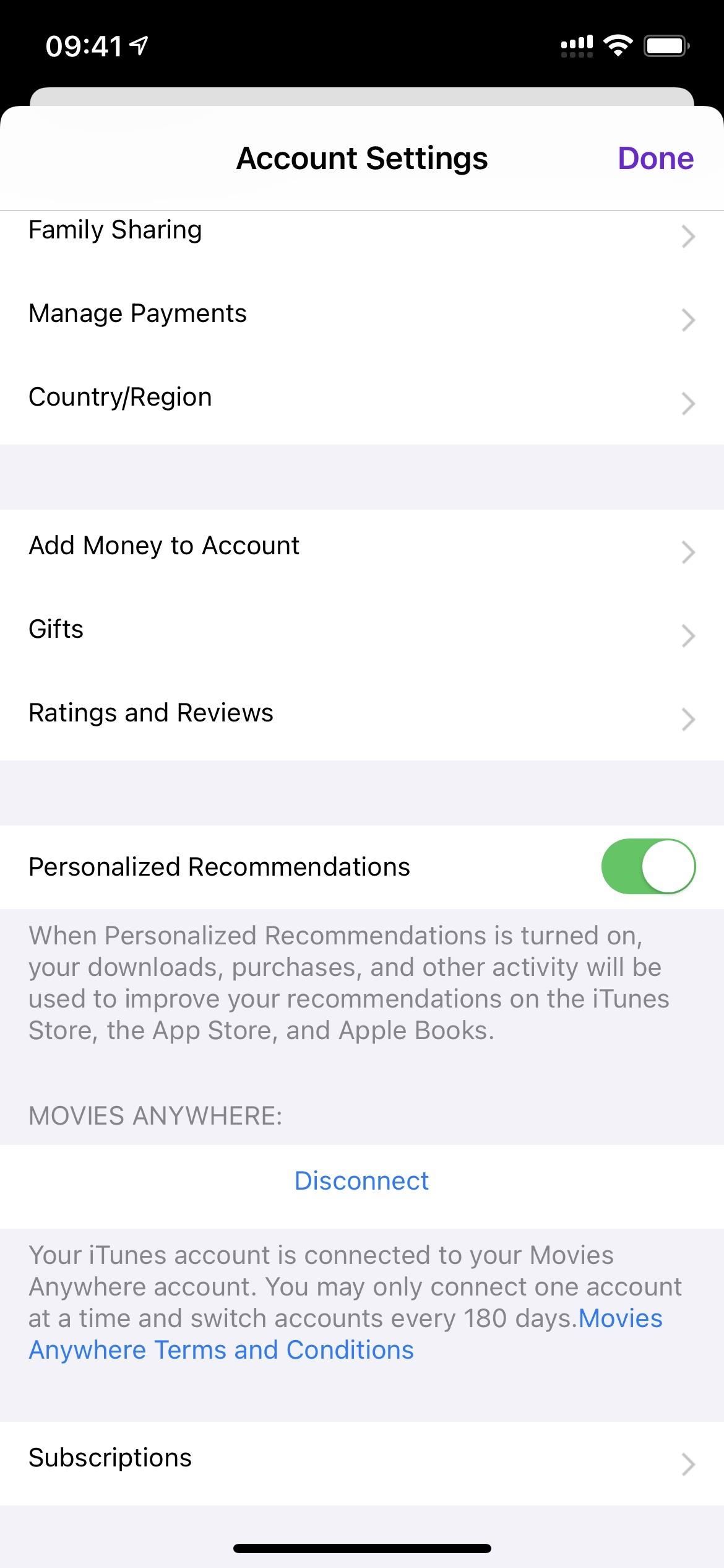
To give you control over your podcast subscriptions, Apple has swapped out the notifications icon on the Listen Now tab with an icon of your Apple ID profile photo. Tap that, and you’ll see that the settings for “Notifications” are still there, but now there are shortcuts to adding funds to your Apple ID, sending gift cards to people, and redeeming gift cards or codes.
You can also tap your name up top to view your Apple ID account settings, including information for Family Sharing, payments, subscriptions, and more. Tap on “Subscriptions,” and you’ll see all of your active podcast subscriptions you can manage.
Feature 3: Follow Shows Instead of Subscribe
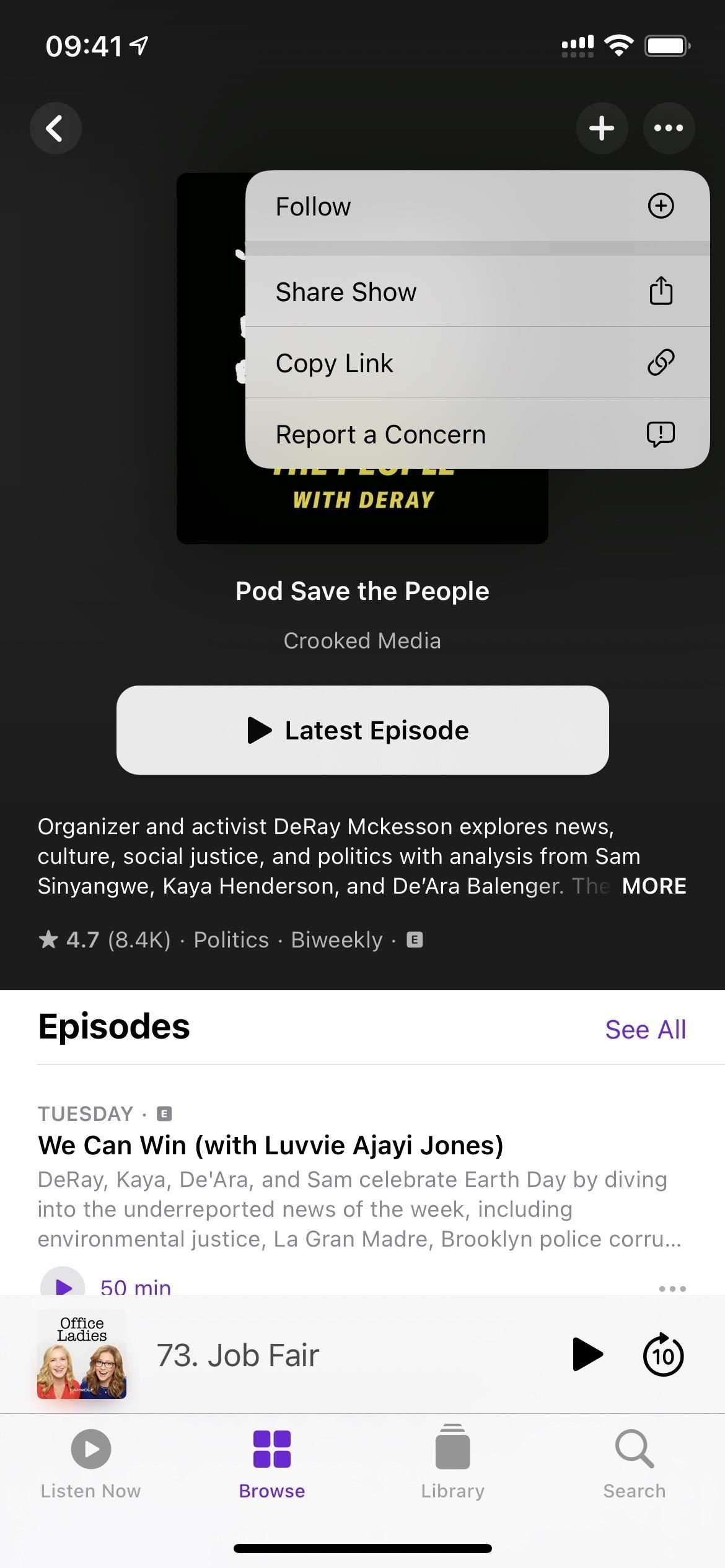
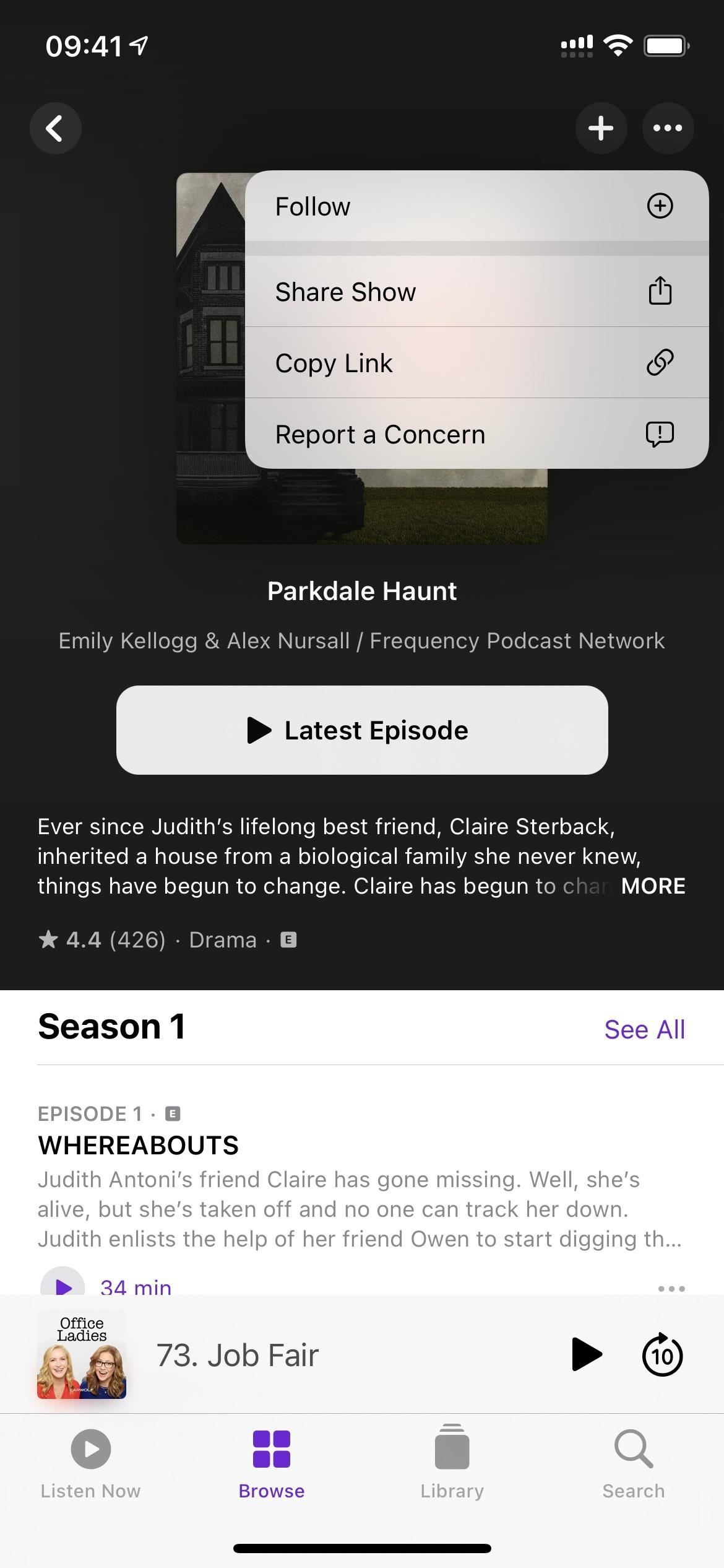
It’s always been about “subscribing” to podcasts in the Podcasts app, but now that there’s a new paid subscription model, things would be really confusing if Apple kept this terminology around for free content. So all over the app, wherever “Subscribe” used to be, you’ll now see “Follow” (or icons for it).
Feature 4: Creator-Curated Channels
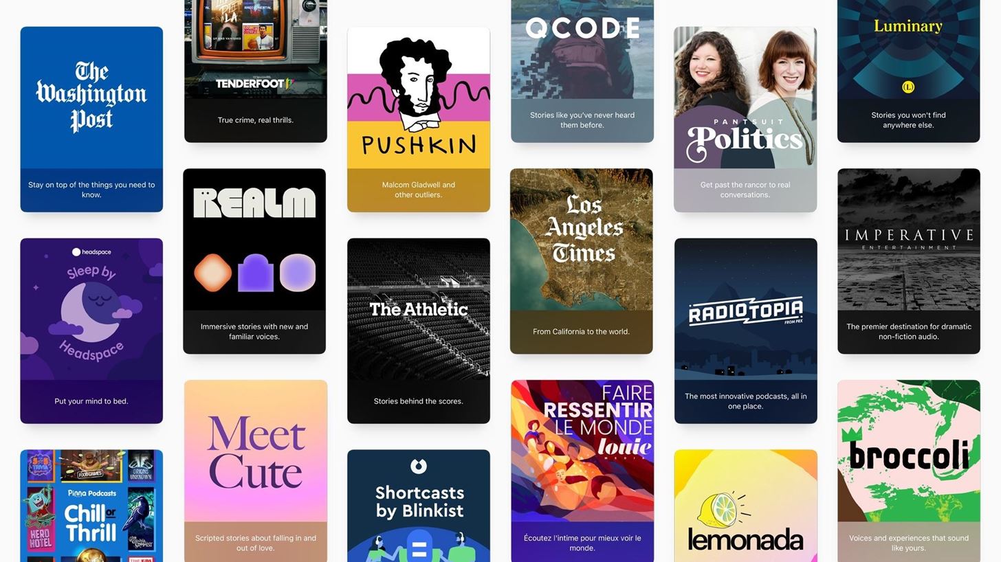
Not only is there now access to premium and freemium content in Podcasts, but Apple has doubled-down on finding ways to make you subscribe and pay — and that brings us to channels. Don’t confuse these with any of those curated collections you may see when browsing. Instead, these are, according to Apple, “groups of shows curated by creators with unique titles, descriptions, and artwork.”
Just as they can with shows, listeners will be able to browse free channels, which make it easy to find more shows from their favorite creators, as well as paid channels and channels that provide additional benefits for subscribers.
You read that right: these creator-curated discovery channels can be all free, or they can be partially free or a paid subscription just like shows can be. For example, if The Washington Post decided to make half of its shows premium-level content, instead of paying separately for each podcast you like, it may offer you a subscription to all of the shows at a lower price.
Feature 5: A More Useful Search Tab
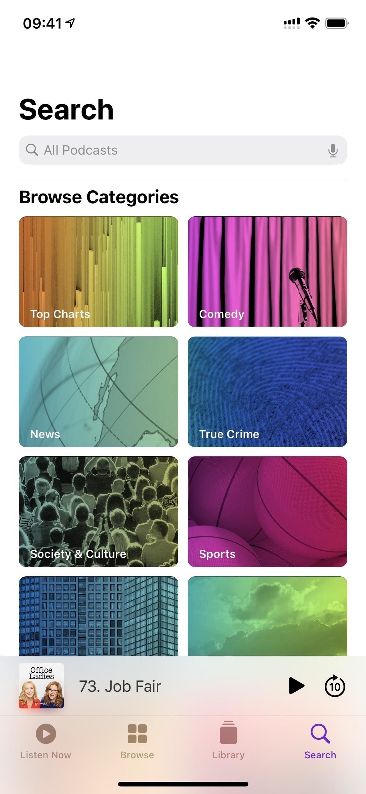
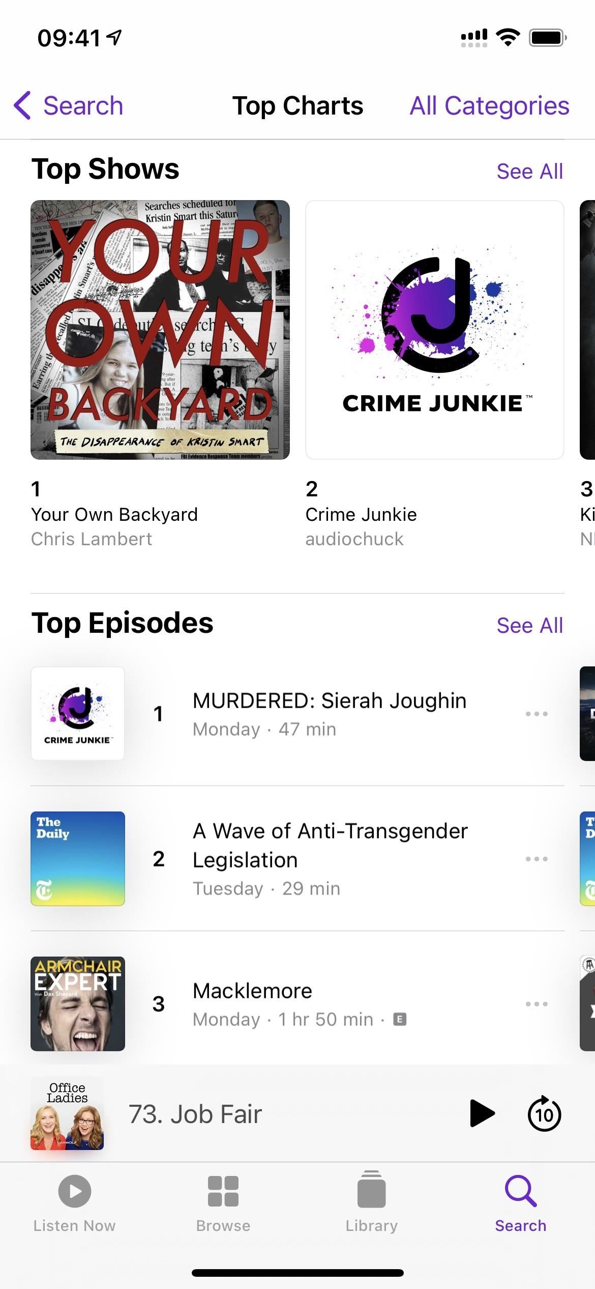
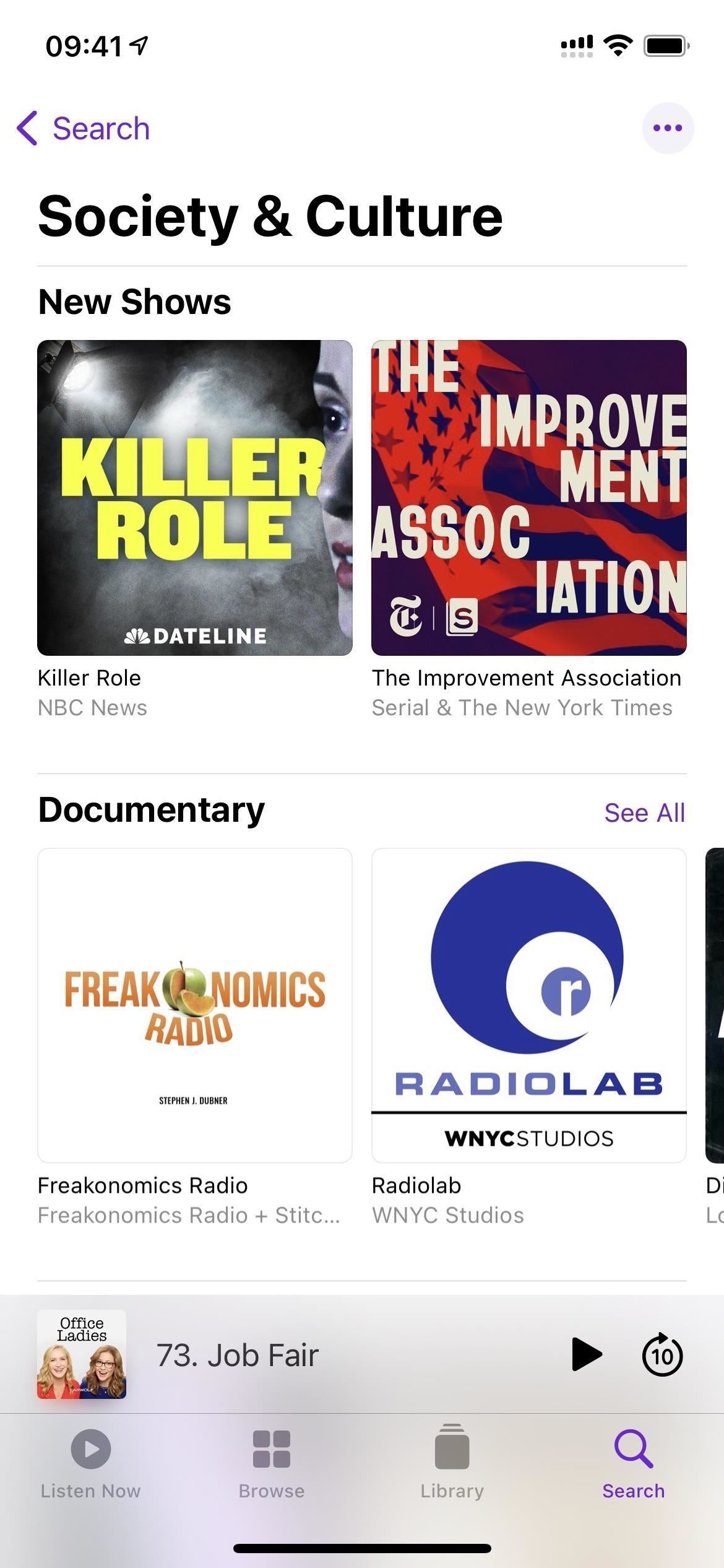
If you subscribe to Apple Music, you’re probably well aware the Music app received a major update to its Search tab in iOS 14, which now houses cards for genres, categories, and top charts. It was a much-welcomed design change to help you browse through content you might have searched for manually. Well, Apple just copied that formula for its Podcasts app, so there’s quick access to Top Charts and categories in Search.
Feature 6: A Better-Looking User Interface
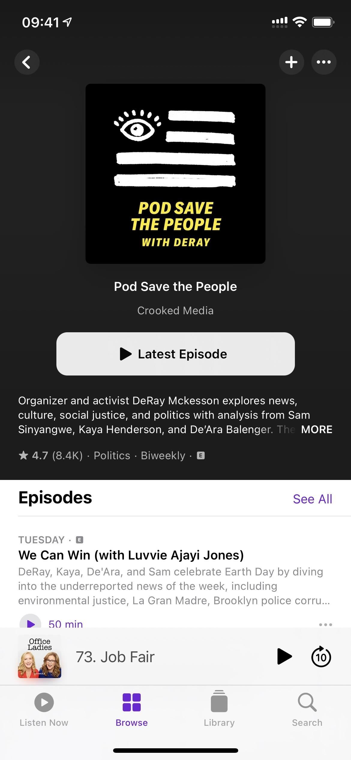
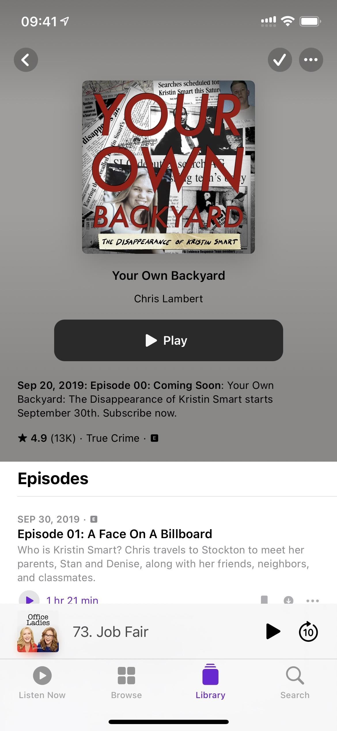
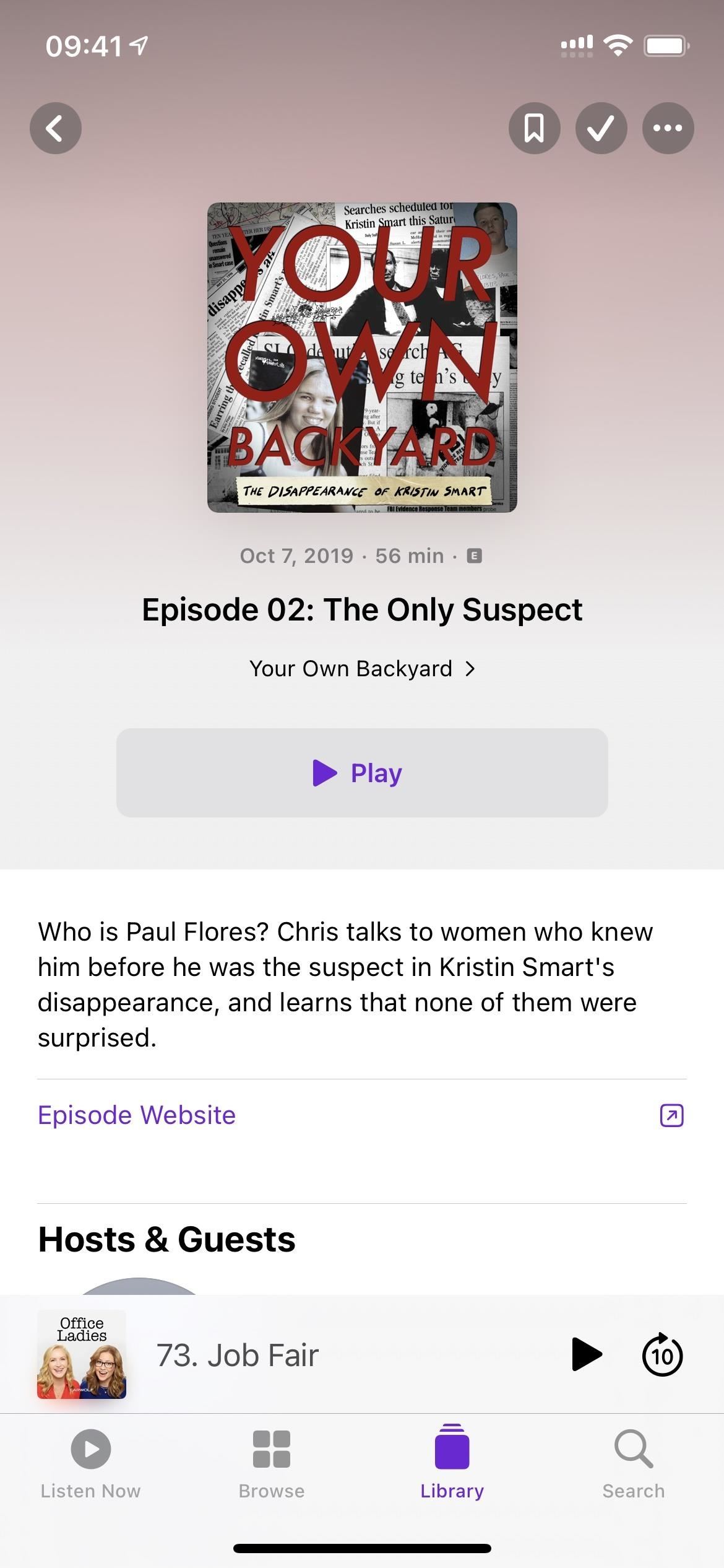
When you first open up Podcasts, you won’t notice any updated UI changes right away. The Listen Now, Browse, and Library tabs all look the same, but you’ll immediately see the UI’s new facelift when you open a show or episode page. Apple has stated that the new pages make it easier to follow, listen, and share shows and episodes. You’ll see some of the following changes:
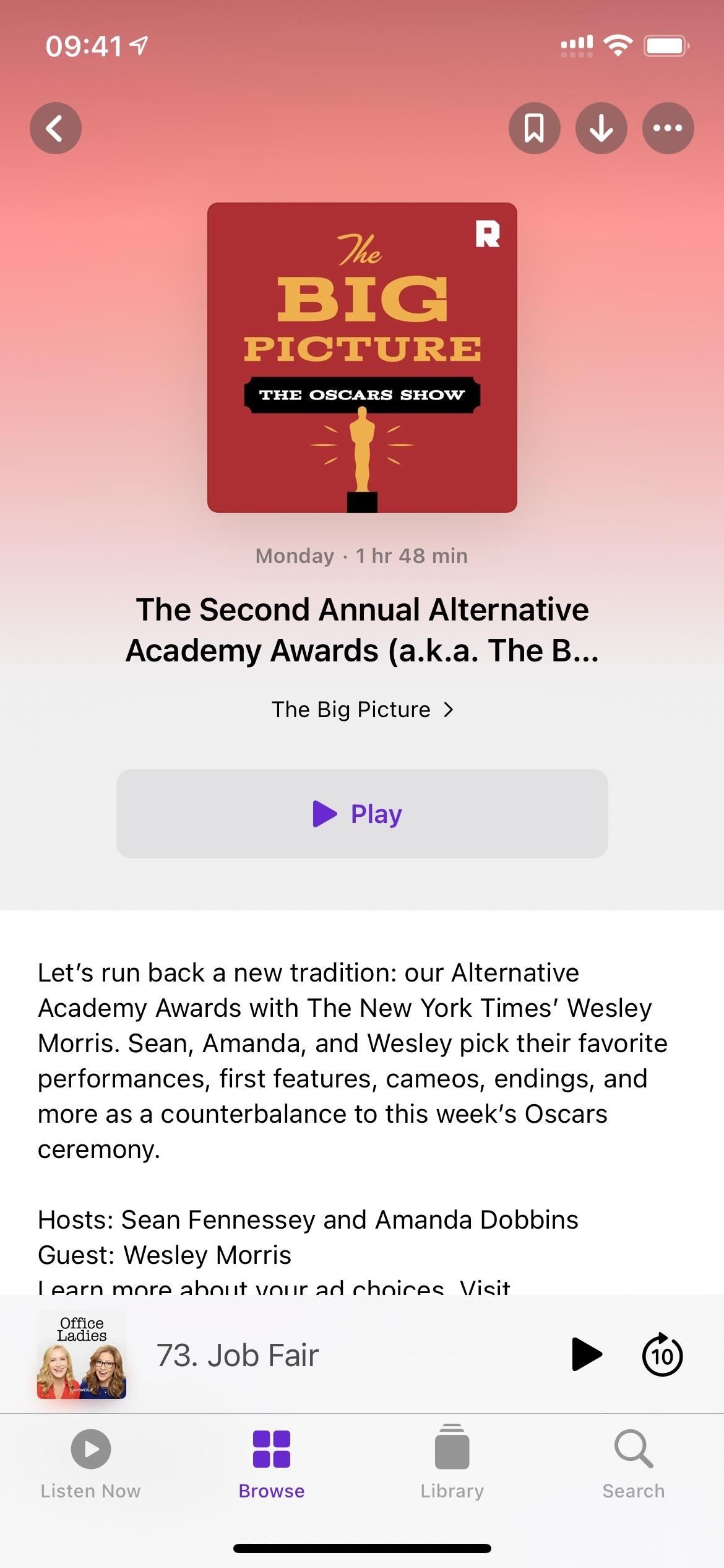
- The back button shows only the left-facing arrow and no text.
- The big subscribe button for shows has been moved to the top right as a mere plus (+) icon.
- The ellipsis (•••) menu has moved up slightly to the top right.
- The show’s artwork is larger and centered at the top instead of off to the left.
- The background for the show’s or episode’s details section complements the artwork’s colors instead of being just white or black (in light or dark mode, respectively).
- The name of the show and creator is now located just below the big artwork.
- The ratings and category on show pages moved to the bottom left, just above the episodes list but below the show’s description.
- An explicit [E] icon will appear next to the ratings and category now for the whole show instead of just on individual episodes.
- The trailer on show pages is under the episodes list now instead of in its own section.
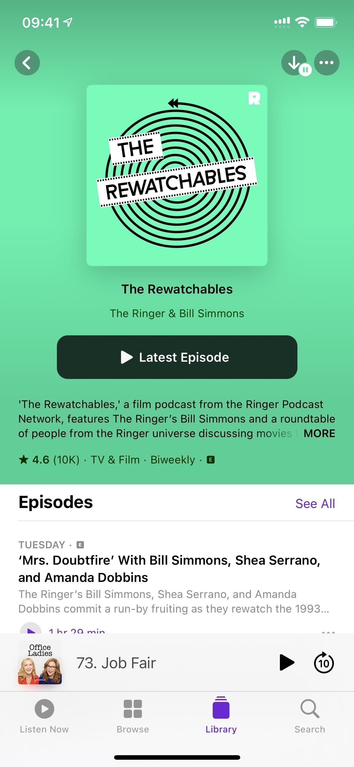
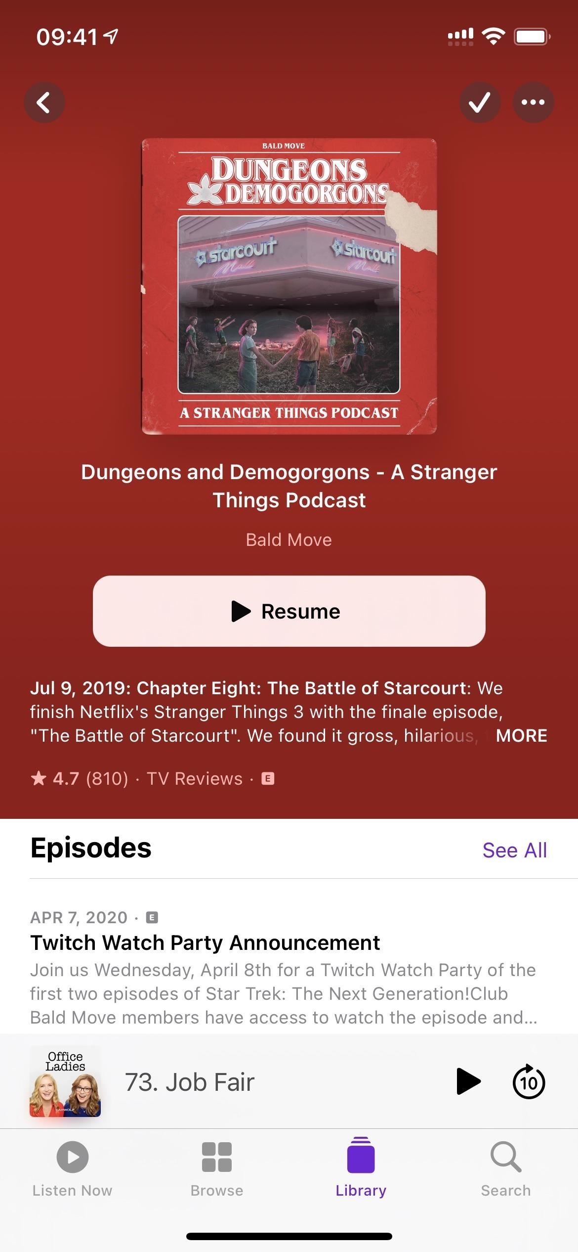
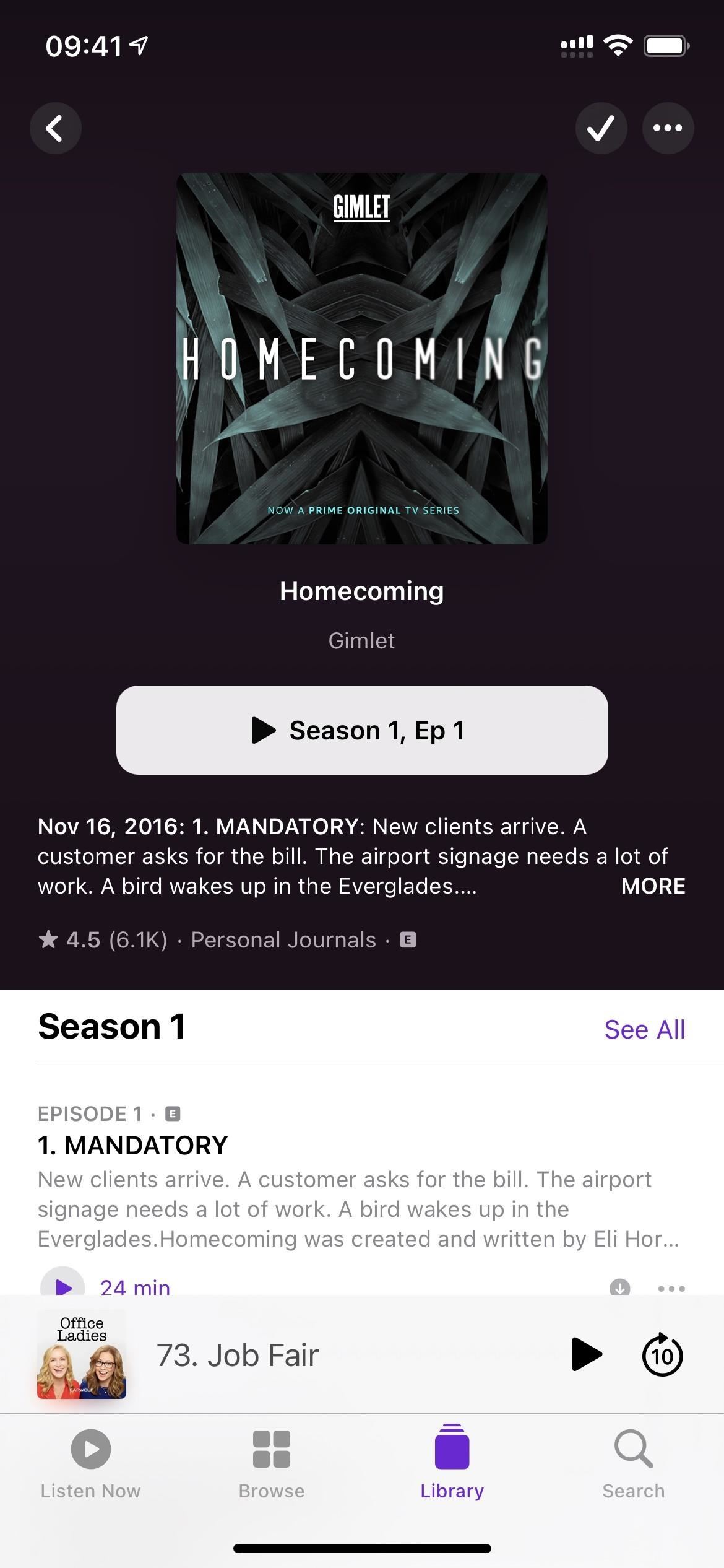
- There’s now a huge button to play the latest episode or resume playback (see Feature 7 below).
- There is no more Add to Library option, so you won’t see it anywhere as the plus (+) icon or an option in the quick actions.
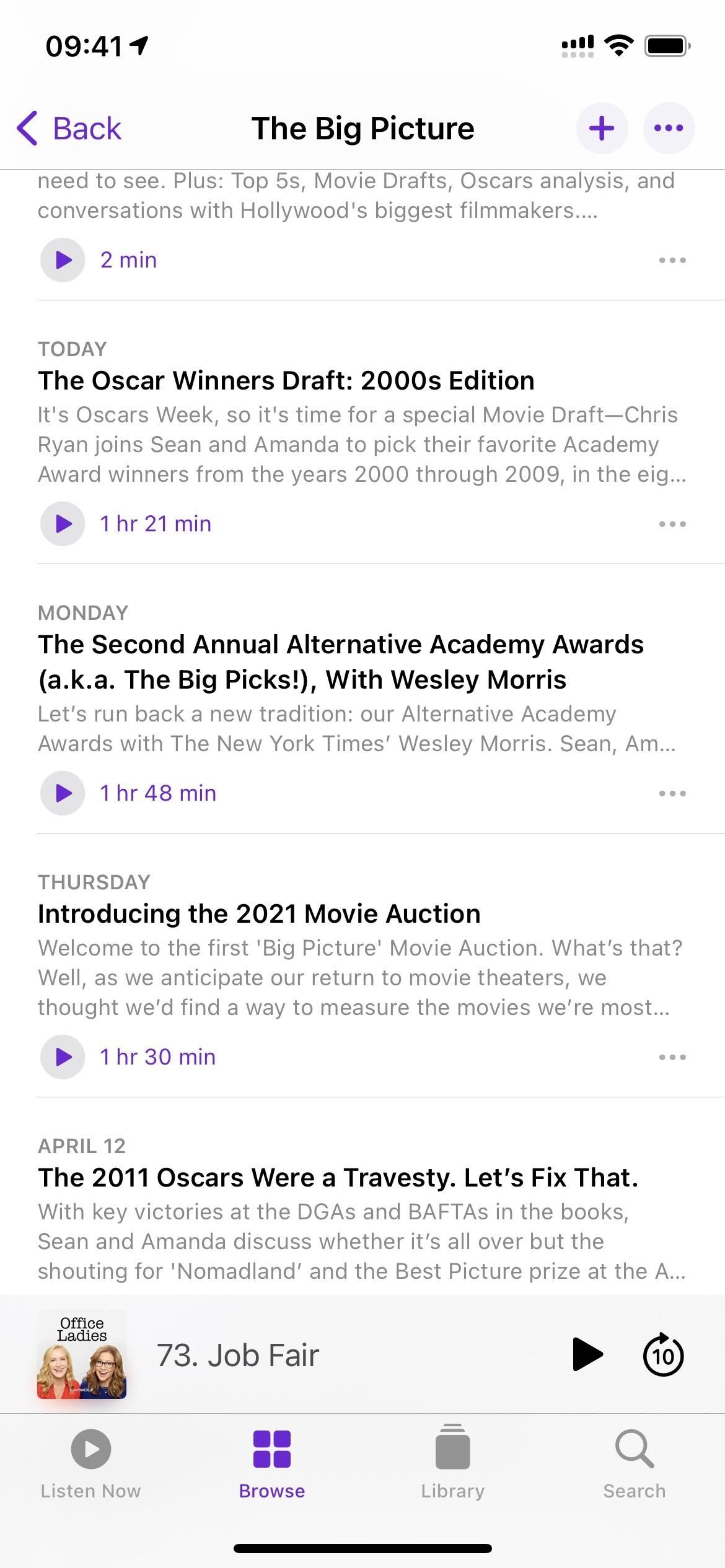
- The “Details” link has been swapped out with the play button and time on the episode list.
- Each episode in a list now has a little ellipsis (•••), which shows the same quick actions as when long-pressing the episode.
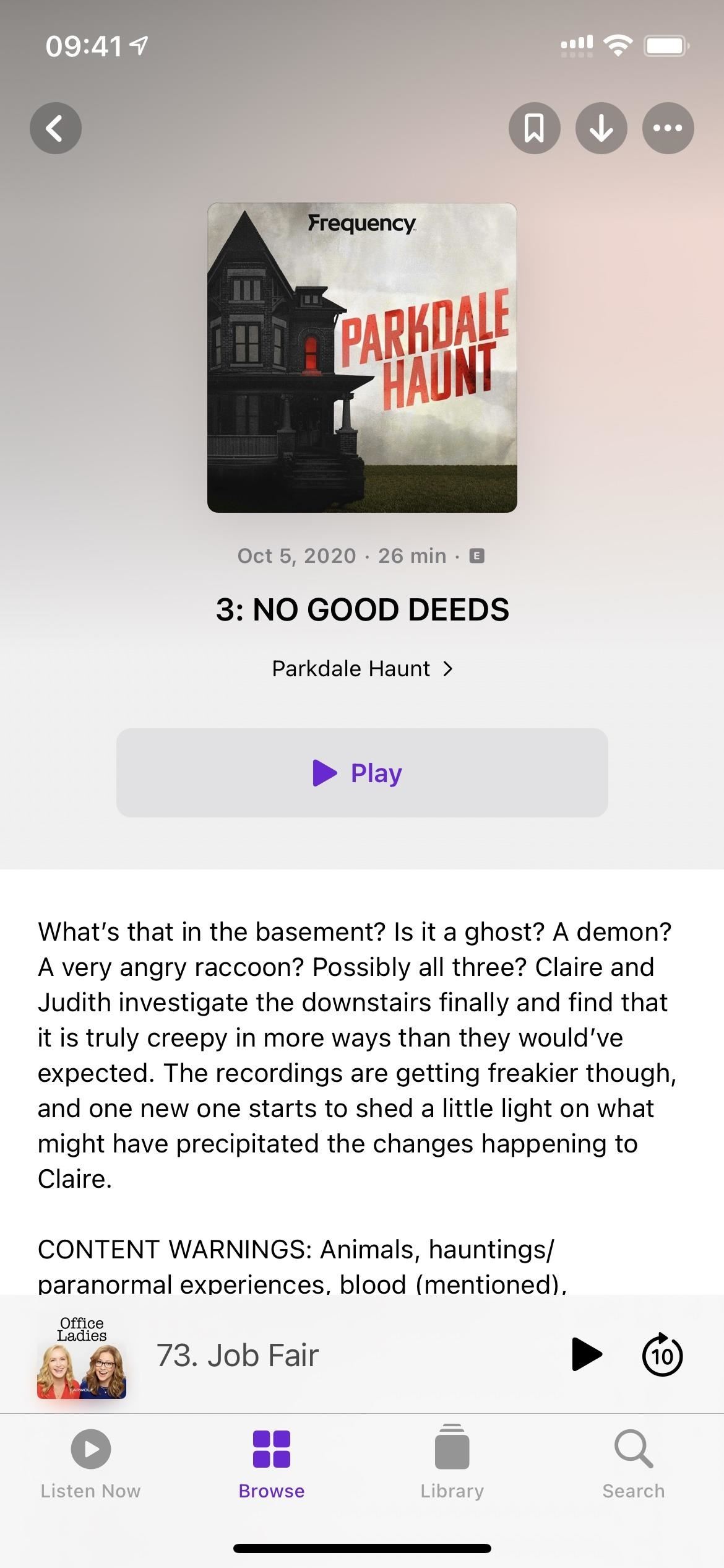
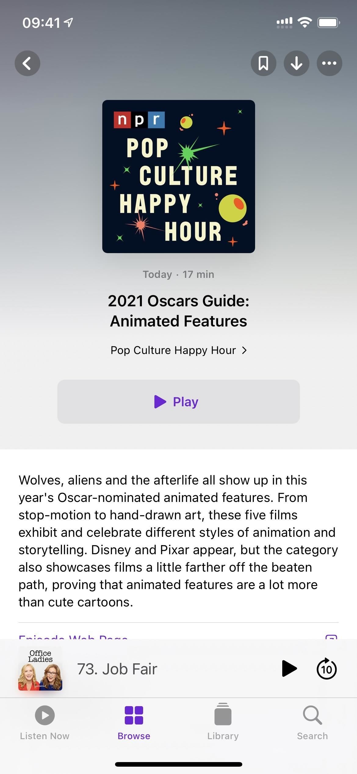
- There’s a new downloads button on episode pages, so you don’t have to add anything to your library before downloading content.
Feature 7: A New Smart Play Button
Since Apple made such a big deal about the new “Smart Play” button, it deserves its own section here. Before iOS 14.5, on a show page, you would see “Subscribe.” Now you’ll see something like “Latest Episode” or “Season 2, Ep 1.” As Apple put it, “The new Smart Play button helps listeners automatically start episodic shows from the latest episode and serialized shows from the beginning of each series.” The button will also say “Resume” if you’ve already listened but haven’t finished an episode.
Feature 8: The Ellipsis Menu Takes Up Less Space
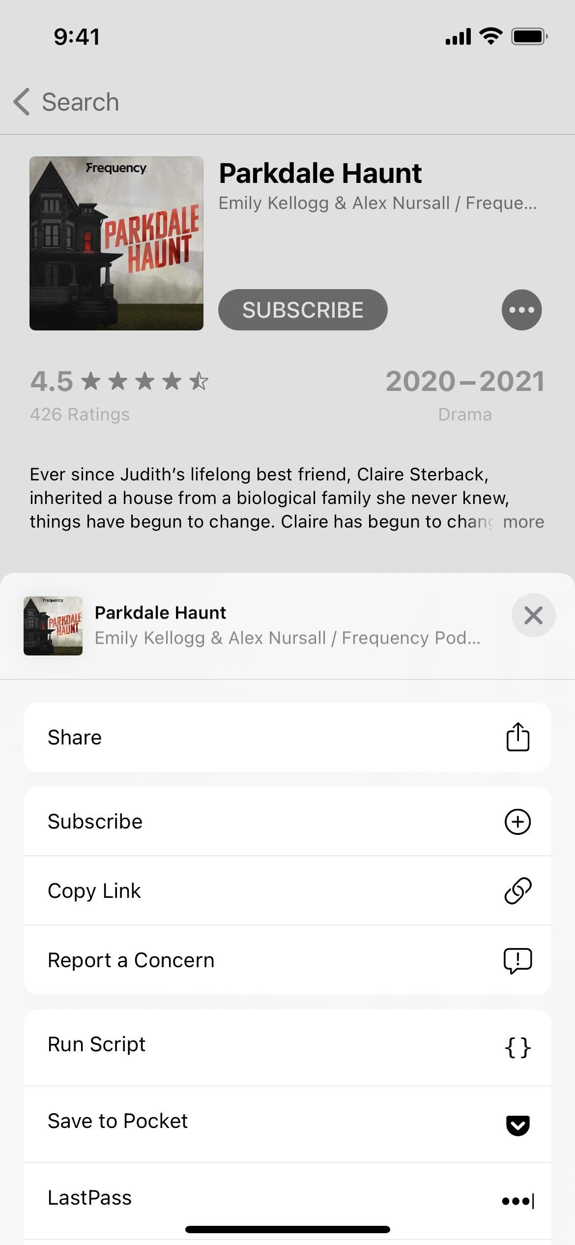
Before iOS 14.5, whenever you hit the ellipsis (•••) icon, the actions menu would cover the entire bottom half of the screen. Now, it’s a small contextual menu that overlays only a small portion of the screen, similar to how it’s done in other Apple apps in iOS 14.
Feature 9: Download Episodes with Quick Actions
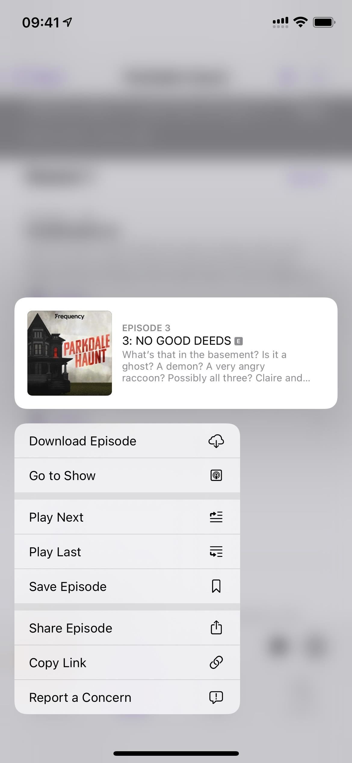
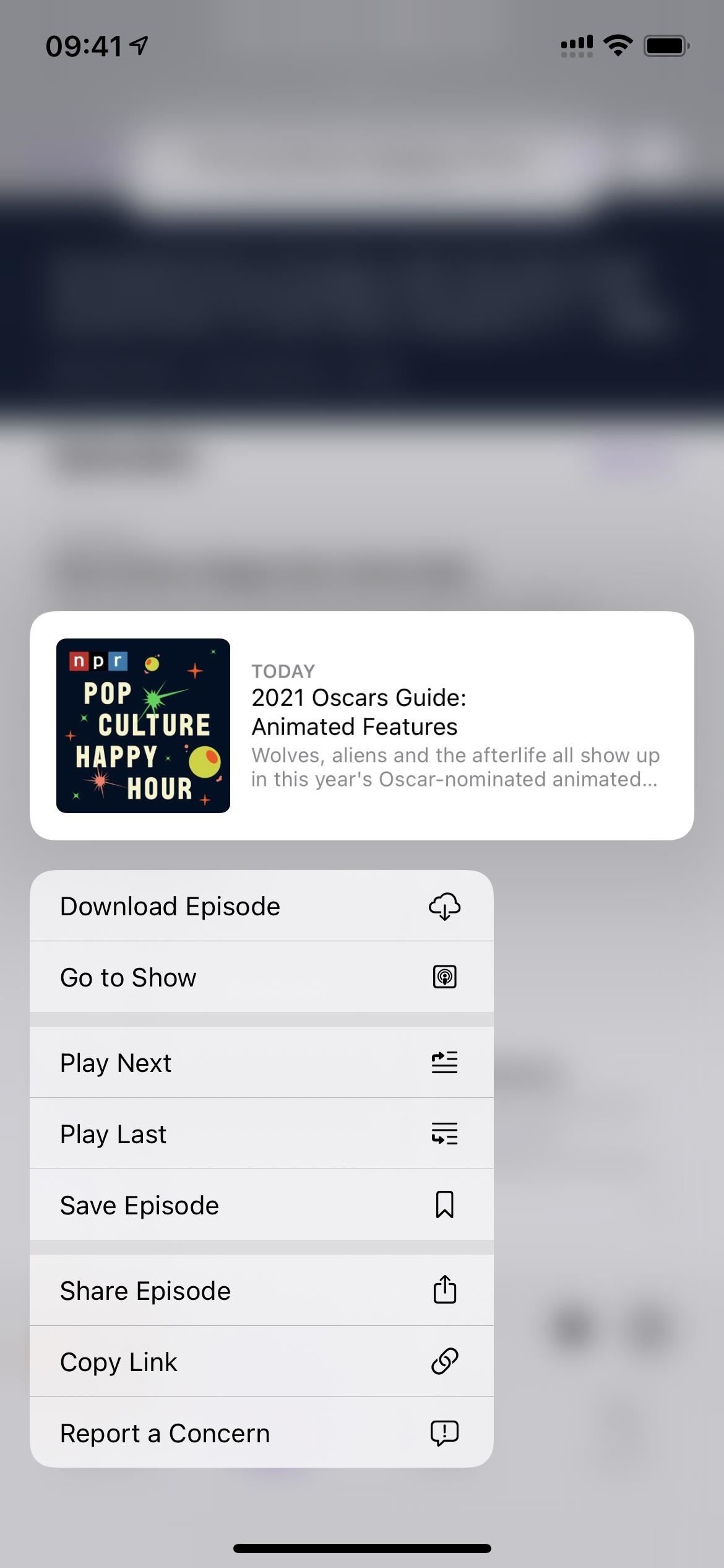
You could always download episodes before, but you had to add them to your library to get the iCloud download button to show up. Now, there’s not only a dedicated download button on an episode’s page, as mentioned above, but there’s a “Download Episode” option in the quick actions when you long-press on a listed episode. If the episode is already downloaded, it will appear as “Remove Download” instead. You can also access these quick actions via the ellipsis (•••) next to each episode.
Feature 10: Find Saved Episodes More Easily
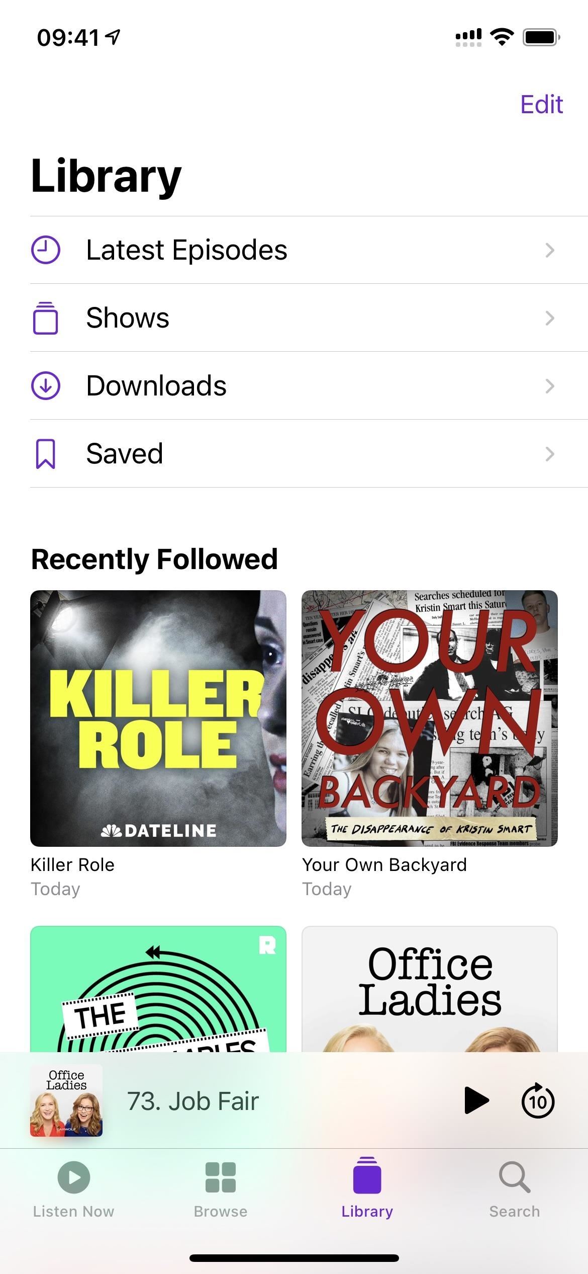
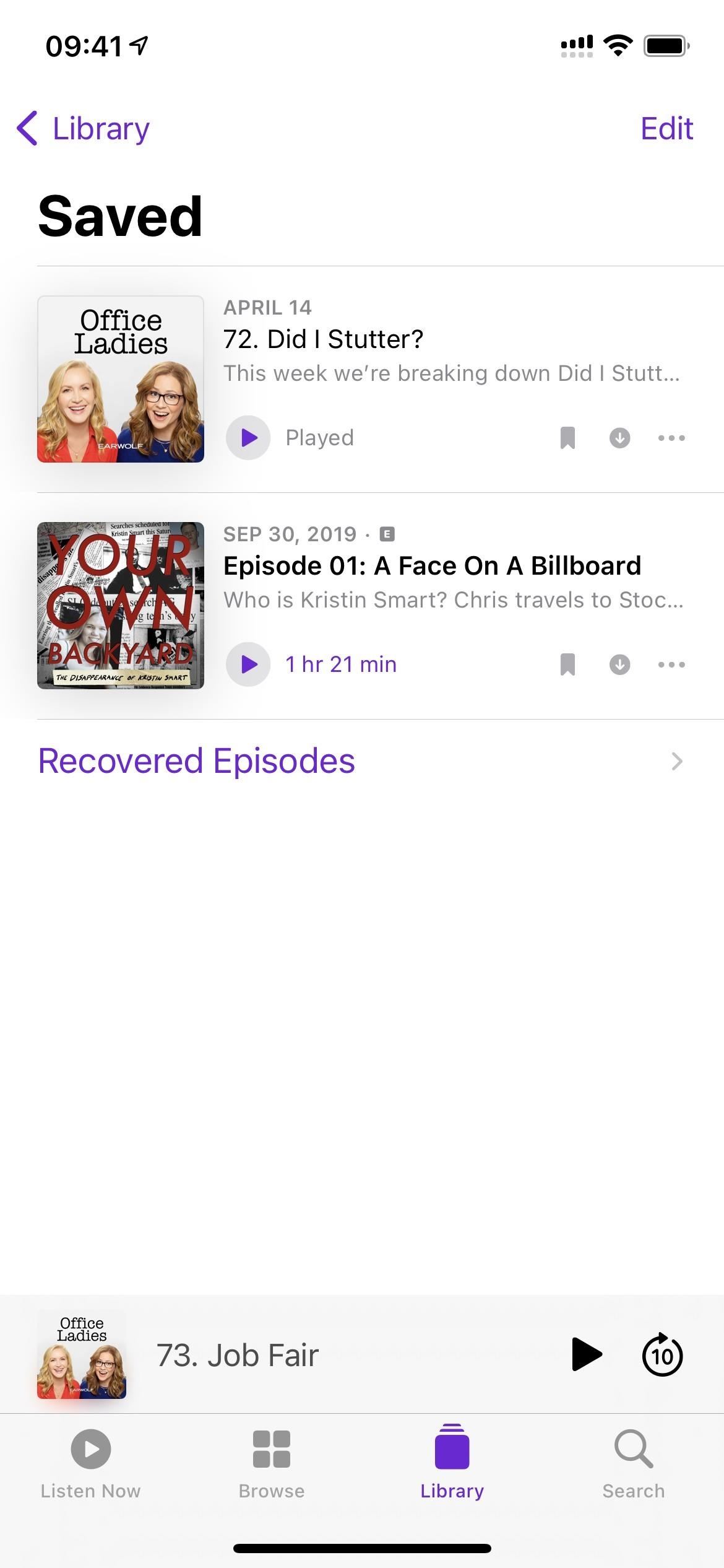
Also in the quick actions for each episode is “Save Episode.” Now, this has been in the quick actions for a while, but accessing your saved episodes could only be done from the show’s page prior to iOS 14.5. If you didn’t realize you bookmarked something, would you even know it was there?
This is all cleared up now that there’s a dedicated “Saved” collection in the Library tap. Apple states that saved episodes “are downloaded for offline playback, making it easy to bookmark podcasts to listen to later from Library.” However, in Podcasts’ settings, you can disable automatic downloads for saved content.
Feature 11: Dedicated Save Button on Episode Pages
Speaking of saving episodes, if you visit an episode’s page, you’ll see a new bookmark icon in the top right. Tap that to save the episode to the “Saved” list in Library. This makes things so much easier, considering you had to add episodes to your library or subscribe to the show for the save option to even appear in iOS 14.4.2 and older.
Feature 12: Stop Saved Shows from Auto-Downloading
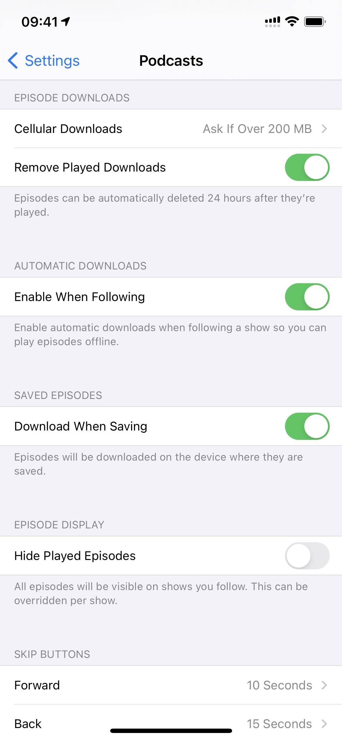
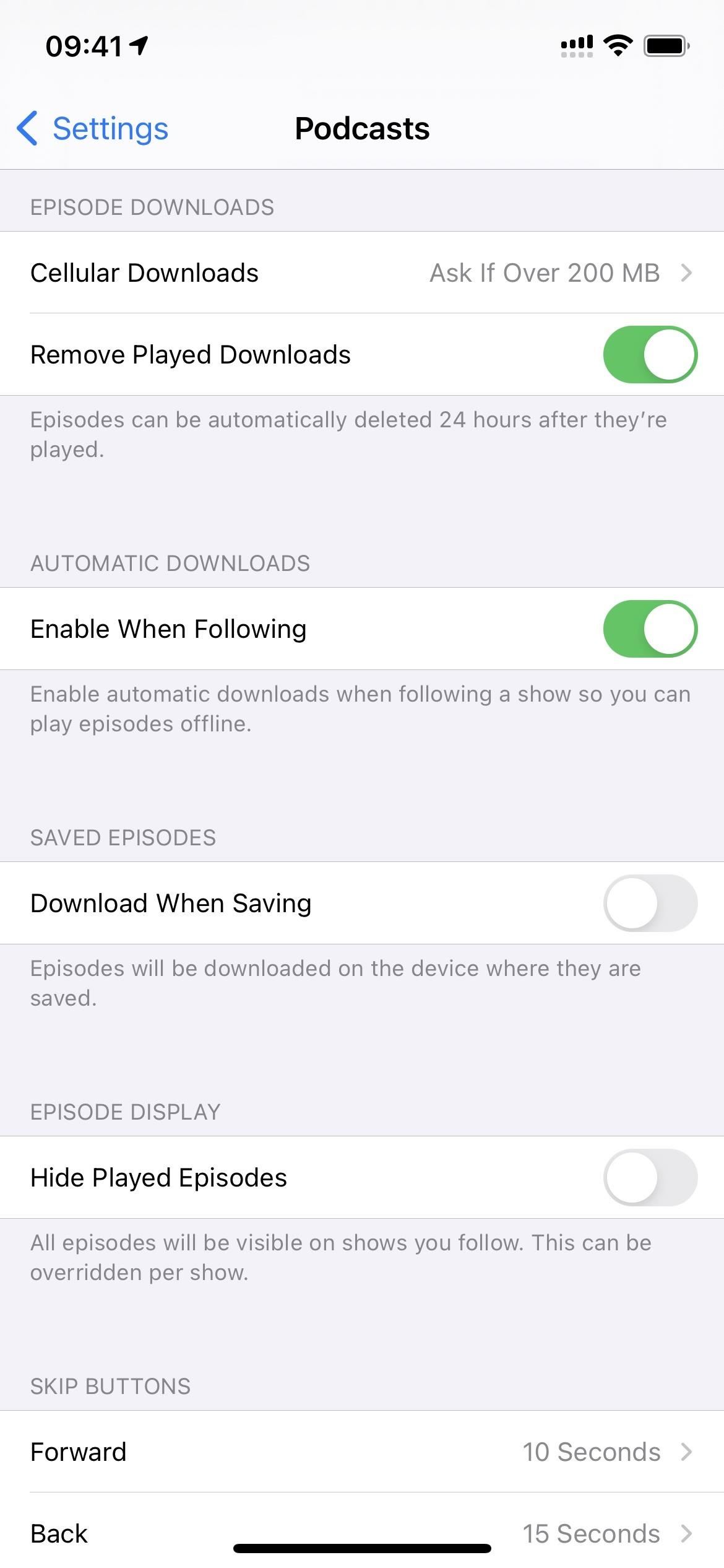
In previous iOS versions, whenever you saved an episode, it would download it automatically as long as you didn’t have “Download Episodes” in the Settings app set to “Off.” It would also affect regular episodes you may have wanted to auto-download if it was off, so it wasn’t a good option.
Now you have more control. In the Podcasts preferences in Settings, you can toggle off the new “Download When Saving” switch to stop it from downloading so you can manually do it yourself whenever needed. This switch is independent of the show settings, so it applies app-wide.
Feature 13: Tapping an Episode Won’t Auto-Play It
Before iOS 14.5, whenever you tapped on an episode in a list, it would start playing it automatically instead of just showing you the episode’s details. To get to the details, you had to tap the tiny “Details” button. I always got tripped up over that since I always assumed tapping the episode would show me more info. In iOS 14.5, Apple has flip-flopped those actions so that tapping an episode now will show you the details, and the tiny play button will play it.
Feature 14: More Swipe Gestures
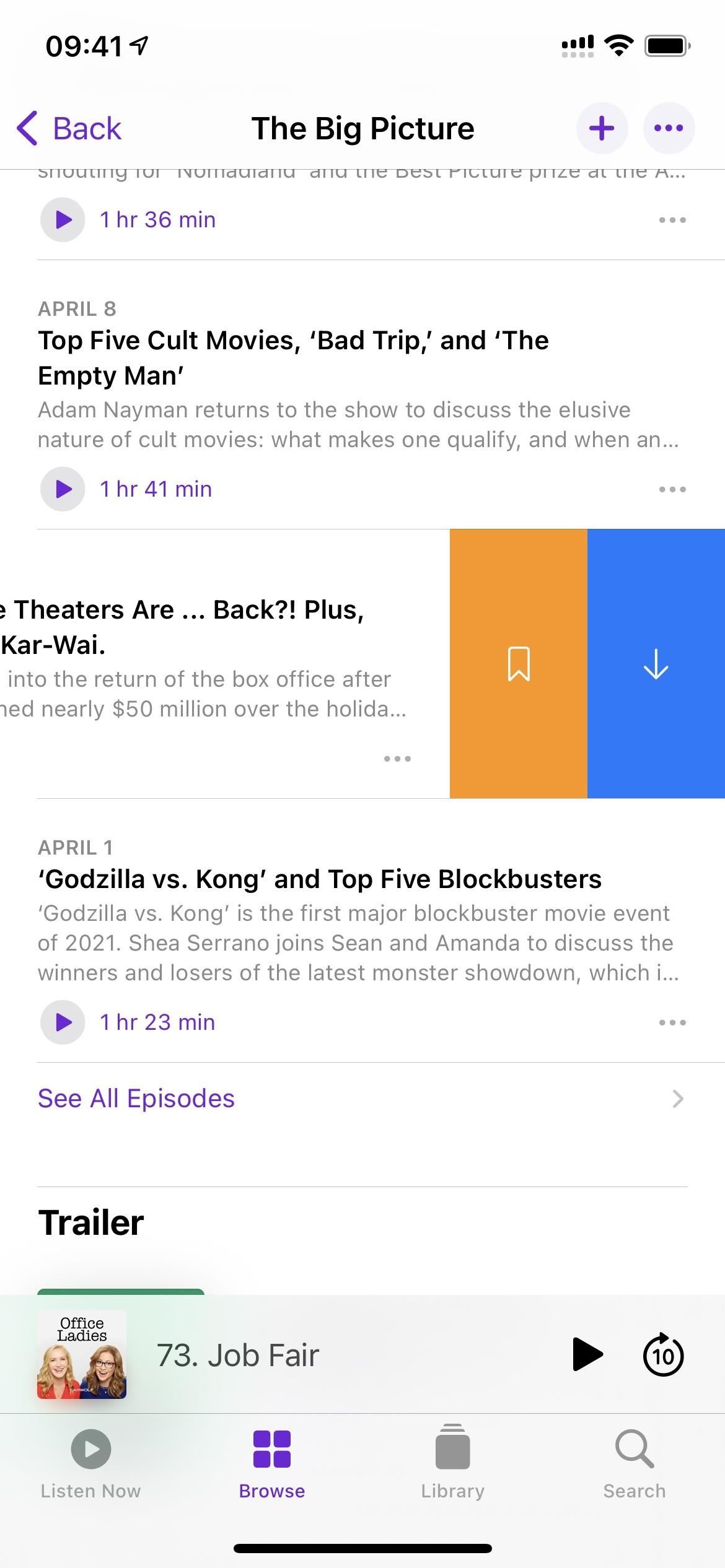
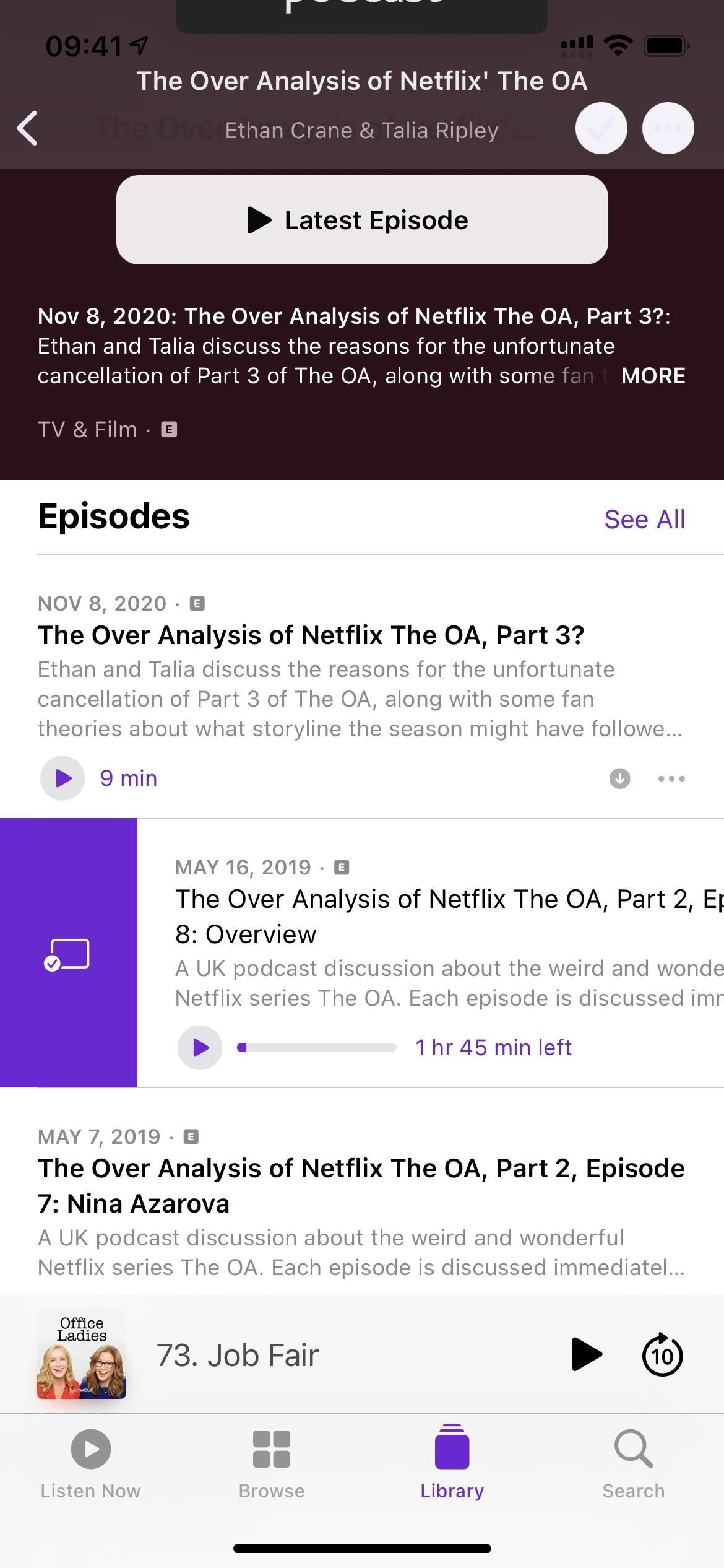
If you’ve never noticed swipe gestures for episodes before iOS 14.5, that’s because there weren’t any outside of your list of downloads (which itself had only one option to remove episodes). Now, if you swipe left on an episode in a list, you’ll uncover another way to “Save” an episode and download or delete it. Swipe right instead, and you’ll see a button for marking the episode as played or unplayed.
Feature 15: Show Settings Are a Little Different
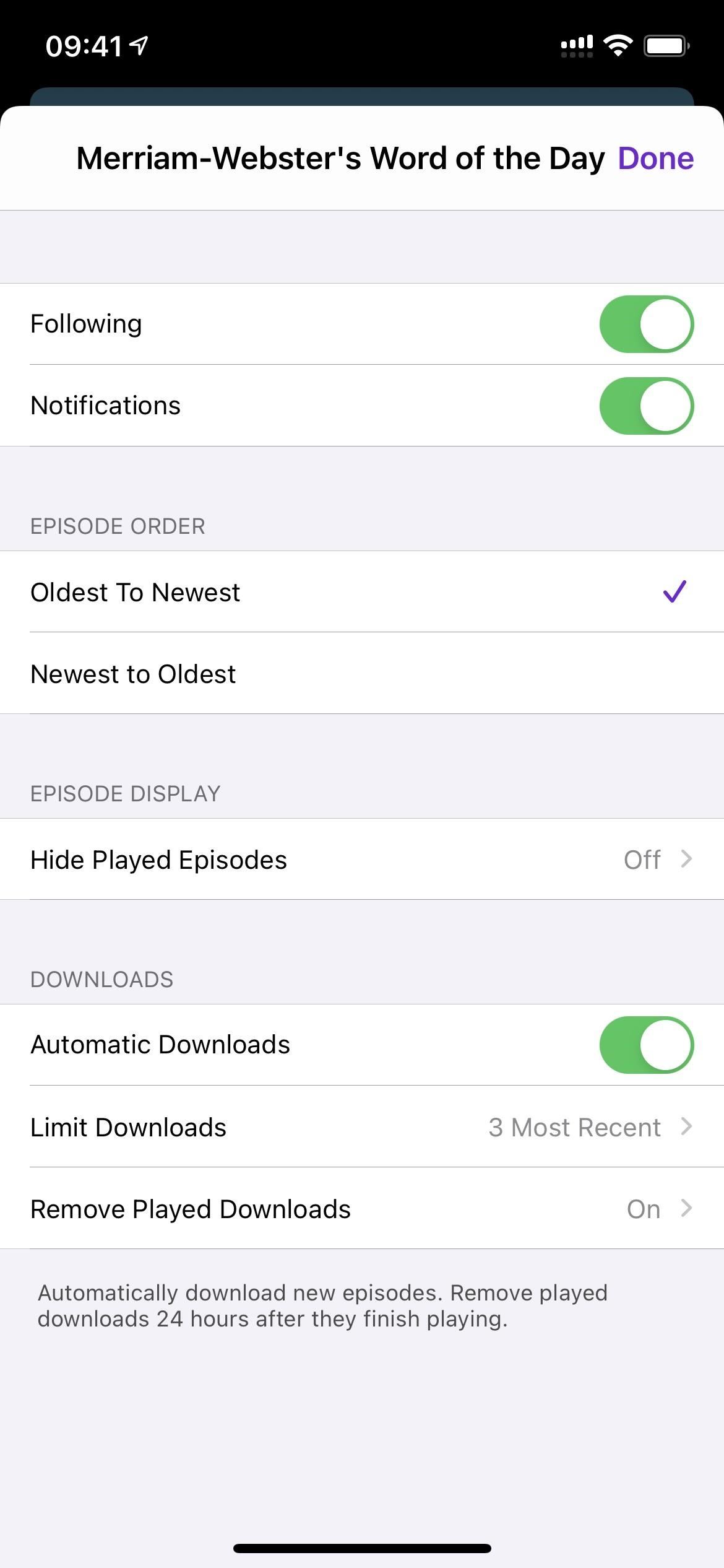
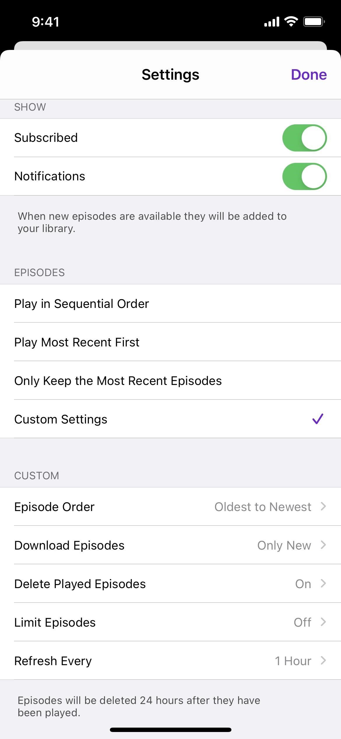
The settings available for each show have changed slightly. Instead of “Subscribed,” you’ll see “Following” above the “Notifications” toggle. The rest is where things get confusing. Before iOS 14.5, you had the following options for episodes:
- Play in Sequential Order
- Play Most Recent First
- Only Keep the Most Recent Episodes
- Custom Settings
That looks quite different than in 14.5, which has different sections for Episode Order, Episode Display, and Downloads. However, if you tapped “Custom Settings” before, you would see similar options for choosing the episode order, removing played downloads, and limiting downloads. The “Refresh Every” is now only an app-wide setting, not a per-show option.
Feature 16: Played Episodes Can Be Hidden/Unhidden
Seeing all the episodes you’ve played of a followed show can make things feel cluttered when all you want to do is check out the new stuff you haven’t listened to yet. That’s why Apple would remove all played episodes from a show’s list of recent episodes before iOS 14.5. However, not everyone liked those played episodes disappearing.
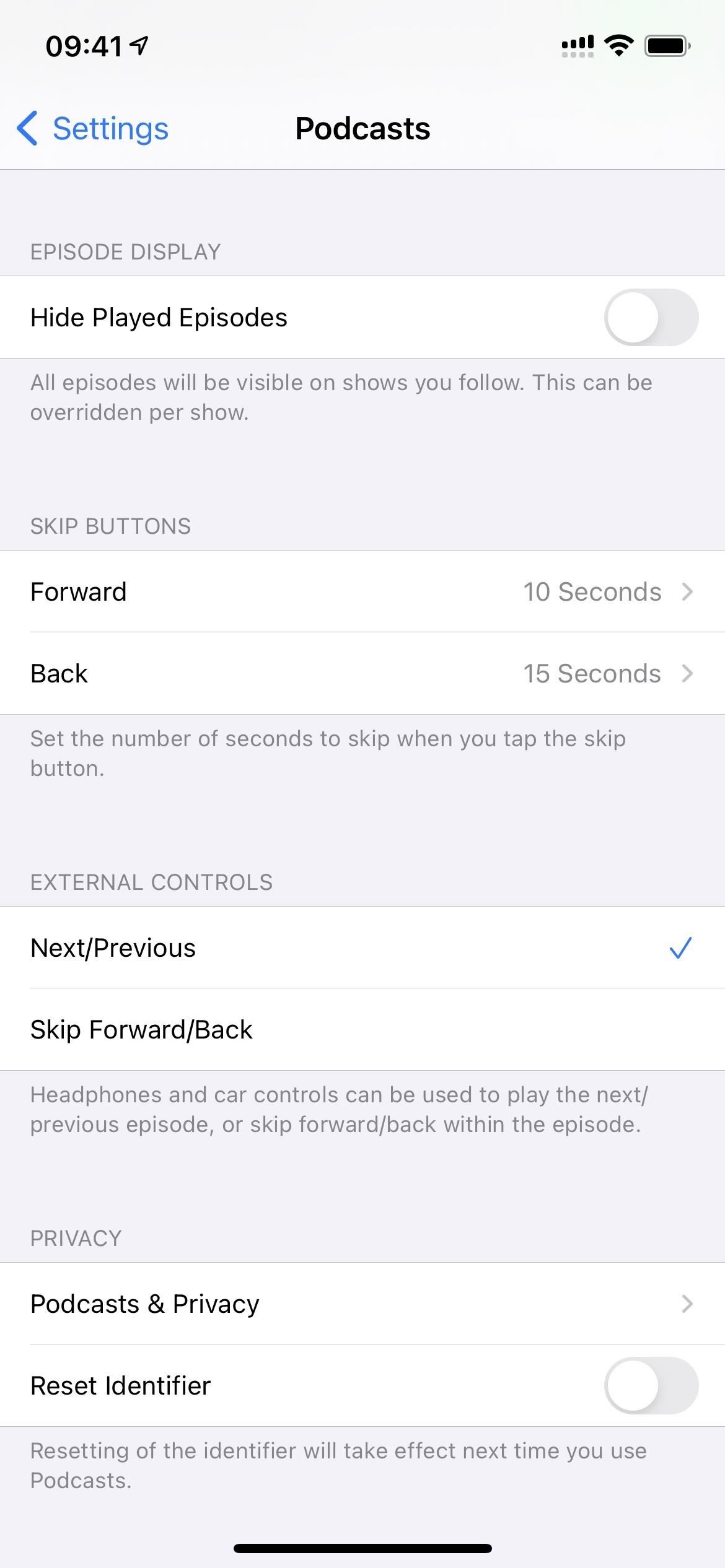
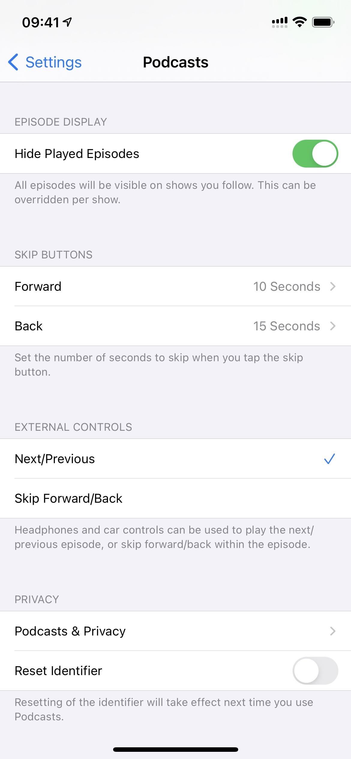
To fix that, episodes no longer hide by default in iOS 14.5. If you want them to, you have to opt-in either from Podcasts’ main settings or from the settings for individual shows. If you hide shows app-wide, the per-show settings can override your choice for that show.
There may be more features hiding within Apple Podcasts, and I’ll update this roundup if I find any. Until then, it’s worth noting that there’s a new Siri feature in iOS 14.5 that lets you train Siri into using the audio apps you want for certain audio files at specific times.
While it’s probably more useful for making Siri use music players such as Spotify, Deezer, Pandora, and YouTube Music over Apple Music, some of those apps can be used for Podcasts. It’ll also let you pick between any podcast player available in the App Store if Apple Podcasts still isn’t enough to impress you.
Just updated your iPhone? You’ll find new emoji, enhanced security, podcast transcripts, Apple Cash virtual numbers, and other useful features. There are even new additions hidden within Safari. Find out what’s new and changed on your iPhone with the iOS 17.4 update.
“Hey there, just a heads-up: We’re part of the Amazon affiliate program, so when you buy through links on our site, we may earn a small commission. But don’t worry, it doesn’t cost you anything extra and helps us keep the lights on. Thanks for your support!”


