GNOME 46: Does It Make the Switch to Linux Worth It?
Could GNOME 46 seal the deal on switching to Linux?
Quick Links
- Moving to Linux
- The GNOME Desktop Environment
- Files, Settings, and Software
- The GNOME Core Apps
- Other Improvements
- A Vibrant Desktop
Key Takeaways
- GNOME 46 brings user-friendly enhancements, including a new style of notifications, and a Today pane in the notification list.
- The GNOME Core Apps have received updates, improving functionality and performance.
- Linux newcomers transitioning from Windows should embrace the learning curve. Everything’s different, including the desktop environment, and that’s a good thing. But in the end, the final choice depends upon you.
Your choice of Linux desktop environment sets the tone for your Linux experience. What will Windows-savvy newcomers make of GNOME 46, the latest version of the (practically) default Linux graphical interface?
Moving to Linux
I’ve always been a little puzzled by Linux distributions that try to look a bit like Windows. I understand the strategy, and removing as much friction from the move to Linux makes good sense. But the benefits of having something similar to a start menu in the lower left corner, and a taskbar at the bottom of the desktop, are somewhat fleeting.
Scratch the surface and the real differences appear. The menu options and groupings have different names, the file system is completely different, application names are different, and the applications themselves can be nothing like their Windows counterparts. A passing similarity to the Windows desktop doesn’t reduce the need to commit to learning new ways of doing things.
When a user leaves Windows, it’s more important that their new desktop environment is stable with good functionality and performance, and looks and feels professional and polished.
And that’s why the GNOME desktop environment is so important.
The GNOME Desktop Environment
Of course, there are many Linux desktop environments, and they’re pretty much all available on any Linux distribution. Some distributions build themselves around their desktop, such as Linux Mint and Zorin OS. However, the default desktop environment in many distributions is GNOME. There’s a strong chance that a newcomer to Linux will find themselves using a GNOME desktop.
GNOME 46, code-named Kathmandu, was released on March 20th, 2024, bringing a long list of improvements and enhancements. Does it hold up to scrutiny, and what kind of impression does it give to someone familiar with Windows? We fired it up to check it out. We used Arch Linux because some distributions modify GNOME to put their own stamp on it, but Arch provides plain, unmodified GNOME.
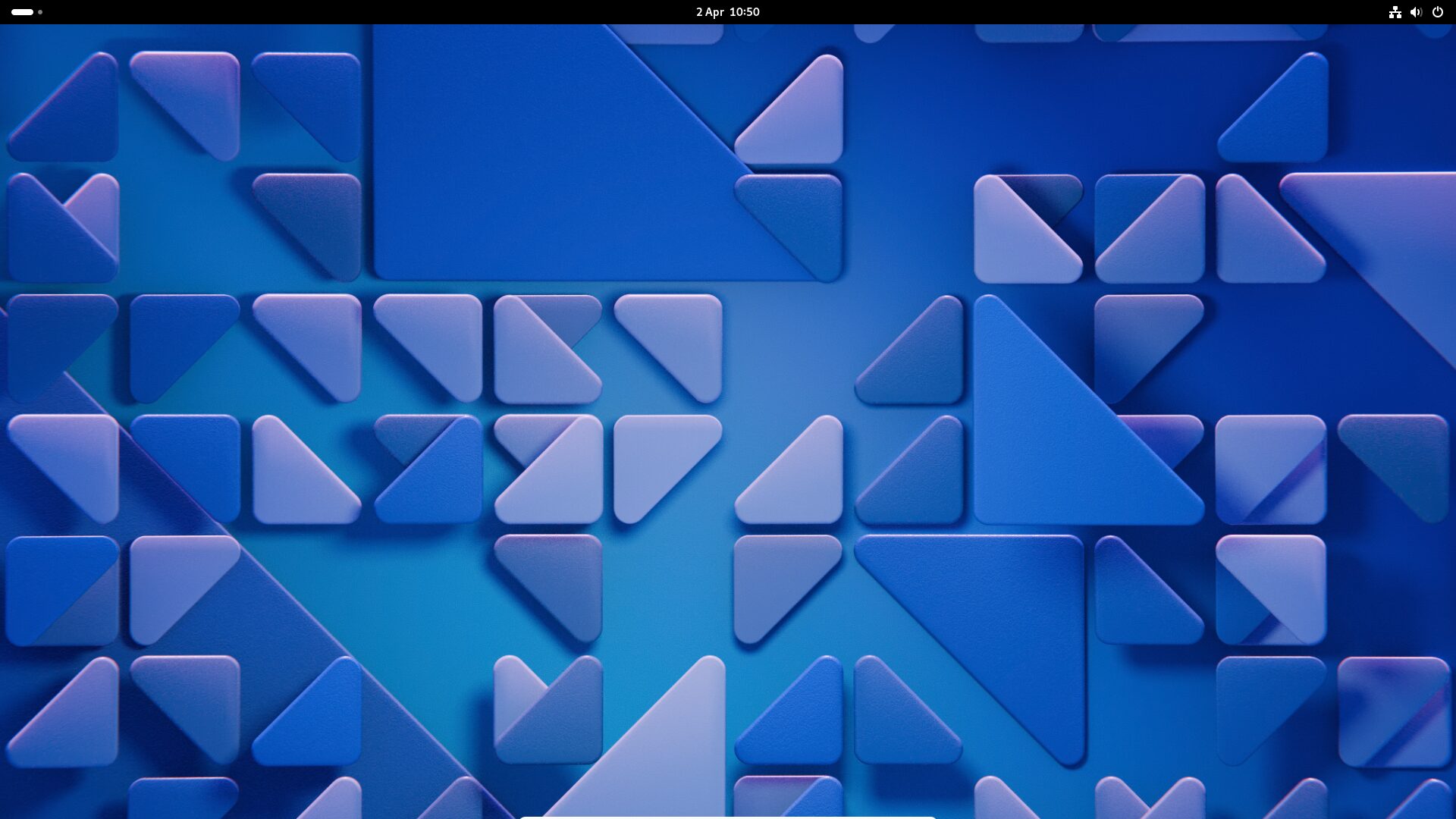
Once you’ve signed in, the desktop with its crisp default wallpaper appears. It looks modern and professional and sets a nice tone. First impressions count.
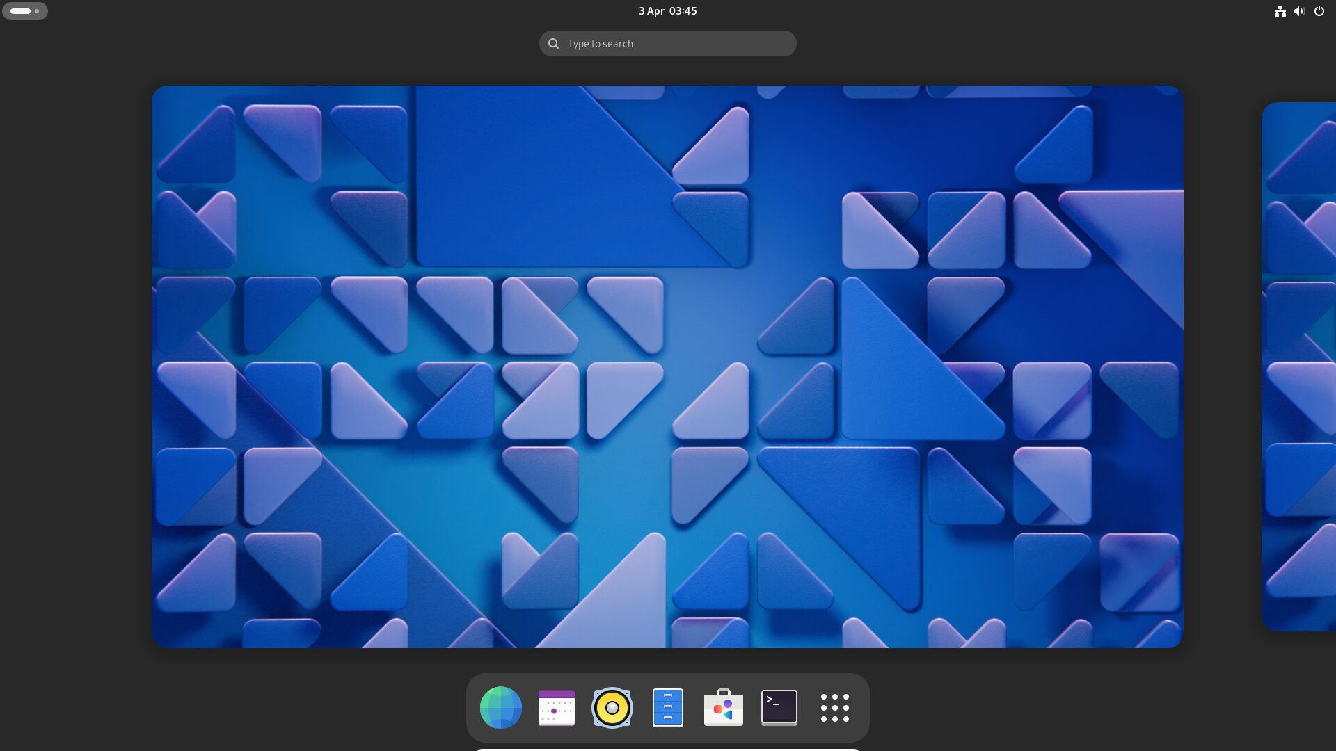
The GNOME panel at the top of the screen is a departure for Windows users who expect their taskbar at the bottom, but a moment’s exploring will reveal that they can click the items on the left, the right, and in the middle. Clicking the symbol on the left, which is actually the workspace switcher, shows the Overview and the default applications in the Dash.
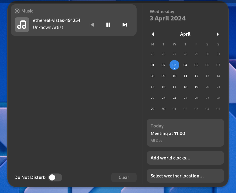
Slightly less obvious is the functionality that lets you hover your mouse over the workspace switcher and use the scroll wheel to move you through your active workspaces. Clicking the time and date in the center opens the notification panel.
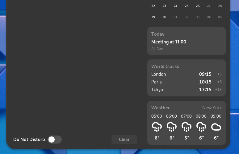
Applications can use pop-up messages to bring things to your attention. These are great but they’re transient. The notifications list lets you review these messages, and clear the list if you’ve no further need for them. Some applications extend their control interface into the notifications panel too, such as the Music application, allowing you to control media playback from the notifications list.
Notifications are now grouped according to their source application, and each notification message has a header showing the application name and an icon. It’s much easier to tell where the message came from. Notifications now have expand and collapse buttons.
Also new is the Today pane. This shows items in your calendar for the current day.
Clicking the World Clocks or Weather panes allows you to set locations you need to know the time for, and to set your own location so that you get relevant weather updates.
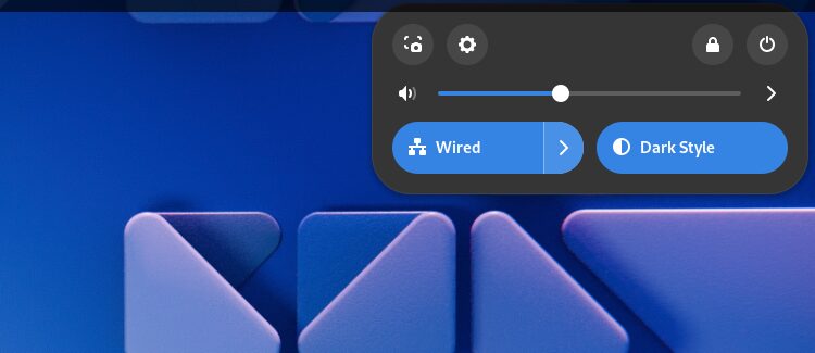
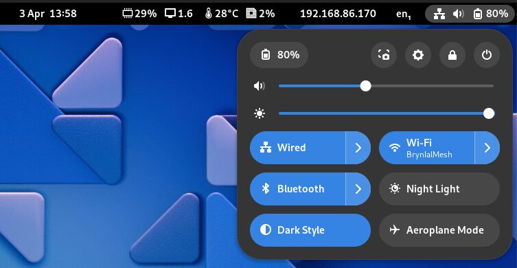
Clicking in the top right corner displays the System Menu. Your hardware will largely dictate what this looks like.
If you have Wi-Fi, for example, you’ll see a Wi-Fi button, and if you’re on a laptop device you’re shown the percentage of remaining battery charge.
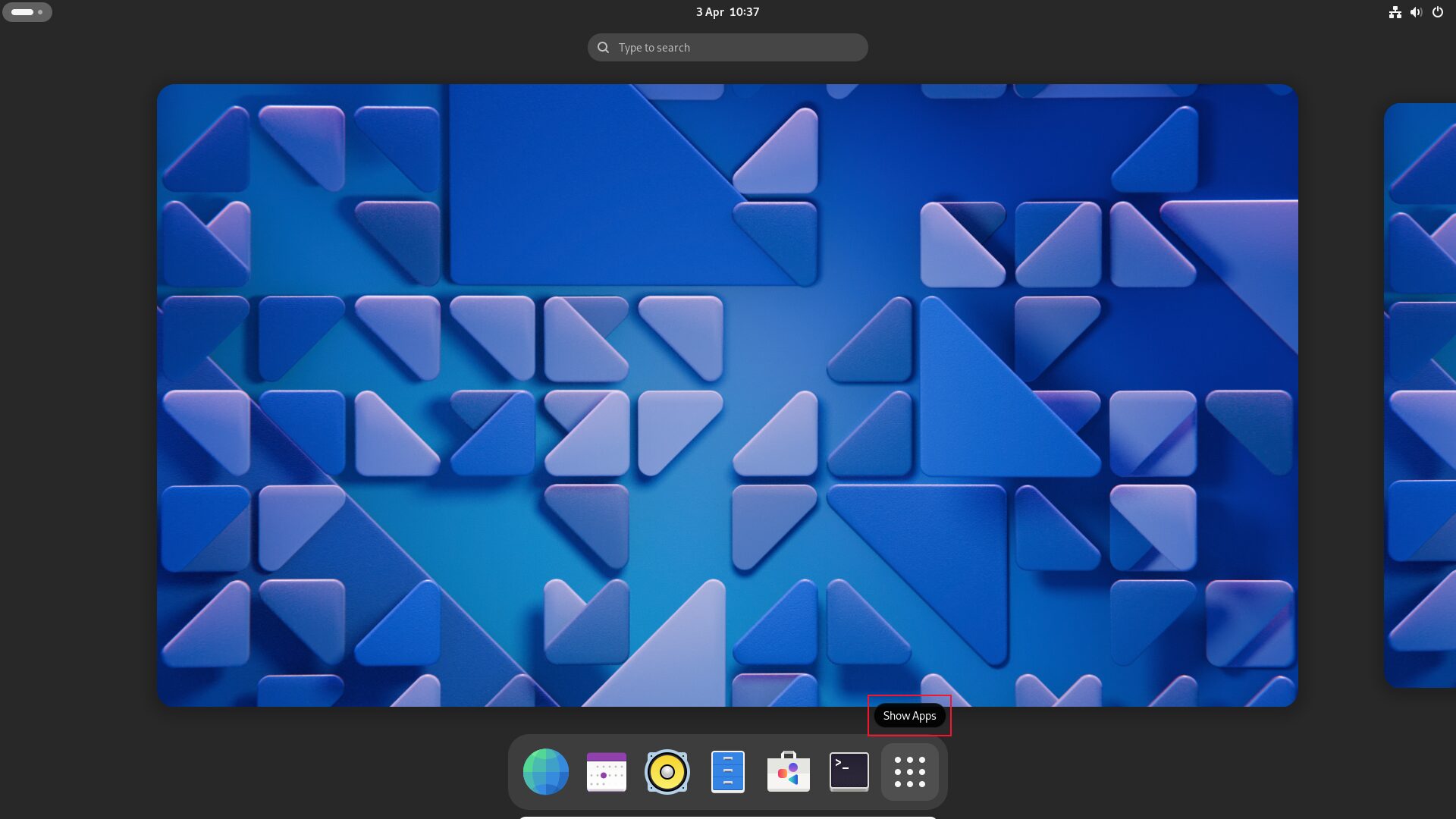
Clicking the workspace switcher (or pressing the “Super” key) swaps to the overview, showing you the open applications. You can drag applications from workspace to workspace. The Dash is shown at the bottom of the screen with its default set of applications.
Applications on the Dash have tooltips. If you’re not familiar with the icons, hovering the mouse over them reveals their name.
Files, Settings, and Software
To be productive, you need to be able to navigate to files and directories, configure things in settings, and install applications.
Files Browser
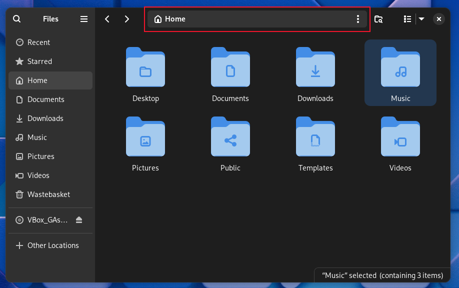
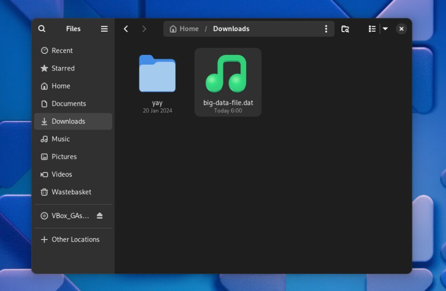
The Files file browser now has a global search, accessed from the magnifying glass icon in the toolbar.
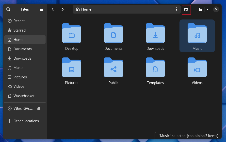
To search in the local directory and subdirectories, use the new icon beside the file path field.
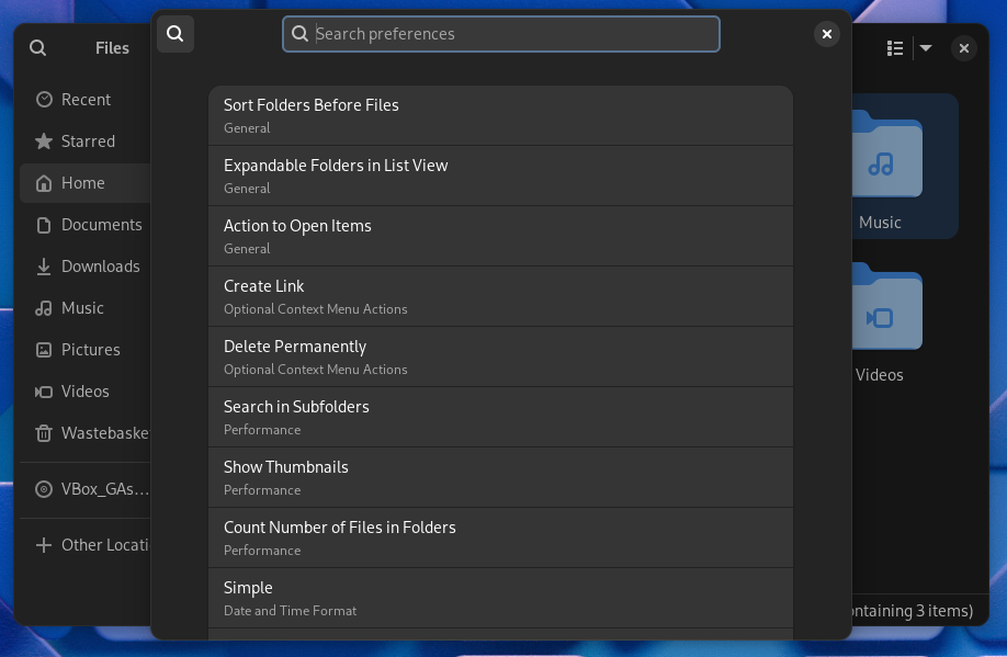
A search field has also been added to Preferences, making it simple to find the setting you want to change.
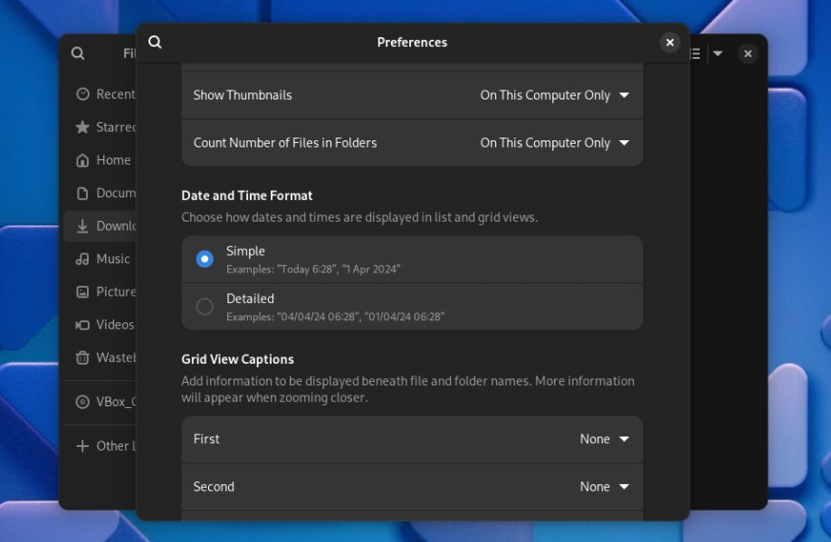
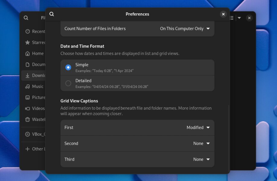
Preferences also has a new option allowing you to display dates in either simplified or detailed format.
This option applies to the List view and Grid view. To see the date in the Grid view, you’ll need to set one of the Grid View Captions options to either Created, Modified, or Accessed.
The selected date is displayed in the chosen format below the icon of each file or directory.
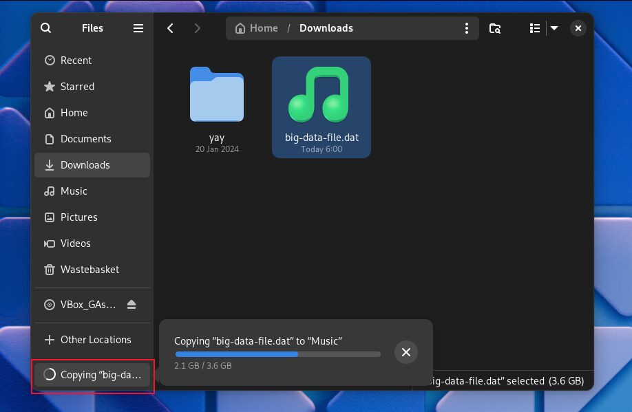
The file transfer progress information has been moved to the lower left of the Files window. Clicking it pops out a more detailed view.
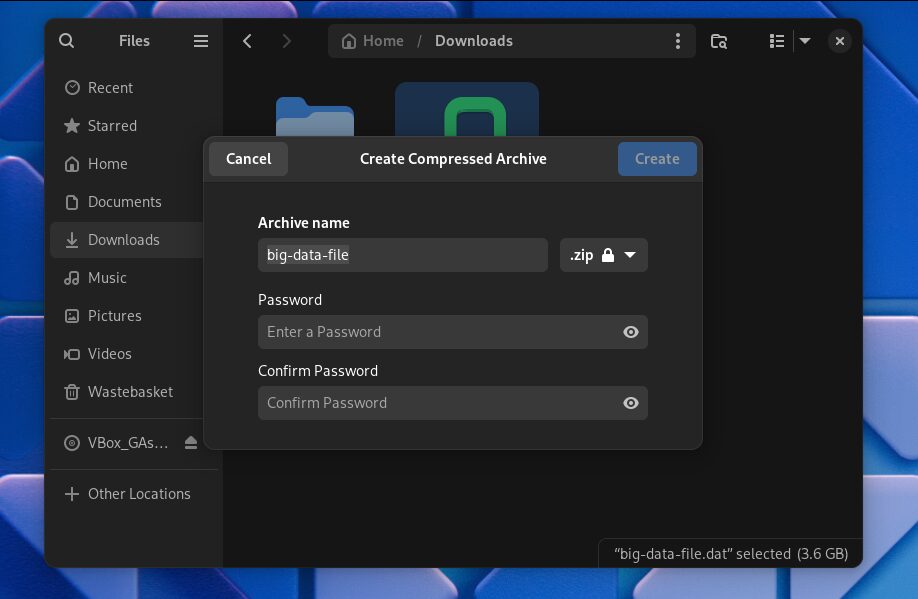
If you try to copy a file larger than 4GB to a FAT partition you’ll get a warning and the file isn’t copied. Previously, Files would copy as much as it could and then fail. When you create a password-protected archive you’re prompted to re-enter the password.
There are performance and usability enhancements too. Swapping between the List and Grid views happens immediately now, and a single click is all that is needed to edit the file path field.
Settings
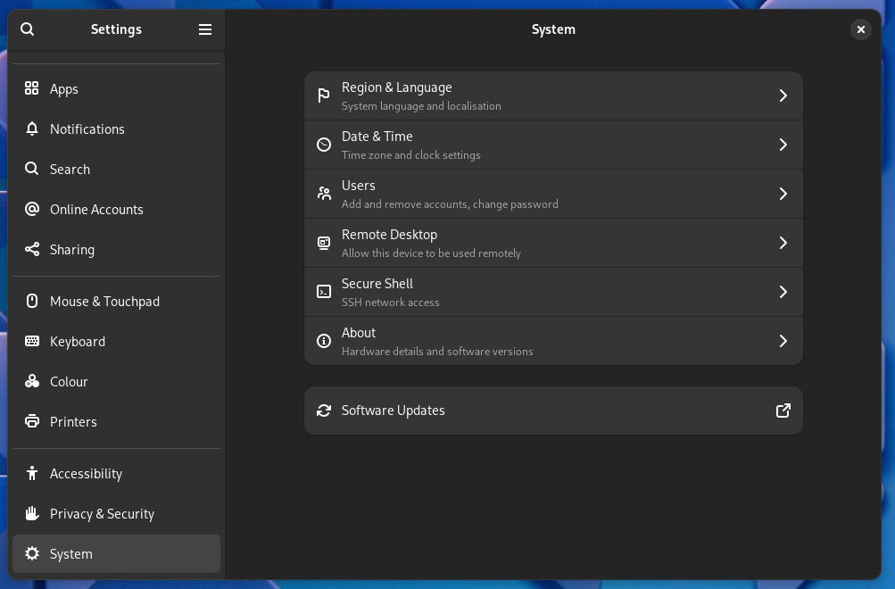
The Settings App has received its share of attention, too. There’s a new System menu option. It groups options such as Region & Language, Date & Time, and Users into one settings pane.
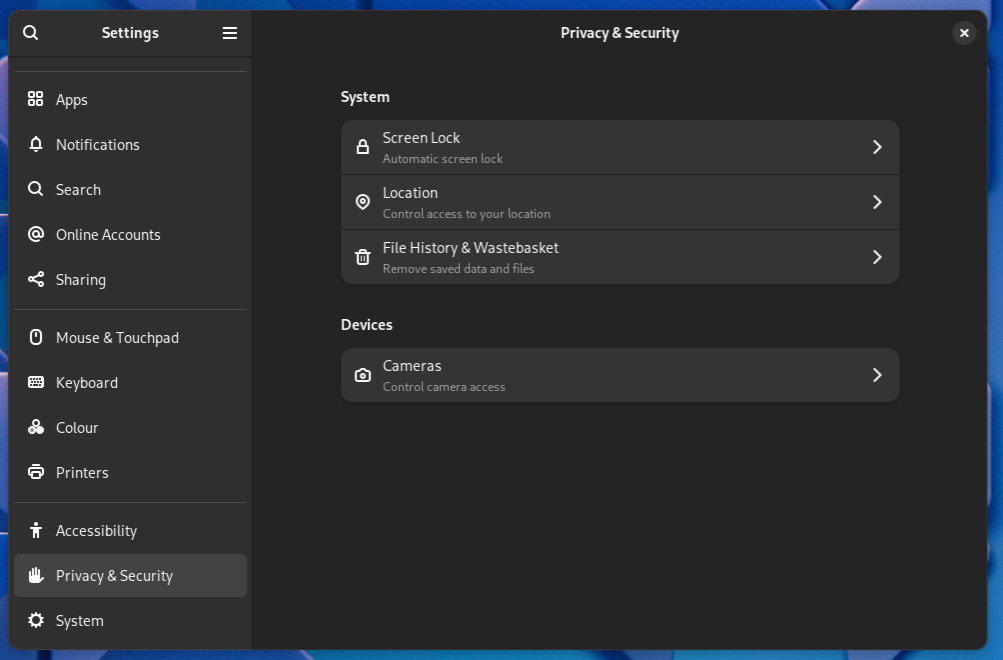
The Privacy option has been renamed to Privacy and Security.
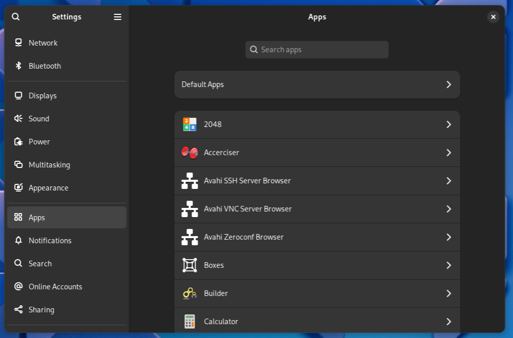
The Default Apps settings have been moved into the Apps settings, which makes logical sense.
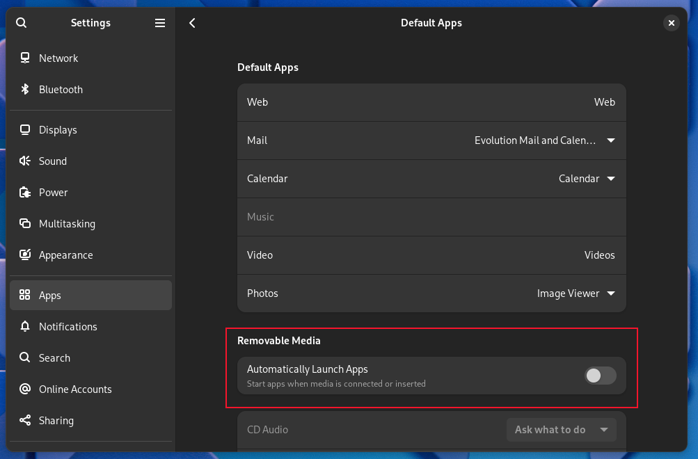
The options for Removable Media have been moved to the Default Apps settings.
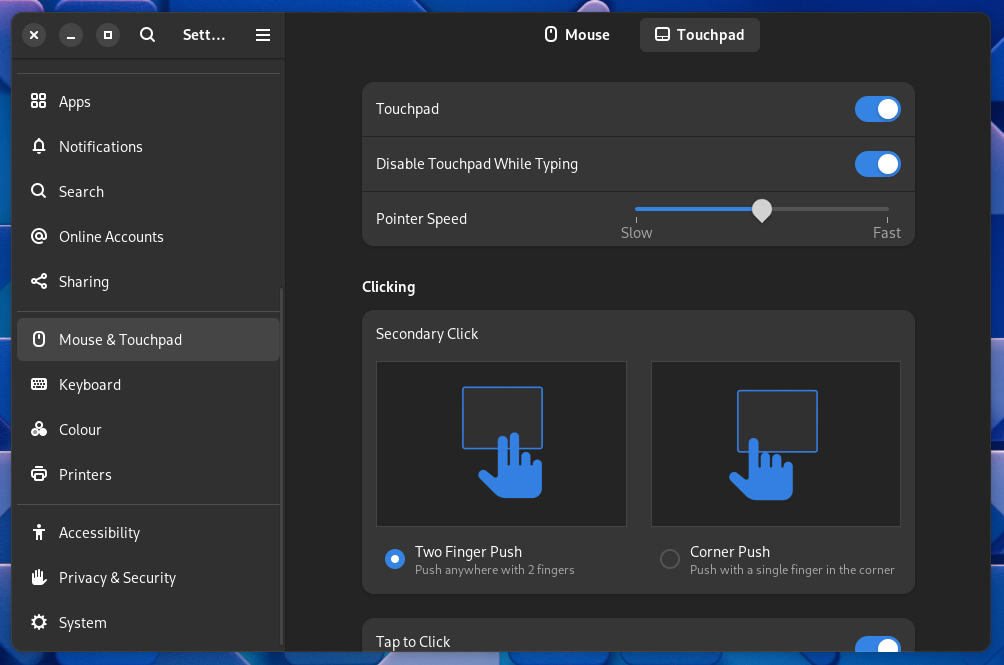
Laptop touchpads can be turned off while typing, and you can select how you perform a “right-click” on the touchpad.
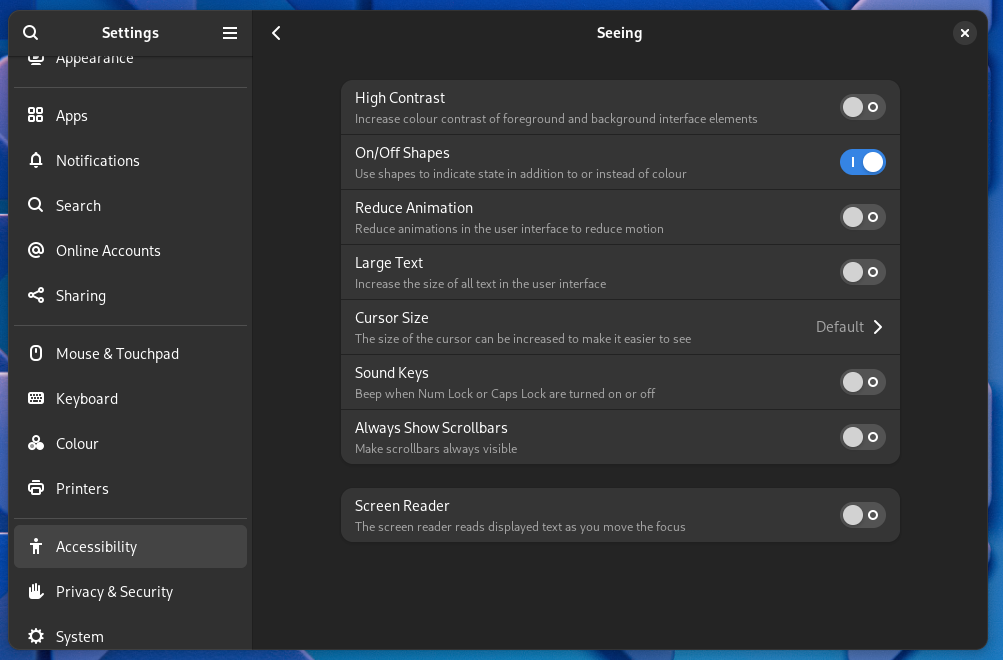
A new accessibility option allows you to show on (I) and off (O) indicators in slider buttons.
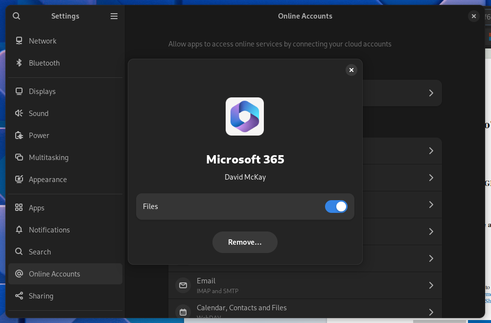
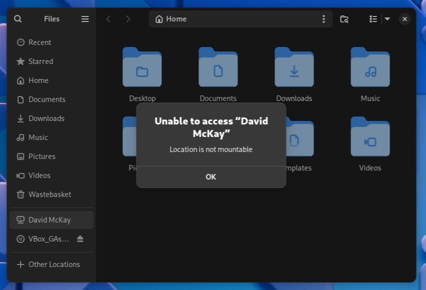
Online Accounts now support WebDAV and Microsoft Personal account types, giving you the ability to access your OneDrive from within Files. This may be exciting news for Windows users, but the excitement will be short-lived. There’s a known issue with authentication which will be corrected in GNOME 46.1.
At first, it looked like the setup process was successful.
But the remote drive couldn’t be accessed.
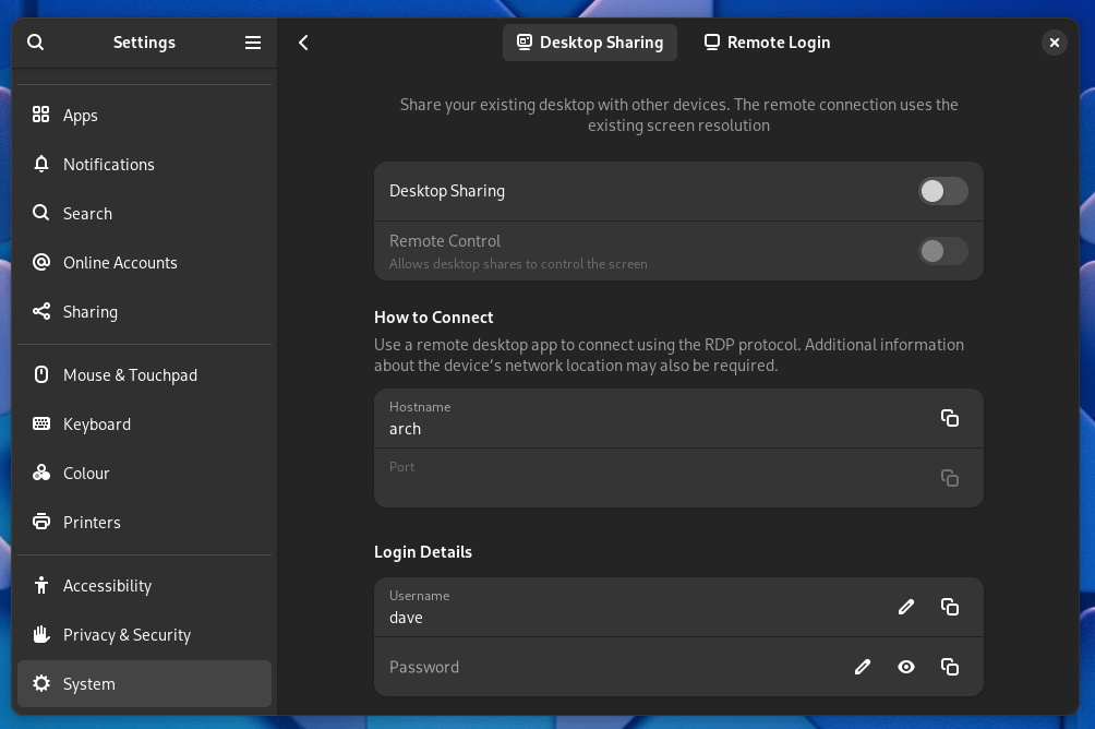
The authorization for all online accounts is now completed in your browser, making the process more secure, and there’s support for USB security keys. Another long-awaited addition is the ability to support remote connections to your computer over the RDP protocol.
You need to turn on desktop sharing on your computer and use an RDP client on the remote computer.
Software
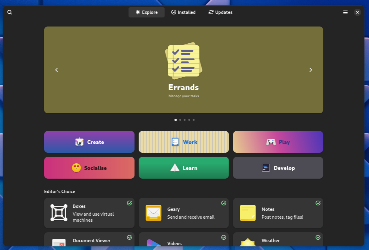
Hovering your mouse over the icons in the Dash will reveal one called Software. Clicking this icon opens the Software application.
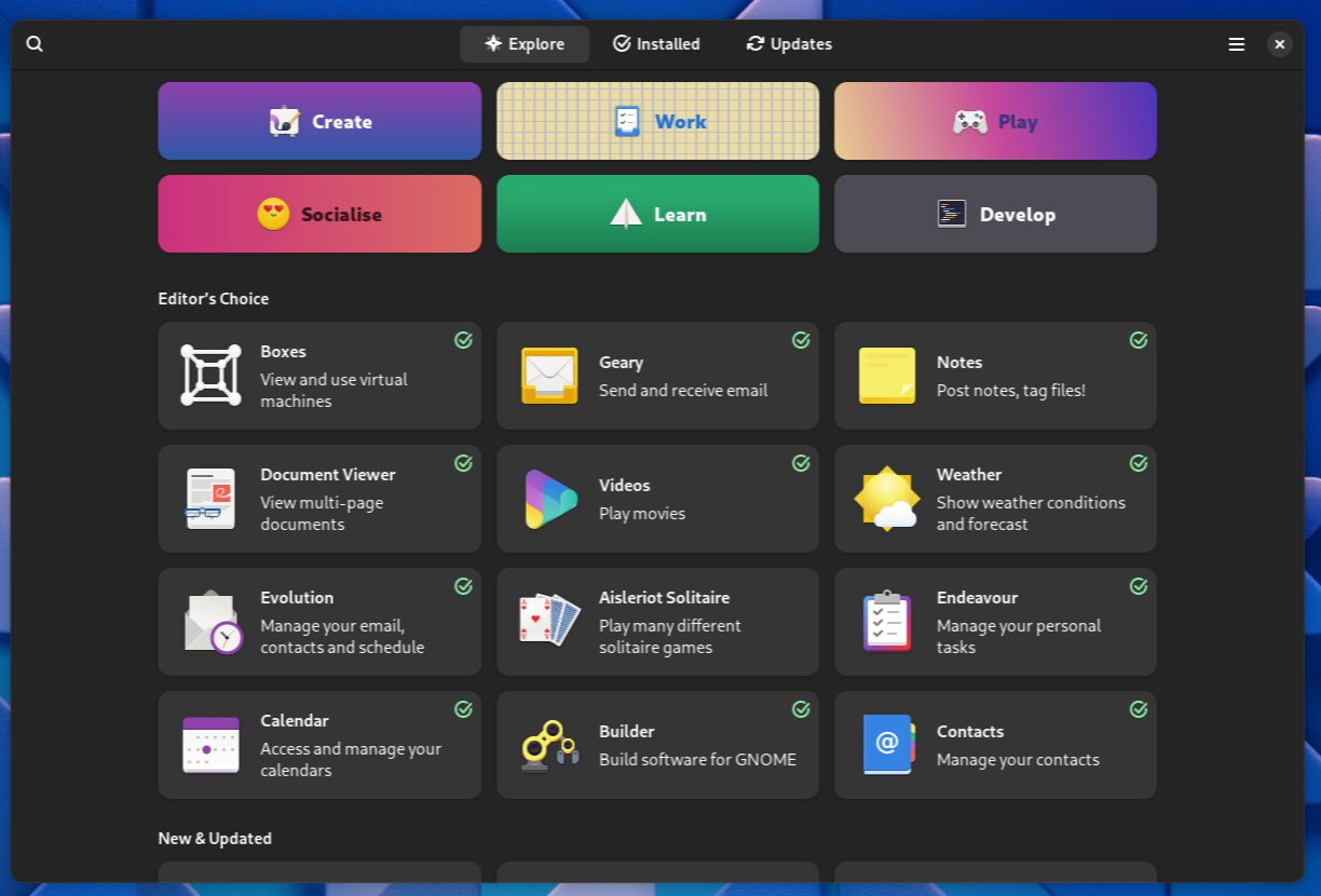
Some applications have green ticks on their tiles. These are Flathub applications created by verified developers.
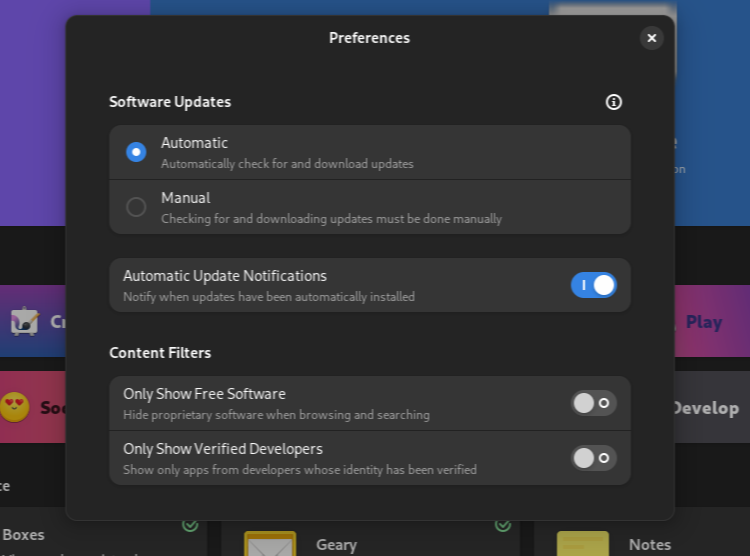
The Preferences window and the Keyboard Shortcuts windows have been refreshed.
Finally, the Software application now gives more meaningful warnings and error messages, like alerting you before you perform a large download over a metered data connection.
The GNOME Core Apps
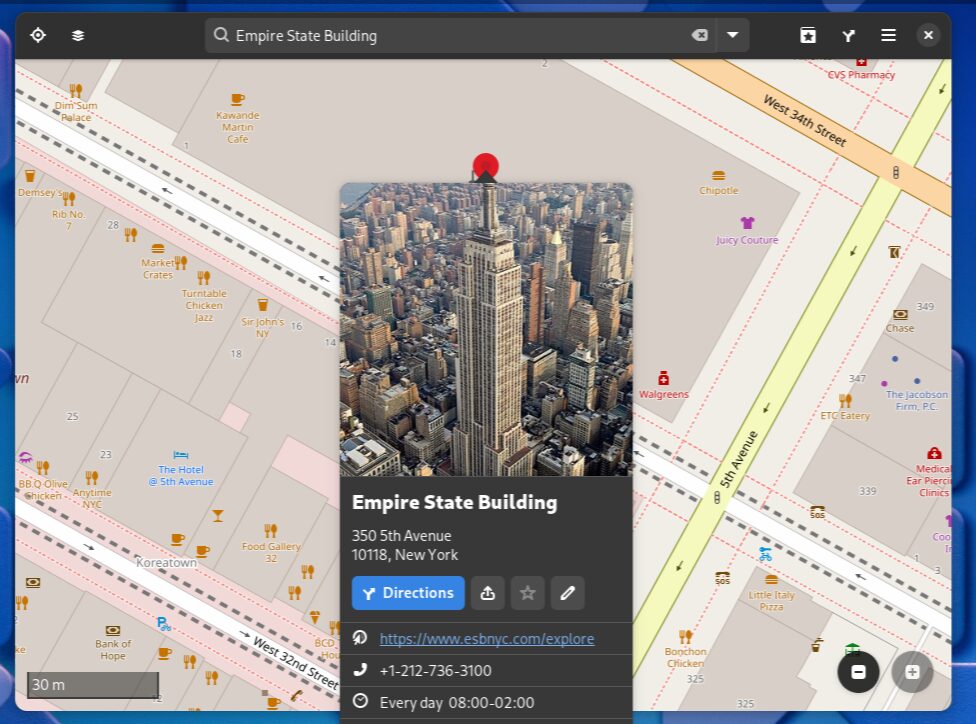
All the GNOME Core applications such as Calendar, Maps, Loupe, Music, and the Epiphany browser have had improvements.
Editing OpenStreetMap points of interest in Maps is smoother, and Maps supports dark mode, and better routing when public transport is involved.
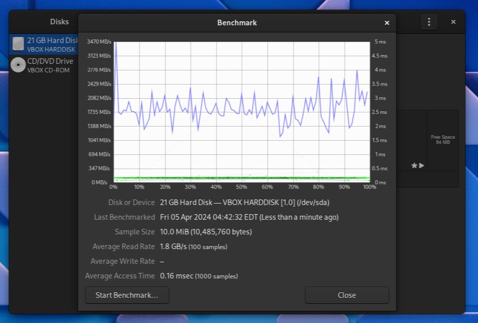
Disks has a graph showing disk input/output speeds.
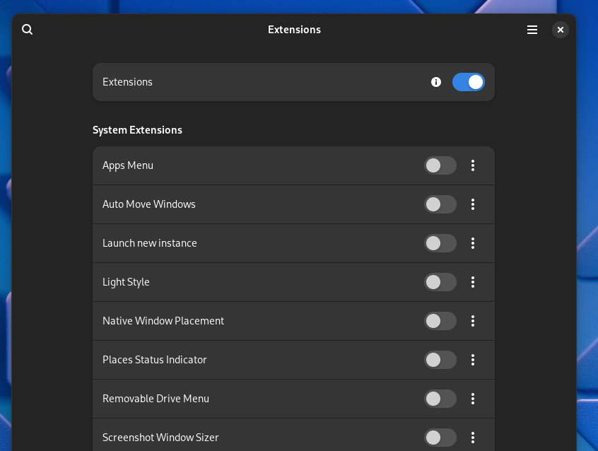
The Extensions app has a new uncluttered look, and the app is now adaptive.
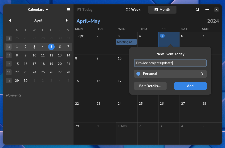
The Calendar app has been given the same visual treatment as the other core applications, including some under-the-hood performance improvements.
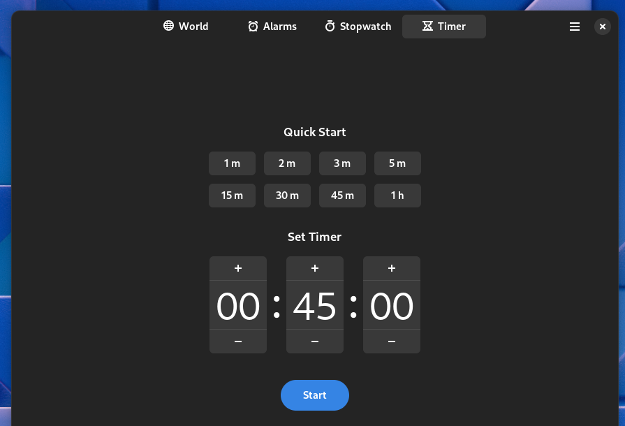
Clocks now provides some preset durations for timers. You can click these to start a timer with a commonly-used duration.
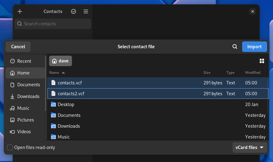
The Contacts application lets you select multiple VCard files to import. The confirmation dialog shows you the names of the contacts that are going to be imported.
Other Improvements
There are numerous other improvements scattered throughout GNOME 46, like these:
- There’s better fractional scaling support which should yield sharper fonts.
- The new default is for touchscreen devices to have touch-to-click activated.
- Of course, there are new wallpapers.
- The System Monitor application has been ported to GTK 4.
- Pressing Super+Ctrl+1-9 will launch the application in that position in the Dash.
A Vibrant Desktop
GNOME provides a modern, well-crafted, and visually appealing desktop with a smooth workflow. It looks and feels cohesive, and it’s great to see the level of attention that’s given to accessibility.
I doubt anyone is going to leave their current operating system because they’re attracted to GNOME. They’ll leave because they’re dissatisfied with what they’re currently using. If they find themselves using a distribution with GNOME, they’ll find little to complain about their desktop environment.


